Website redesign: Your complete guide

What is a website redesign?

A website redesign involves reviewing and significantly updating the structure, layout, branding, content and overall user experience (UX) of your website. This involves a complete overhaul of its code and its visuals. The most common reason is to improve the experience for your target audience, generate more organic traffic and boost revenue as a result.

This is different from a website refresh, which may make small scale changes but will keep the existing code and functionality intact. For example, a refresh might involve changing the logos and branding alone. Or updating content to make it more relevant and improve SEO.

A refresh can make sense if you are still working with your website’s original developer and just want to make some low-risk incremental changes. But in most cases, the person who coded your original site is long gone. If that is the case, then beware of the temptation to try and eke out a refresh on the cheap.

It’s not as easy as you’d think for new developers to try and re-skin or optimise your existing build. They need to contend with legacy code with no clue as to its robustness. So if they break something by accident, it can cost more to fix than if you had opted for the full redesign.

This is not just a matter of branding, but the entire user experience.

Why redesign your website?

Redesigning your website is not something to undertake lightly. It should be a strategic marketing decision. One that fits with the rest of your organisation’s marketing objectives.

Let’s have a look at some of the most common reasons for a website redesign:

You’ve updated your brand

Great news – you’ve created an incredible new brand identity. Naturally, it now needs to be incorporated into your online presence. A rebrand is a good signifier that your business has evolved. Perhaps you’re reaching new audiences. Or you want to update the perception of your existing market. Whatever the reasons behind such a fundamental change, your website needs to reflect them too.

A new brand identity should come from a close examination and understanding of your core value proposition, which focuses on what you do, who you do it for and why they should choose you over the competition. The website user experience is an extension of your brand identity, by making your audience’s needs and content central to your planning, you will improve how your brand is perceived by your customers.

Your website isn’t generating enough enquiries

There is only so much juice that you can squeeze from your old website. So at some point, your only option will be to go for a full redesign.

Of course, you can start with incremental improvements. This could be through search engine optimisation (SEO) to boost organic traffic, lead generation campaigns to drive more paid traffic, or content and UX changes to improve conversion.

But often legacy code and an unwieldy content management system will prevent you from making the significant changes needed to make an impact on your traffic volume and conversion rate.

For example Google introduced Core Web Vitals, user-focused metrics designed to measure a page’s speed and performance. These include the average loading time of a page and how well it renders for a user. A poor experience will directly impact SEO, however as technology and coding best practice are constantly advancing, it’s a pretty impossible task to optimise bloated old code to meet new requirements, without creating many more issues in the process.

Businesses also frequently outgrow their content management systems, they are no longer able to flex with their needs without costly development. For example, publishing content and creating new landing pages, changing content site-wide such as CTAs and headers and introducing ecommerce or translations.

The only way of knowing for sure where you stand is by conducting a full website audit – which we’ll discuss later. If there aren’t many low-risk options for cost-effective improvement, you can be confident that your current website needs a full redesign.

Your website needs to be a true and faithful reflection of everything you do as a business. The whole point of your website is to focus on positively meeting the needs of your ideal customer.

You’ve changed your business strategy

Your website needs to be a true and faithful reflection of everything you do as a business. If you have simply added a new product or service to your arsenal, there might be scope to adapt what you’ve already got. But if there are more significant changes happening, then there will need to be a similar scale of change for your website.

This could be the result of a merger or acquisition. It could be the result of a sudden change in your existing market. Or it could be that you’re targeting a new market altogether.

The whole point of your website is to focus on positively meeting the needs of your ideal customer. If you’re targeting new customers, or meeting the needs of old customers in a different way, then your online presence needs to change too.

For example, let’s pretend you have pivoted to a content marketing strategy. That means you’ll need to be able to quickly and easily update content on your website. If you can’t add videos or gated content without jumping through 17 hoops, then what’s the point?

Your website looks older than the dot com bubble

This is not just a matter of branding, but the entire user experience. Internet users are savvy enough to spot when a website hasn’t been updated in years. And it’s easy to make assumptions about a company as a result. You might be red-hot on the latest trends and techniques in your particular industry. But if your website looks like it would still recommend AskJeeves as a search engine, your prospects will go and find one that doesn’t.

Of course, most websites aren’t that bad. But if your site doesn’t responsively adapt to different devices and follow the latest UX best practices, then it will seem just as dated.

The same can be said if it uses old software like Flash, which could now result in broken features. The entire user-journey needs to be a smooth and effortless experience – no matter the user, platform or device.

You need to keep up with the competition

The problem with web design is that it is forever improving. So what if your competitors have added features or functionality that you can’t incorporate? Yep – it’s website redesign time.

A good point to make here is that a website redesign shouldn’t just improve the user experience in the present. It should be built with the future in mind too. So the next time the competition improves their online offering, you can adapt instead of redesigning again.

Check out our web design services for more information

Before you get started…

1. Define your brand positioning and key messages

Having a clearly defined brand positioning and brand identity can be an enormous competitive advantage. It’s what makes your company unique, it builds loyalty, and it’s a key driver for long term growth.

When it comes to the website, your positioning will directly inform the key messages you wish to communicate and create clarity around your offer. Without a single minded proposition you risk becoming all things to all people and increasing bounce rate from your site, as people fail to see how you can help them.

2. Update your buyer personas and clarify their intent

As we have already hinted, your website redesign should have very little to do with your own preferences. The golden rule of web design is that it should be user-centric. So, you need to be extremely clear about who your customers are – and what they want, specifically from your website.

Your buyer personas are fictional representations of the different types of your most common customers. They incorporate demographic and psychographic data ranging from their job title and location to their needs, concerns, channel preferences, knowledge gaps and online experience.

If you’ve never created them or your target market has changed since you last designed your website, then this is where you start. Map out the personas you are targeting, including the key marketing messages for each one.

This will form the foundation for understanding the user intent for each persona.

Types of user intent

User intent can be defined as the reason why people visit your website in the first place. It generally depends on where they are in your marketing funnel.

Top of funnel – Informational – Web users at the top of the marketing funnel are only vaguely aware of you as a business – if at all. They have a need and are looking for potential solutions. Their primary objective is to acquire information about whether your company and solution meets that need.

Middle of funnel – Educational – These users have found a number of solutions and are now considering their options. Perhaps they are comparing the pros and cons of each solution, or investigating more specific details of one particular choice. They know who you are, but are still deciding if you’re right for them.

Bottom of funnel – Transactional – These are your favourite type of users – the ones that know who you are and what they’re looking for. They’re ready to buy. Your job is to make it as easy as possible for them to do exactly that.

You will have users that meet each of these criteria. The job of a website redesign is to give them what they need now and move them further down the funnel to a conversion.

Through Google Analytics segment builder you can track the different buyer personas on their journey.

3. Conduct an in depth website audit

Once you’ve established your personas and what they want from your online presence, you can examine how your current website meets those needs.

A website audit evaluates every aspect of your current site, including its usability, technical performance, content, SEO, conversion rate, and how it fares against the competition.

It’s your chance to benchmark what’s going well, which are your most valuable pages and where the gaps are in your current offering.

Benchmark your performance

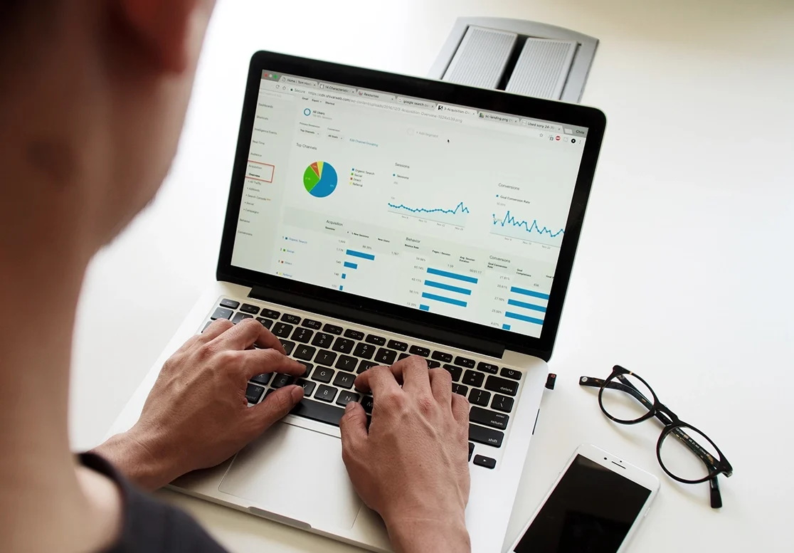
Through tools like Google Analytics segment builder and user exploration, you can track the different buyer personas on their journey through your existing site. Use these tools to determine which pages brought them to your site, the information they found valuable and where they dropped off.

In fact Google Analytics tools (or similar) are vital for benchmarking your performance on a range of factors, including:

  • Bounce rate
  • Number of visitors
  • Unique visitors
  • Time on site
  • Form submissions
  • Sales generated

On-page search engine optimisation (SEO)

Which are the pages that are bringing the most traffic to your website? Are there some which are underperforming? Check your content for any clumsy SEO errors like badly organised headings, keyword stuffing or irrelevant anchor text links. There are plenty of free SEO audit tools that will give you some tips on which pages are doing well and what to improve.

Technical SEO

It doesn’t matter how good your content is if your website takes longer to load than it does to write it. Or if your layout isn’t responsive to mobile devices. Tools like Page Speed Insights will assess whether your site meets the technical standards required to rank in the SERPs (search engine results pages).

Conversion rate optimisation (CRO)

CRO helps to assess your existing layout and content for chances to turn your current web traffic into more enquiries or sales. Which landing pages are generating the most enquiries? Are some pages missing a call to action? Use heat mapping tools like Hotjar or Lucky Orange to see where customers are engaging and how to improve conversions.

Competitive analysis

It’s always a good idea to analyse how your competitors are converting your target users. What features and functionality do they have that you don’t? How do you compare when it comes to ranking for competitive keywords? Use their progress to help generate ideas for yours.

By the end of this analysis, you can segment your web pages into four different categories:

High traffic – high conversion – These are your golden geese. The pages that are bringing the most users to your website and converting them most efficiently. And if it ain’t broke…

High traffic – low conversion – These are your ugly ducklings. They aren’t generating too much business yet, but they have the potential to be beautiful. Apply a little CRO know-how and see if they start to flourish. These pages may be popular with the top-of-funnel informational audience. So if they’re not ready to buy, perhaps offer them some valuable information to download.

Low traffic – high conversion – Redesigning these pages has an element of risk, because you don’t want to lose those conversions. Examine the personas they appeal to for a better idea of how to direct more of that traffic their way.

Low traffic – low conversion – These are your consequence-free pages. Play around with their design, content and UX to your heart’s content. You’ve got little to lose and everything to gain.

4. Identify the gaps and set measurable goals

At this point, you will have a good idea of where the improvements need to be made.

It’s time to turn all that analysis into objectives for your new site. Define what you are going to change and how you plan on measuring success. This will need to account for the purpose of your website, your reasons for wanting to redesign and the gaps that you have identified.

E-commerce

If you are selling products or services directly from your website, then identifying your key performance indicators (KPIs) is a no-brainer. Because your bottom line is your bottom line. So the metrics you can use will include:

  • Number of sales: Have the basic metrics improved?
  • Revenue generated: Is the website bringing in more cash overall?
  • Average order value: Are people spending more in one go?
  • Customer lifetime value: Are your customers sticking around to buy more for longer?
  • Sale conversion rate: Are you generating more sales from the same web traffic?

An MQL is a prospect that has already volunteered enough information to demonstrate that they meet your criteria for what makes a quality lead.

Lead generation

If you want to bring in leads instead of sales, it can be easy to get bogged down in the dozens of potential KPIs. Sure, newsletter sign-ups are great, but does that actually count as a lead? Technically, yes. But an email address isn’t likely to result in a sale anytime soon. Really, the value of this kind of website is how many marketing qualified leads (MQLs) it can generate.

An MQL is a prospect that has already volunteered enough information to demonstrate that they meet your criteria for what makes a quality lead. These are the prospects that match your buyer personas exactly.

Perhaps you want to target certain job roles in companies with an annual revenue of more than £5 million. By defining the number of these MQLs you want to generate, it helps to clarify how you can achieve it via your online presence.

Other KPIs for lead generation include:

  • Number of leads: This is quality marketing and sales qualified leads
  • Lead quality: How many enquiries meet your required criteria?
  • Lead conversion rate: The number of leads you generated compared to the web traffic on the page.
  • Average lead value: Are people spending more in one go?
  • Time to close: How long does it take to convert from first contact to sale?

10 steps to plan and execute your website redesign project

1. Set an achievable timeline

First things first. There’s no point in doing all of your homework if you’re going to rush the final execution. A good rule of thumb for executing a website redesign strategy is that it should take between two and four months. This is dependent on the size of the job at hand.

2. Put together a cross-functional team

A lot of people within your organisation are going to need to feed into this process. Your team needs to include:

  • UX and design
  • Copywriting
  • SEO
  • Sales
  • Customer support
  • IT support

Each team will have their own expectations and needs when it comes to the redesign. The earlier that you get buy-in from all sides, the better prepared everyone will be and the smoother the overall project will run. This team can of course be a hybrid team between your in-house resource and your agency, specific roles and responsibilities would be established during project kick off.

3. Design the information architecture and sitemap

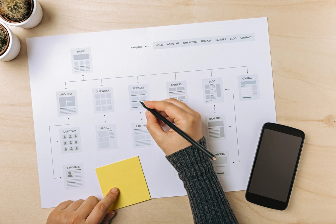
The information architecture defines the overarching relationship between the areas of your website. The point here is to organise everything in a user-centric way so that it can inform your sitemap. Your audience personas will directly inform this phase.

Drawing on the relationships defined by your new information architecture, your sitemap lays out all of your pages to demonstrate their hierarchy. Here, you can label each page according to its goals, content and functionality.

The end result is a clear visual representation of the new website’s layout, which can then be refined, challenged and improved.

4. Design the wireframes

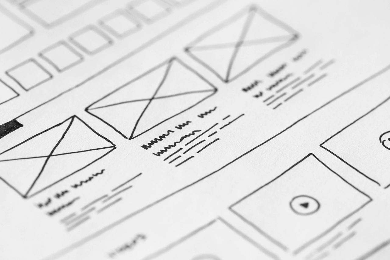
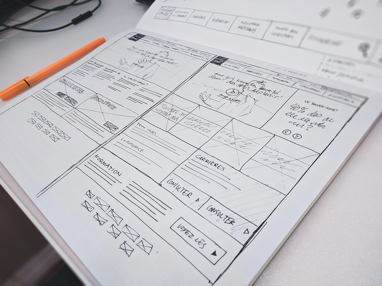
Wireframes are a visual representation of the user interface of the new website design. They don’t usually contain branding or logos. Instead, they are a simple and cost effective way to sketch out which elements will be added to the pages and where. As well as content hierarchy, it will inform content production, demonstrating rough word counts for best fit.

Once approved, your wireframes can lead to mocking up some designs of the most important new pages for further feedback and user testing.

5. Conduct keyword research

The majority of pages on your new website should be optimised for one SEO keyword or topic. You will know which pages and keywords you want to preserve from your website audit. Now is the time to find more opportunities to rank and generate new, relevant traffic to your redesigned website.

6. Create the new content

Writing the new copy needs to take into account the SEO, brand positioning and user journey. It has to meet the needs of your personas and nudge them down the marketing funnel. But that’s not the only type of content available.

Videos, e-books, white papers, testimonials, reviews and case studies are all essential elements to consider. Done well, these contribute to a higher likelihood of generating that sale or lead.

7. Design key pages

Using the wireframes as a guide and any brand guideline work to inform look and feel, produce your key page designs. It’s not necessary to produce a design for each page as a lot of the components will likely follow through from other pages of the site, as long as you have a blueprint for development to follow. It’s useful to annotate the designs with specific interactions, functionality and key headers (H1, H2’s etc for SEO).

8. Start coding your new design

Assuming everyone is happy with the sitemap, wireframes,design and content, you can now begin the work of turning into the final product. Coding is a slow and detailed process. Your developer needs to incorporate all the graphic elements of your brand identity into the new design. They need to adhere to technical SEO best practice and test any special features or interactivity. And they need to ensure that the new design works regardless of the device or platform used to access it.

9. Populate, test and review

Once you have the basic outline of the website on a staging or development server, you can start to migrate the existing content or add new content. This will most likely throw up challenges to fix as the website grows in pages. Make sure every piece of text aligns, all link works, every form submits, the site renders as it should on every device, the content is all accurate and the code adheres to the current standards. You also need to check things like your 301 redirects are all in place. So users are sent to your new pages instead of the old URLs.

10. Launch your website redesign

Congratulations, you’ve reached the end of an extremely difficult process. It’s time to upload your files to the server, make one final check to ensure they’ve installed correctly, and then push the site live.

Needless to say, you will still need to monitor your new design on an ongoing basis. Be prepared to fix oversights or problems quickly and make sure you keep your new site up to date and secure.

You should also be continually looking to further optimise your content and layout with sensible A/B testing.

Need your website to generate more leads?

Common website redesign mistakes to avoid

Not basing your website design on robust data

The decision that your business’ website needs a new design should be based on an objective analysis of its current performance. And that means focusing on the metrics that really matter. If you’re in a particularly niche industry, it doesn’t matter if your unique visitors could all fit into a modestly-sized commuter-train. As long as those numbers are in line with your industry benchmarks, then focus on whether they are converting into leads or sales.

This leads nicely into the second requirement for robust data standards, and that is what constitutes success. Don’t get distracted by vanity metrics – focus on the data that will make a tangible impact on your business outcomes.

Rushing to hit an artificial deadline

From the decision to redesign to the execution of the plan itself, an arbitrary timescale will only cause additional stress.

This is a complicated process that needs proper execution. To establish a reasonable deadline, conduct a thorough planning process that involves your key stakeholders. Listen to what they think is achievable and work backwards from your intended launch day to deliver according to their realistic timelines.

Compromising on performance to save budget or time

Getting the technical aspects right for a redesign can be a slow process. Ironically, this is the only way that you can ensure better performance for your website in the end. When it comes to site speed, site navigation, uptime, mobile performance and content availability, there are no corners that can be cut.

Sure, the metrics for success of your new design should be couched in terms that are relevant to your business objectives. But the KPIs for a high performing website need to be measured in terms of page load time and mobile responsive UX, amongst many others. These are the measurements that will help push your site higher in the rankings.

Not focusing purely on your users

There is often a temptation to add functionality or design because it looks good or it’s new. Neither of those reasons matter if they are not based on the needs of your website’s users.

The user experience of your website should be an intuitive, seamless journey towards the actions both you and your customer want to take. That takes good quality content combined with functionality that your users expect and need. Google prioritises websites that offer these two things most of all so make sure you don’t get distracted by shiny things.

Performance issues can quickly impact the ranking of your newly launched website.

No consistency in your brand or positioning

Your brand identity is a promise to every stakeholder in your business and it should be the starting point for creating a user-centric redesign, since brand identity design is a thoroughly user-centric process itself.

Having a clearly defined set of brand guidelines is an essential part of this redesign because your website is one of the best opportunities you have to connect with potential customers using your brand’s personality.

Leaving the website alone after it’s gone live

There is no such thing in website design as ‘fire and forget.’ Website performance issues can quickly impact the ranking of your newly launched website and gremlins have a habit of turning up at the worst possible time. Keep a close watch on the performance of your website post-launch. Analyse it for broken links or issues with search engines unable to access your pages (known as crawl errors).

Webmaster tools like Google Search Console will help you find issues quickly and if you do then be prepared to tackle them as soon as you find them.


How much does a typical website redesign cost?

Unfortunately, this is impossible to answer without understanding the variables. Various factors impact a cost estimate, such as volume of content (number of pages), the complexity of the functionality and site interactions (the build), any technical considerations with other platforms and the exact role you want your design and build partner to play, for example do you want them to produce and optimise your content or will this be fulfilled by an in-house team?  

Ultimately you get out what you put in, and that means ensuring your website redesign cost includes ample budget for upfront planning. In summary this covers aspects such as:

  • Understanding business, marketing and project objectives
  • Reviewing audience research and developing segmentation by needs specific to the website
  • Define the optimal user experience in line with these needs
  • Performing a content audit and understanding the gaps
  • Conducting keyword research and mapping 
  • Any technical discovery (for example, further exploration of a CRM or eCommerce integration)

Whilst the actual design and build phases should make up the bulk of the work, you must also consider the time required to populate all site content (whether this is migrating from your existing site or populating with new content), testing and bug fixing and all activities involved in website deployment, including the delivery of a technical SEO and website migration plan. 

It’s all relative to the size of your website of course, and a small business will obviously have a tighter budget, but to give you an indication of how your website redesign cost should break down, we’d estimate the following:

  • Discovery and planning 15%
  • Design 25%
  • Development 35%
  • Content population, testing and deployment  25%


Good luck!

As with all big projects, preparation is the key. If you would like any help with your website redesign, get in touch.

image

Written by

Paul Grogan

Creative Director

Award winning, and self-confessed typographic and graphic design perfectionist, Paul has 26 years experience in the industry and is our managing and creative director.

Stay up to date and subscribe to our newsletter.

Newsletter