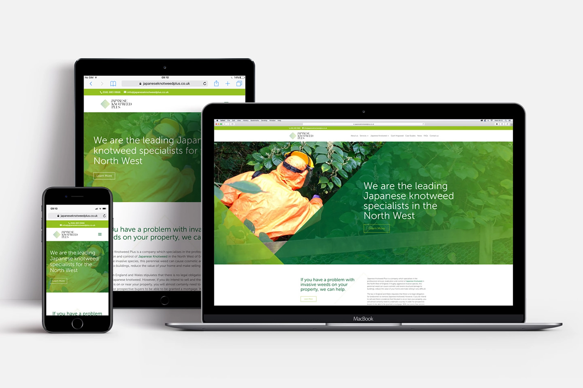
Japanese Knotweed Plus, a local business, specialises in treating invasive plants. These include Japanese Knotweed and Giant Hogweed in Manchester and Lancashire. They offer comprehensive plant management services.
Earlier this year, business partners Stephen and Igor approached the Think team for a potential website revamp. Following an initial meeting to explore possibilities, we agreed to initiate a complete rebrand, beginning with a new logo. This was an important step for them. A logo reflecting business quality sets the foundation for the entire visual brand identity and overall feel.
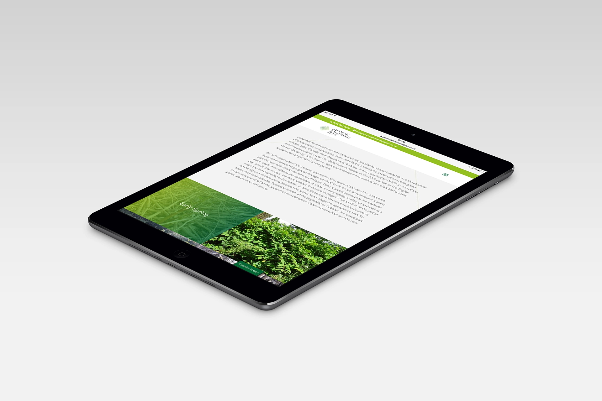
So, the first stage was to redesign their existing logo to make the business stand out in the market. With the second stage being the creation of a highly functional, responsive website, including providing Search Engine Optimisation (SEO).
A key piece of information provided by them was that they treat Japanese Knotweed with a precise application of poison. They do not remove it because this is currently against Environmental Agency guidelines.
The concept for the logo design was based on this value proposition that Japanese Knotweed Plus offer. The chosen design included a geometrically accurate leaf to reflect this approach to sit along with a custom abstract typeface which suggested the disappearance of the invasive weeds.
This was underpinned by using a gradient suggesting positive change, as the colours merge from a dark green to a light green.
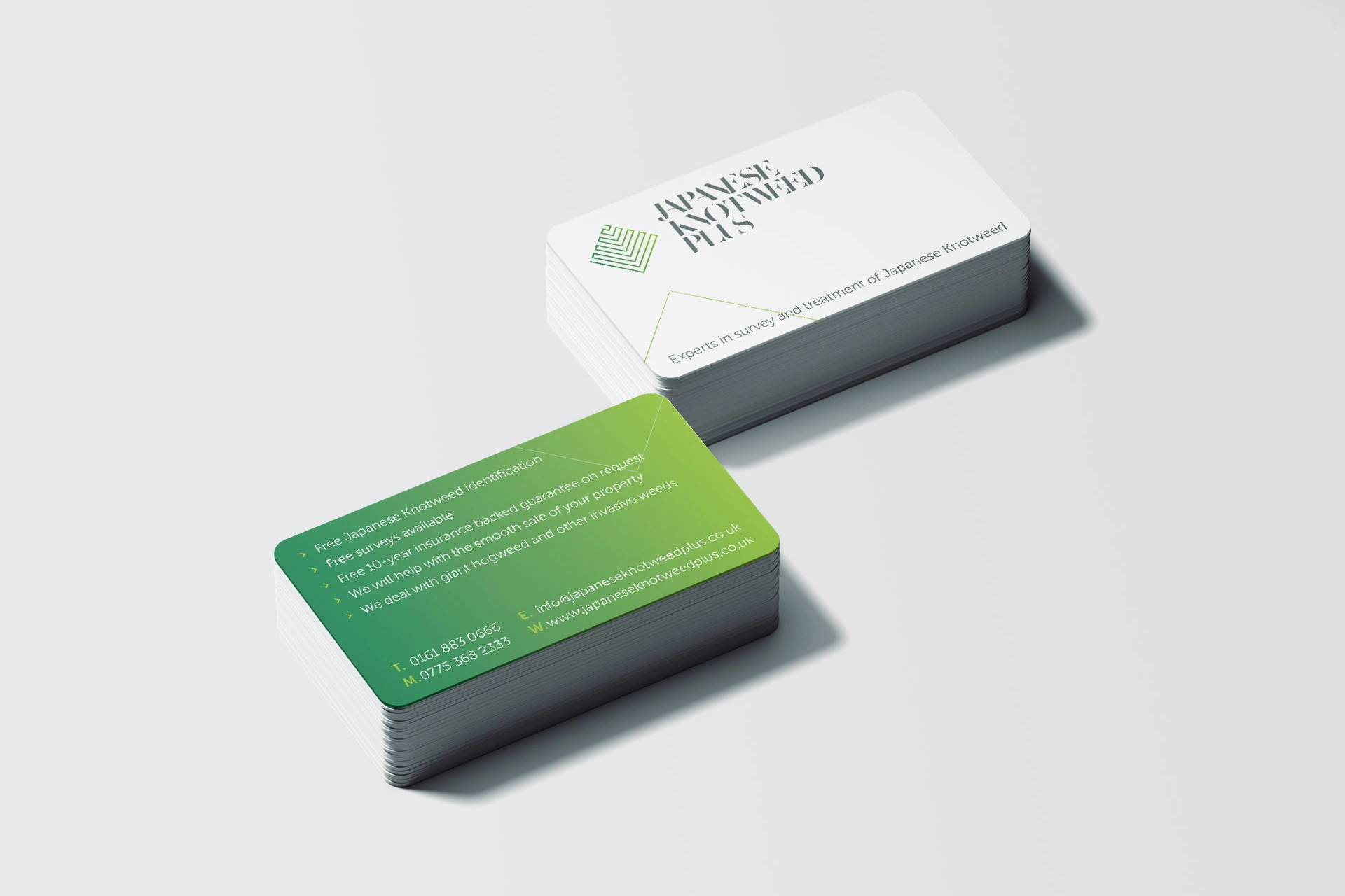
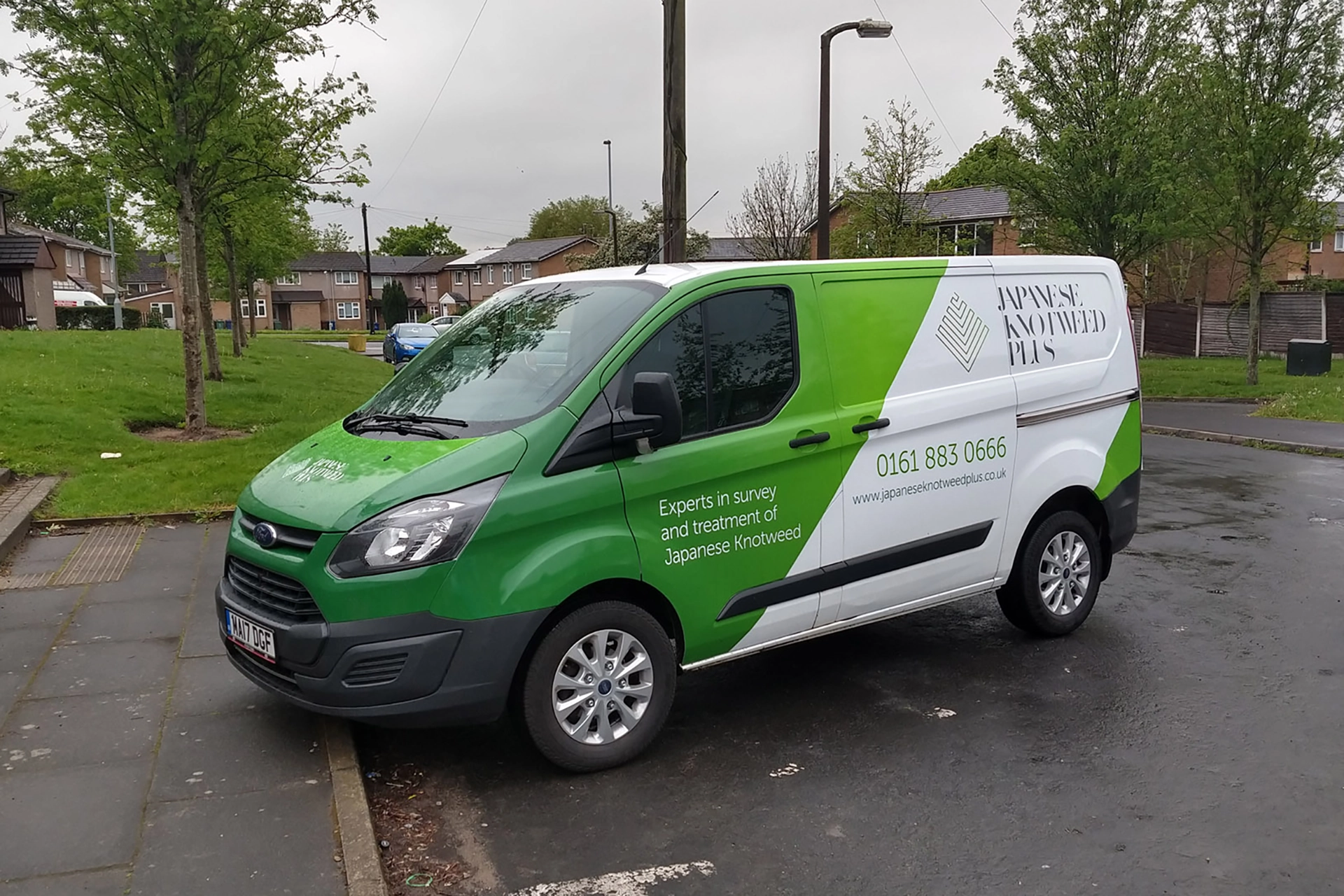
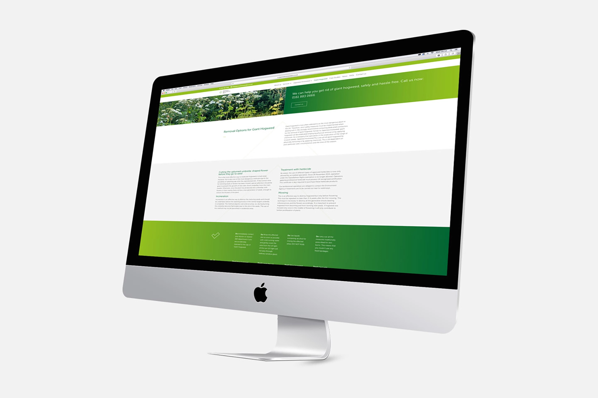
Once the basic brand items, such as business cards and a van livery were completed, we rolled out the branding into the website. This reinforced the brand and will help to keep the online presence consistent with other collateral.
We continue to work with Japanese Knotweed Plus, currently focusing on improving the SEO of their website.
You can check out the website we created here at https://www.japaneseknotweedplus.co.uk.
