Before we began work on their website design, we helped Moscrops FP navigate the potentially choppy waters of a full redesign of their logo and brand identity. Interestingly, the entire project stemmed from the meeting about their website, but it soon became apparent that they really needed to look at this first.
I deliberately didn’t say rebrand. This is because it would not be factually correct. A full rebrand would involve a new brand strategy, looking at their positioning and tone and of course the design.
Moscrops FP is a well-established and highly regarded business with a long history. Whilst we did a review of the overall branding, we felt that it was more the visual aspect that we needed to look at.
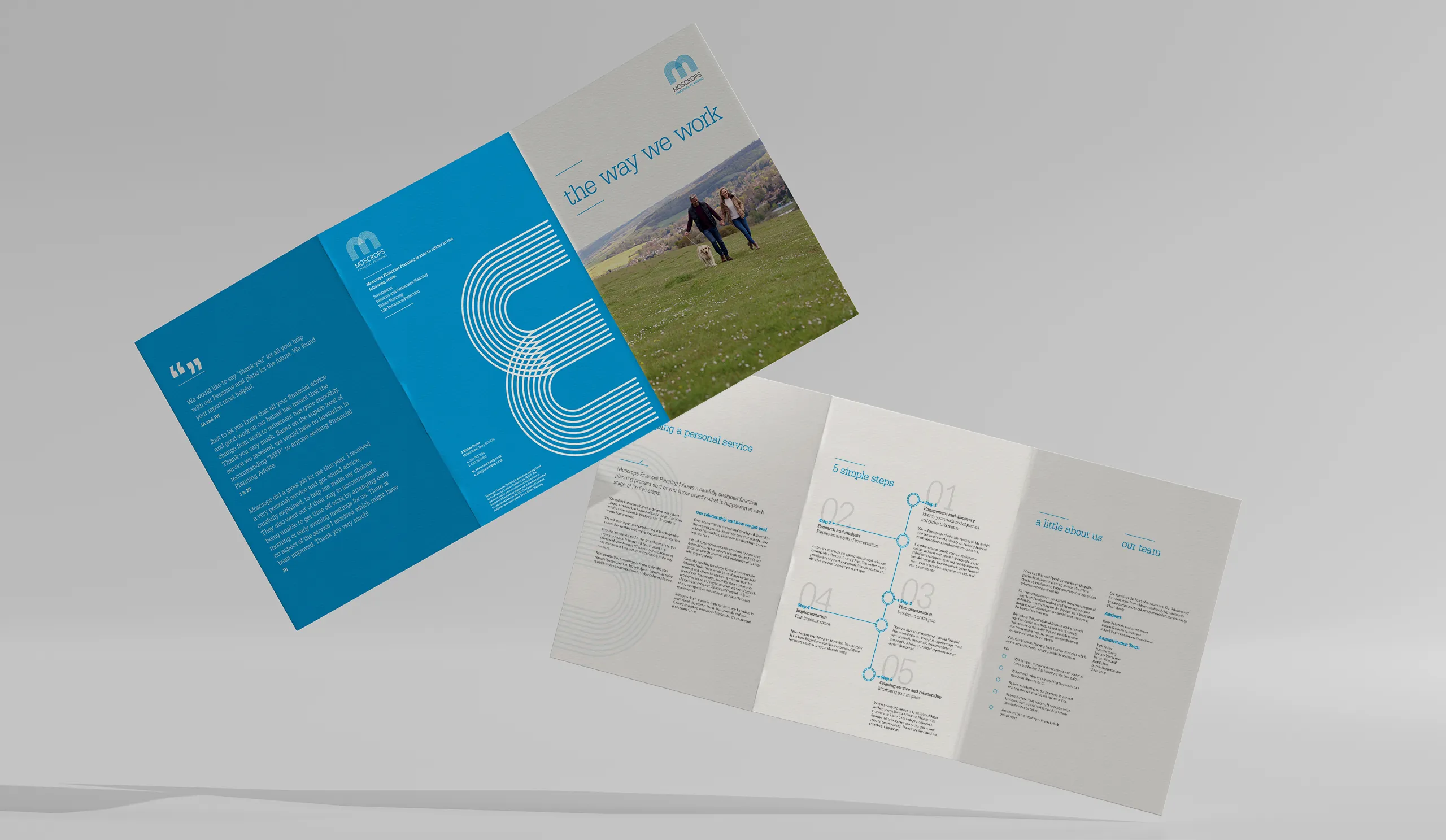
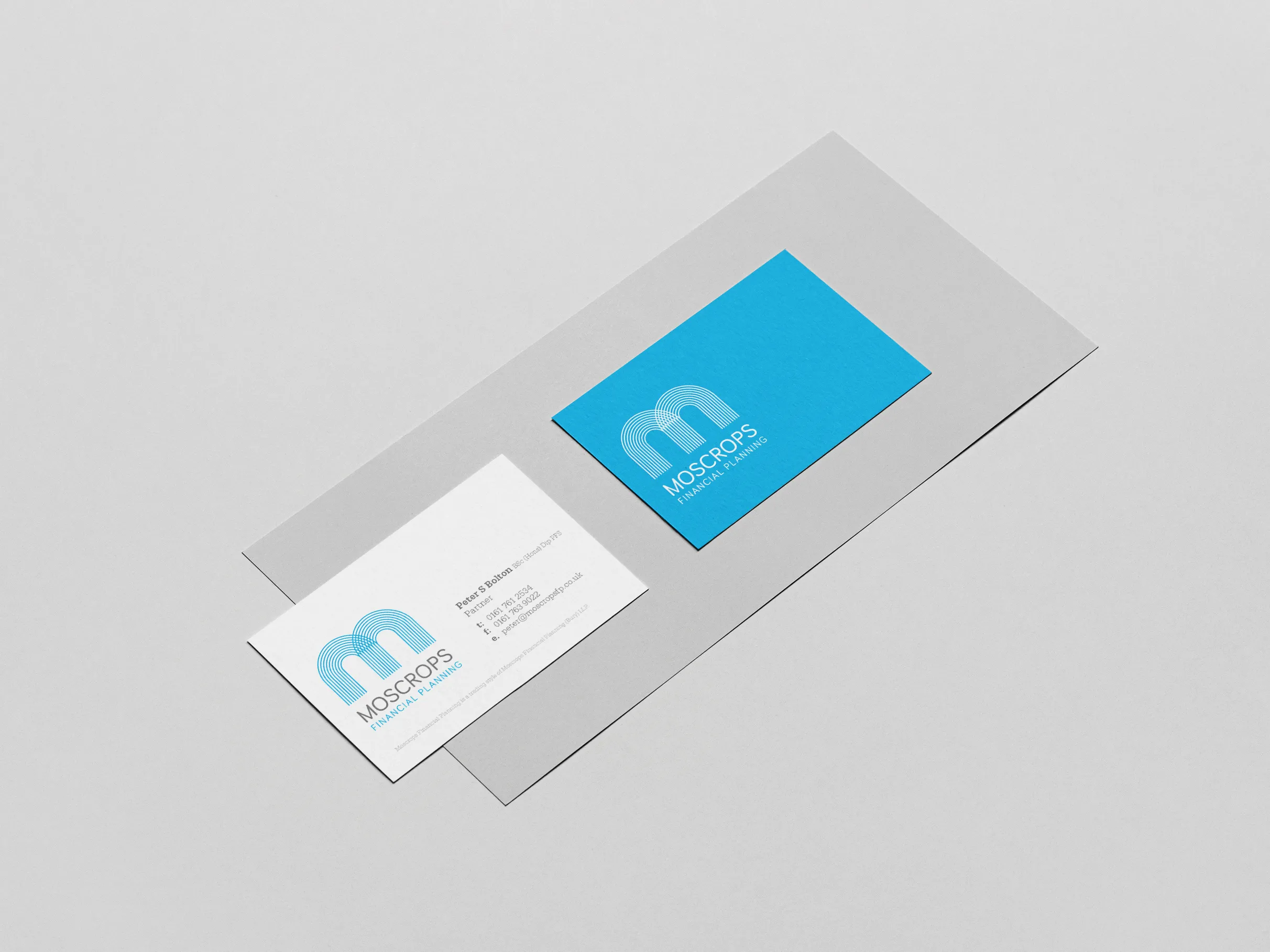
Design agencies can’t ‘make’ a brand – or design a brand for that matter. Designers design a brand identity that reflects the businesses branding. Or in simple terms, you can’t just design a logo and say ‘that’s our branding’. When you create a logo design, it becomes part of your brand identity, which a business could commission us to do – and create the following items which would help form their brand identity:
- Logo design – (the main symbol behind the entire identity and brand).
- Stationery design – (letterheads, business cards, compliment slips etc.)
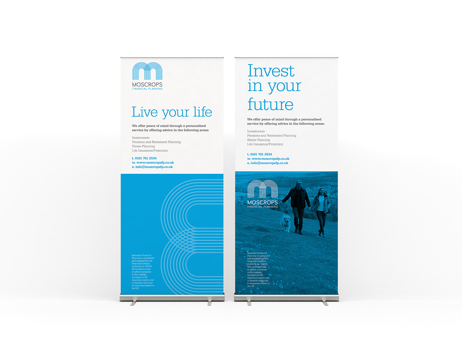
- Marketing collateral – (flyers, brochures, books, websites, etc.)
All the mentioned items and more contribute to a business’s brand identity. The logo design embodies the brand, serving as a cornerstone for the entire identity.
The design of the logo is intended to imply a partnership between their clients and themselves. Financial planning is at its best when both parties work together. A carefully selected typeface was added to reflect the monogram and remain friendly. This line art style also allowed us to develop a beautiful set of icons for the website and other collateral.
We also developed the tagline, “Live your life” as part of the process.
Once the brand identity had been complete, we were able to commence the website design for approval. The Moscrops Financial Planning website primarily provided information, all of which had FCA approval. The whole point of the redesign was to communicate this information in a much clearer and easier way to find way. The process started with the site map and the simplification of the website structure.
The design features consistent messaging, call to actions, but more importantly a consistent use of brand style if present throughout.
After obtaining approval for both the design and this step, we proceeded to implement it across the web build. We ensured it worked seamlessly on both mobile and desktop devices.
After finishing the site, it needed FCA approval again. We were delighted to find that only one styling change was required.
As with all of our web projects, there’s no point in paying for a new website no one can find, so as part of our project costs we always ensure that the on page SEO was up to Google standards and within a week of the launch we saw ranking gains of 1,500 places, and stats for localised Bury searches as follows.
#1 Rankings = 11 (+11)
57 (+33) in the top 20 positions.
45 (+35) in the top 10 positions.
77 (+41) in the top 50.
33 (+27) in the top 5 positions.
It was fantastic to work alongside Moscrops’ team on this. Since they understood it to be an investment, their engagement was superb. They generally trusted us to do the work.
See more inspiring finance logos on DesignRush’s Best Logo Designs page.


