Our rebrands of Manchester charities, Once Upon a smile and Wood Street Mission, have earned prestigious recognition at the Indigo Awards.
Once Upon a Smile received four accolades:
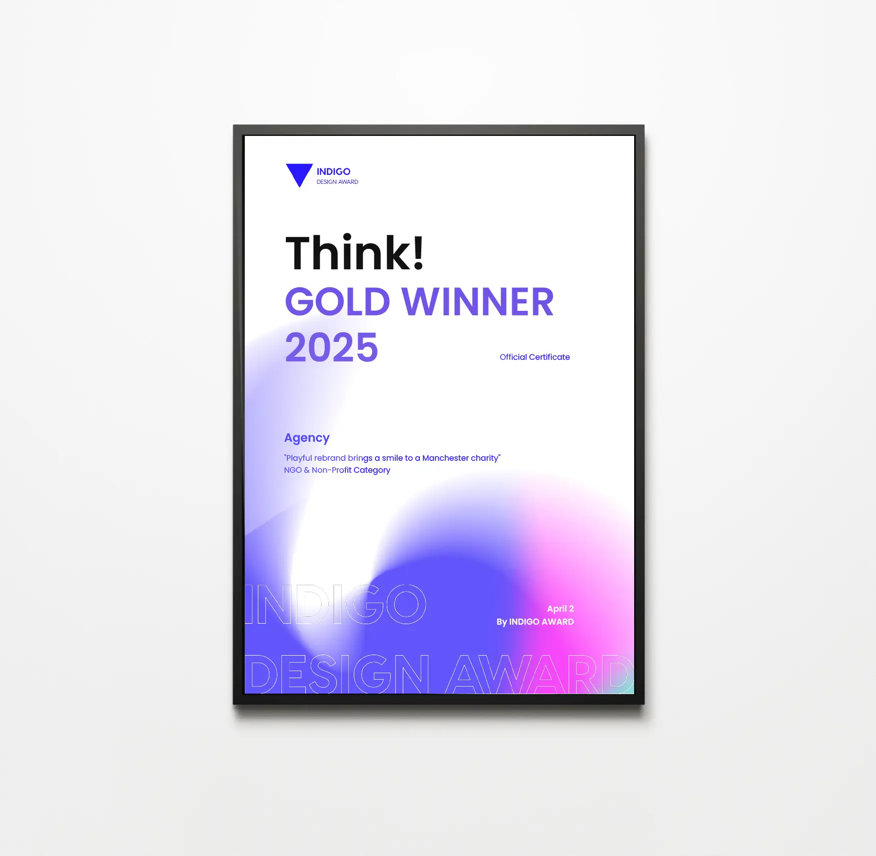
- Gold Winner in Branding for NGO & Non-Profit
- Silver Winner in Branding for Graphic Design
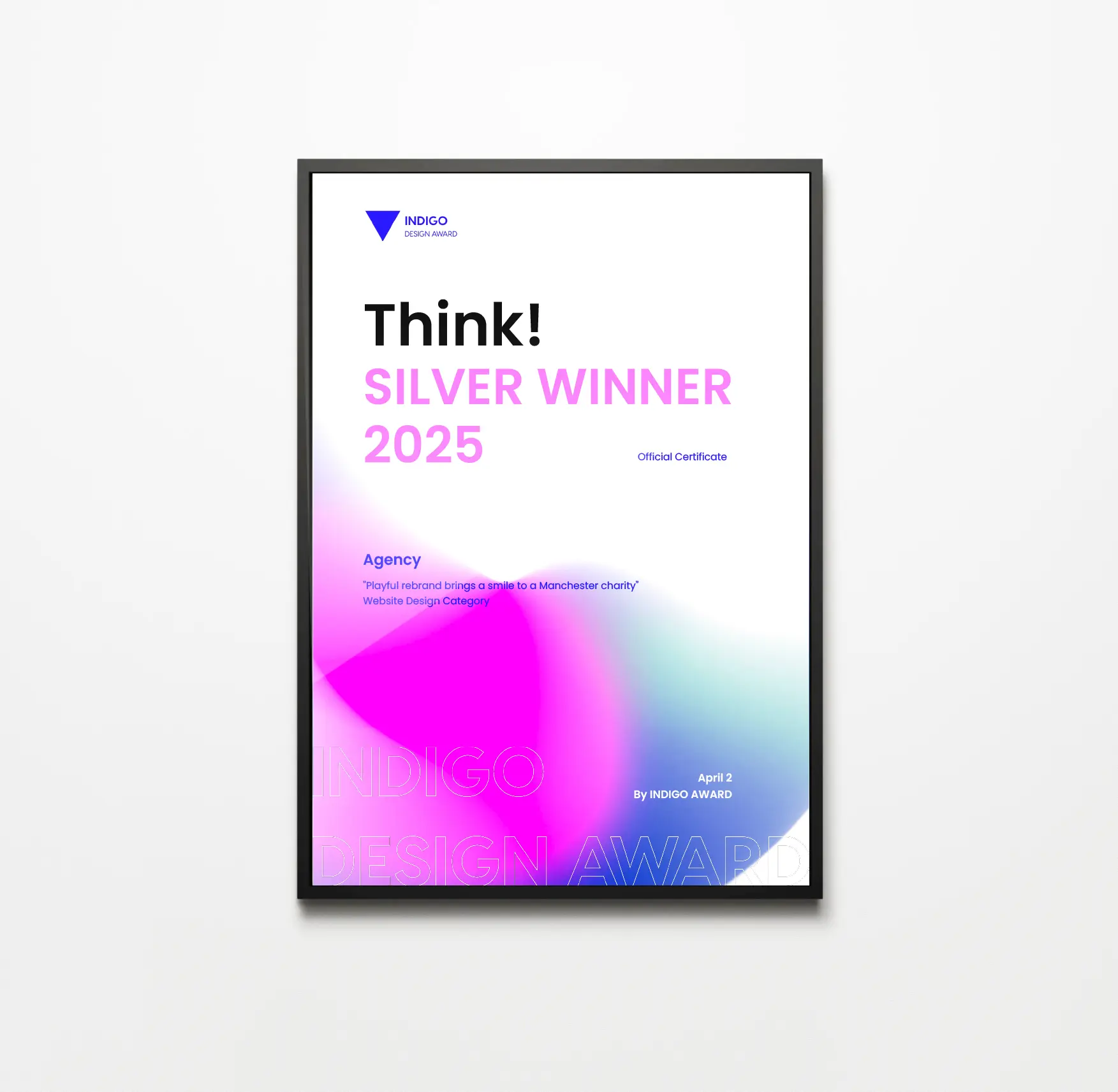
- Silver Winner in Website Design
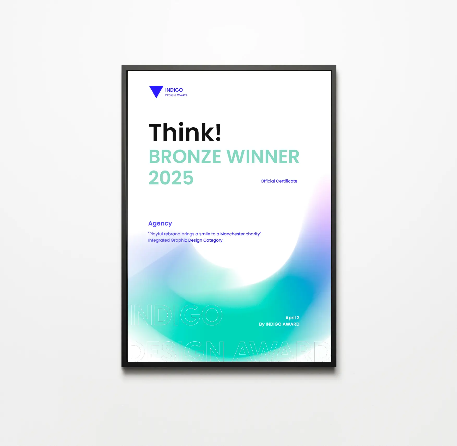
- Bronze Winner in Integrated Graphic Design for Graphic Design
Wood Street Mission received two:
- Bronze Winner in Branding for NGO & Non-Profit
- Bronze Winner in Branding for Graphic Design
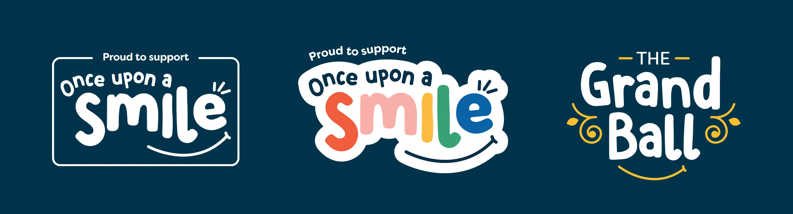
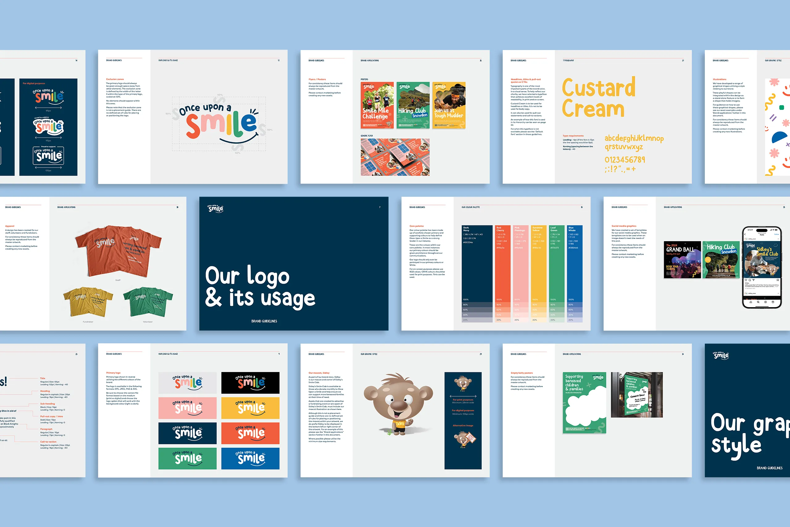
Once upon a smile
Once Upon a Smile, founded by Daniel Jillings and Danny Miller, provides emotional and practical support to bereaved families, filling a critical gap in Greater Manchester as the region’s only dedicated children’s bereavement organisation. The charity operates out of Sidley House, a vibrant support centre tailored to children’s needs.
Key updates included:
Logo redesign: Friendlier typefaces and accessible design to resonate with the audience.
Brand identity: Inspired by children’s artwork, playful illustrations and an expanded colour palette were introduced.
Website Overhaul: Improved user experience through wireframes, fun graphics, animations, and streamlined navigation.
Beyond the website, we extended the new brand across various assets, including social media templates, newsletters, annual reports, event materials, and fundraising collateral. The rebrand culminated in integrating the Grand Ball fundraising event under the updated identity.
The revamped website and branding launched on February 20, 2025, receiving enthusiastic praise from the charity’s founders. This transformative project ensures that families seeking support during difficult times can access resources effortlessly while reflecting the warmth and hope central to Once Upon a Smile’s mission.
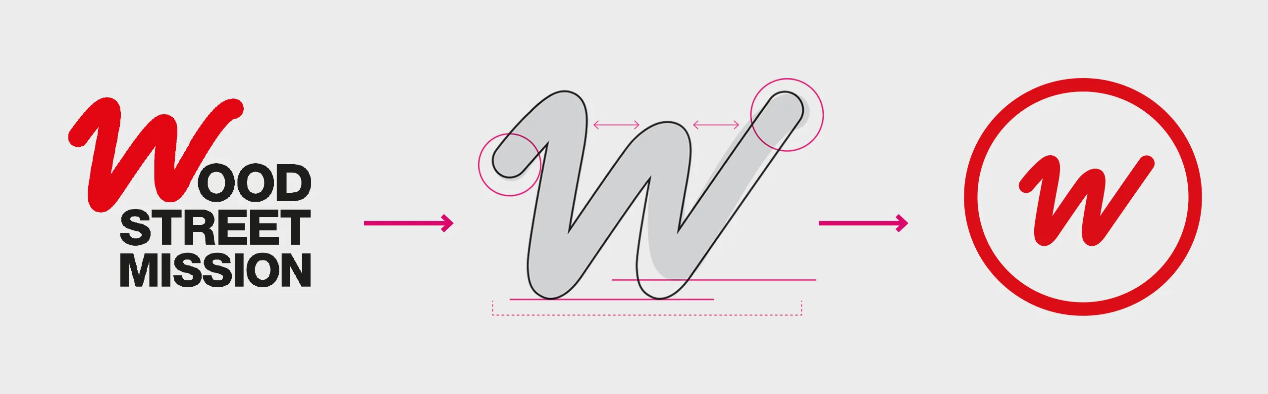
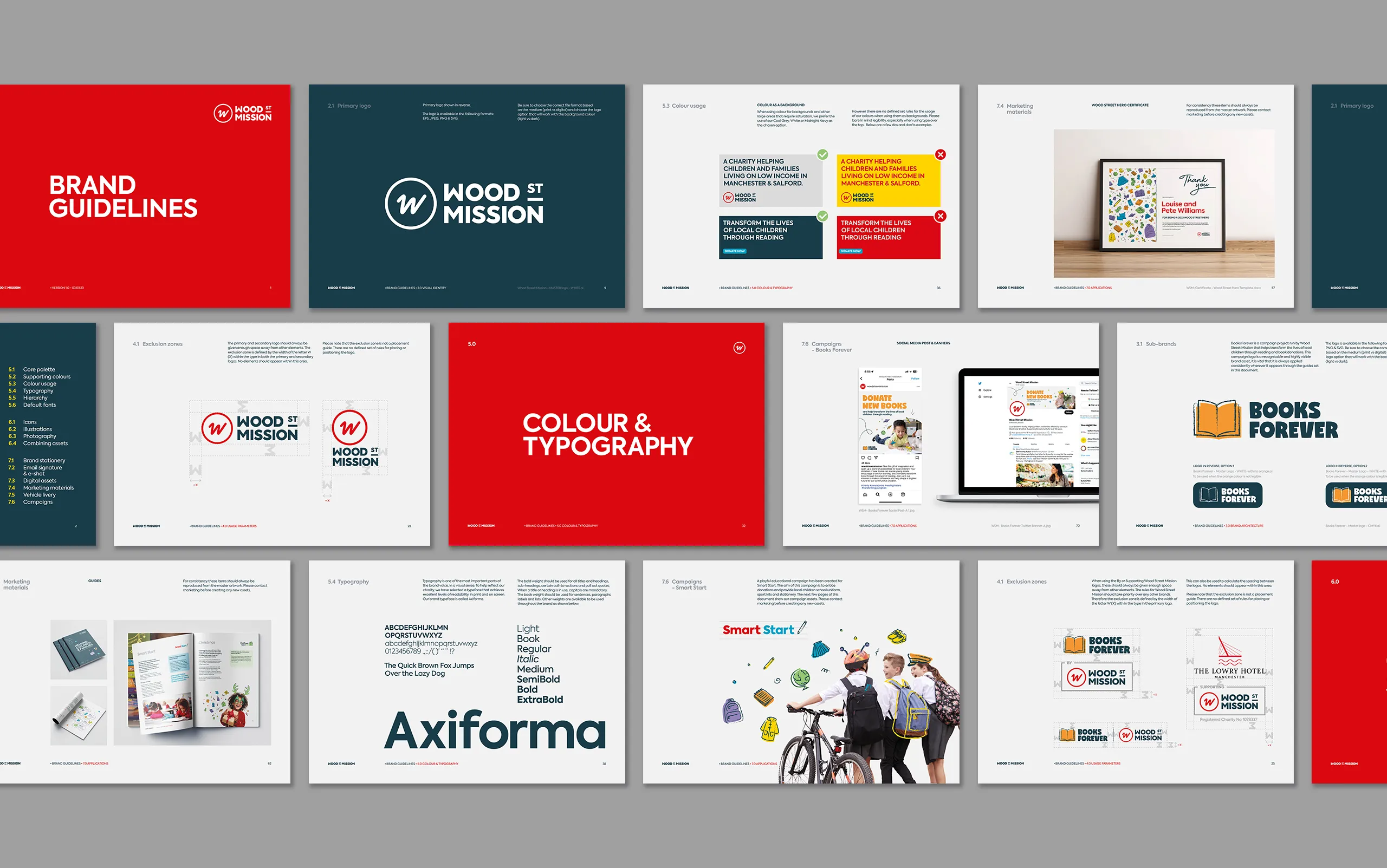
Wood Street Mission
For over 150 years, Wood Street Mission has been a lifeline for families in need across Manchester. Our goal was to help amplify their mission, ensuring they can continue to support local communities for years to come. Through our collaboration, we revamped their branding and marketing collateral. We focussed on modernising their presence while staying true to their roots.
Key updates included:
- A a set of rules and styles for the Wood Street Mission brand
- The second part being the campaign brand style
A key aspect of the rebrand was to create a set of campaign sub-brands that were distinctly different, that visually linked to what they were, without them looking inconsistent.
The theory being that they would become more easily recognised as Wood Street Mission campaigns.
The quality of our execution is evident in the seamless integration of our brands across the various channels. From social to the website, campaign marketing collateral and vehicle livery.
This has helped to consistently deliver engaging content in line with the new branding, and effectively communicates their mission and impact.