Here at Think, we have been busy rolling out a brand style that could be from the 1990s. Granted that is our opinion, but it did start to make us think.
Some graphic design projects do date as styles drift in and out of design trends. Other styles should really stay put (in our honest opinion). Others design styles stay current or just continue to look cool.
The agency, The Attik was a great example of creating new styles that even now look fab – some 20 or more years on.
So when our Creative Director, Paul found a number of old graphic design projects from branding, catalogues and brochures to direct mails, we thought we should share them.
Why not we thought? Great graphic design shouldn’t date.
Ok, rewind to 2006. Paul worked as Senior Designer at Fathom Creative, based on Ducie Street in Manchester. DMM were a client. DMM International are a North Wales based climbing equipment company. The only climbing equipment business in the UK who design and manufacture here.
The brief came in to design their annual catalogue.
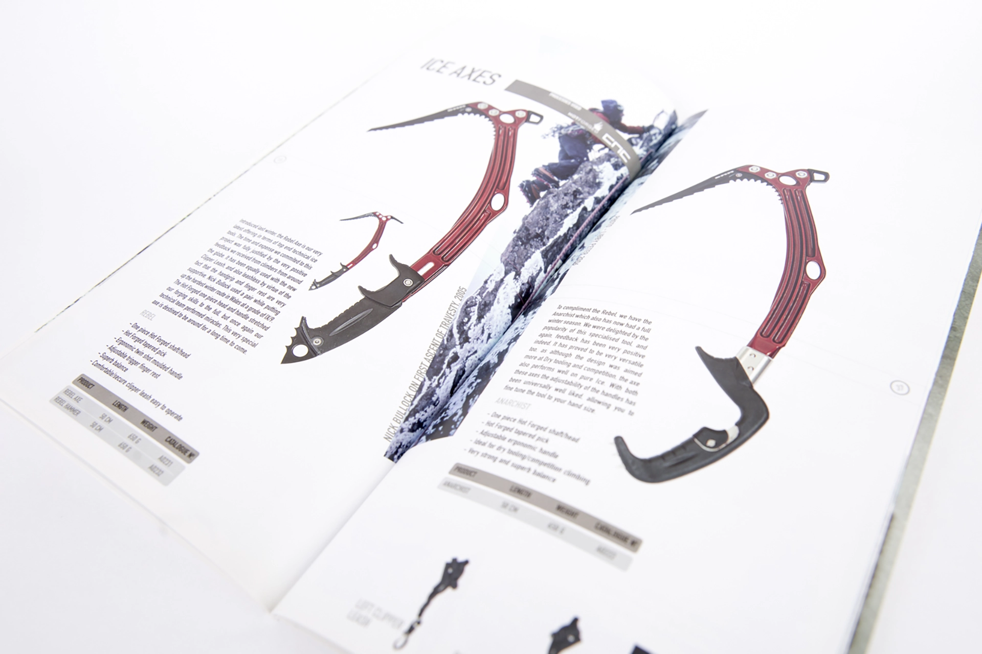
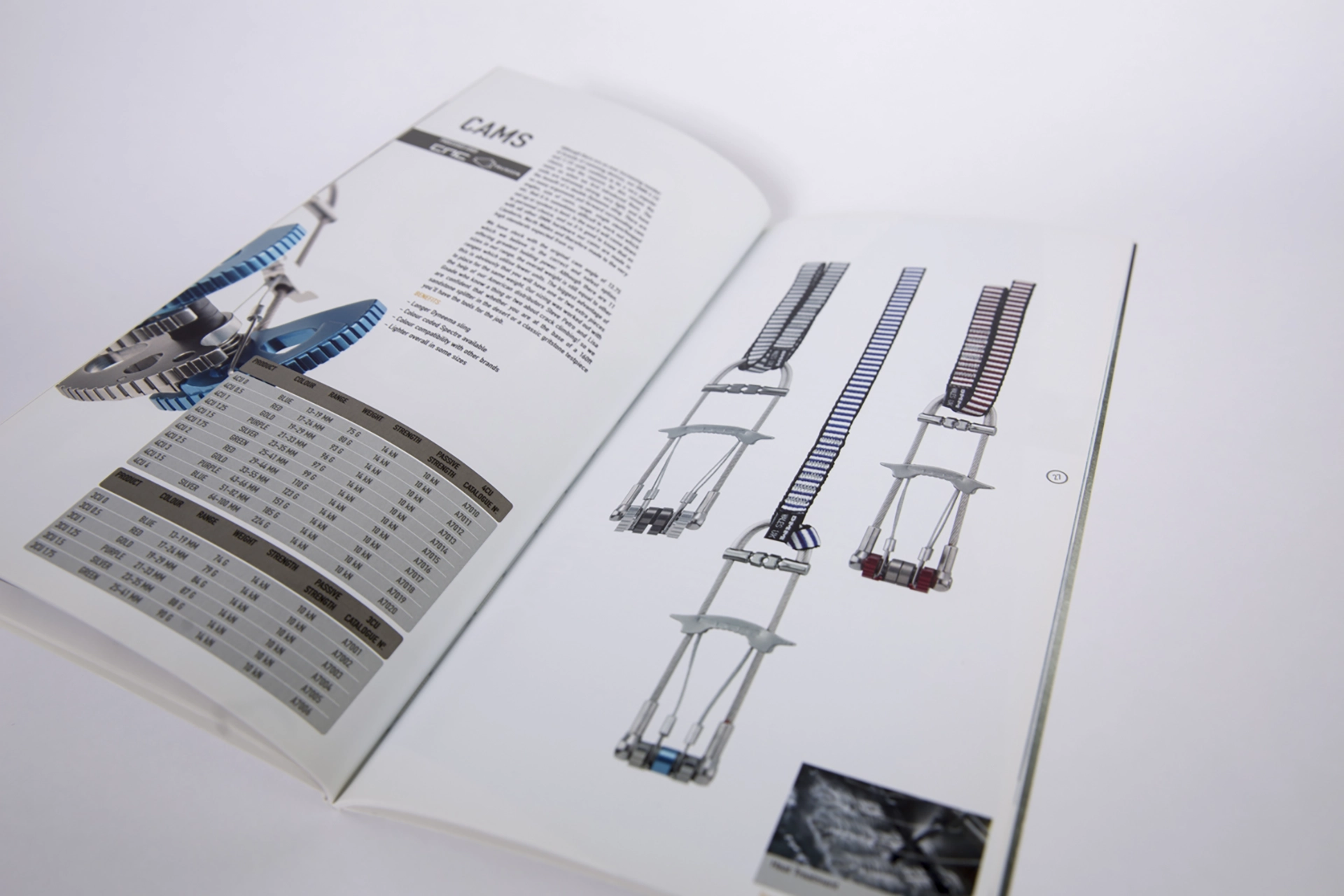
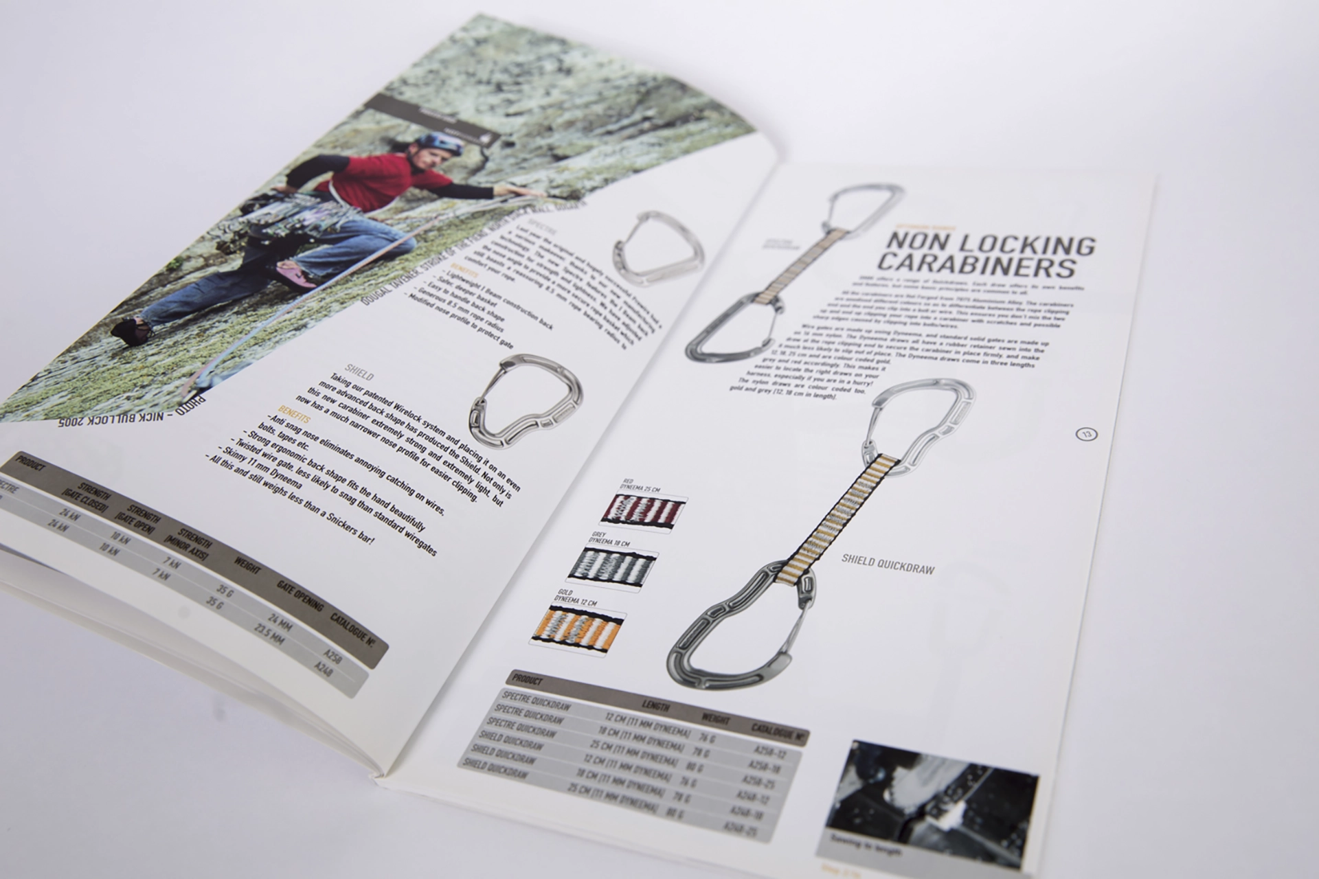
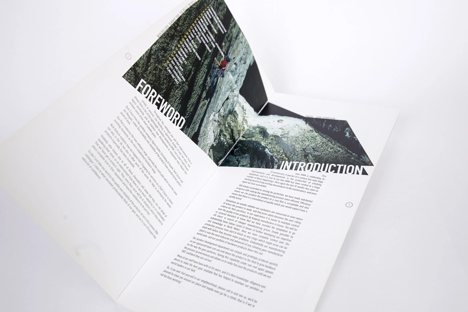
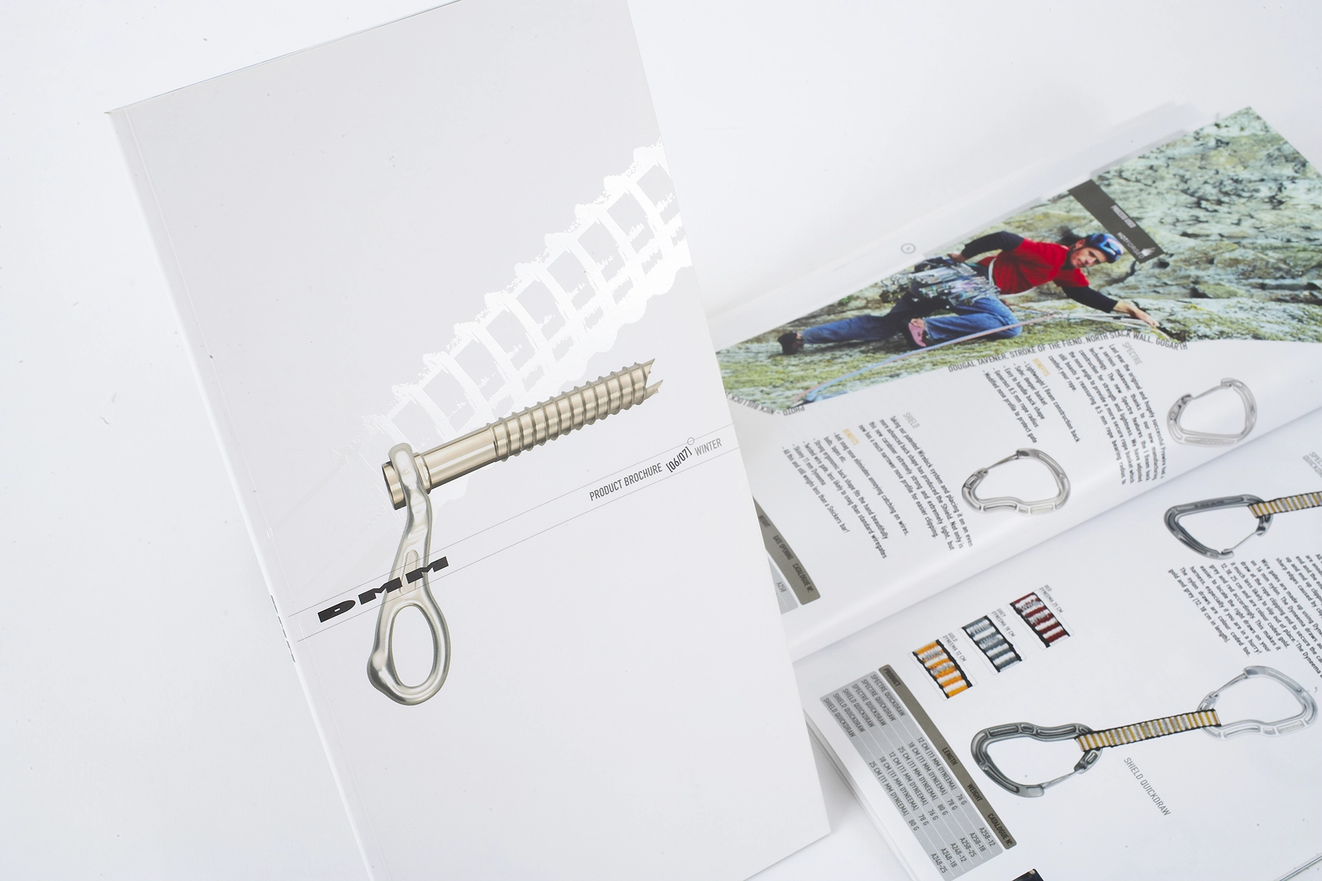
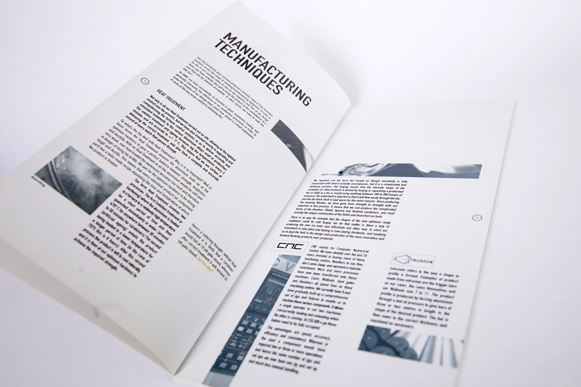
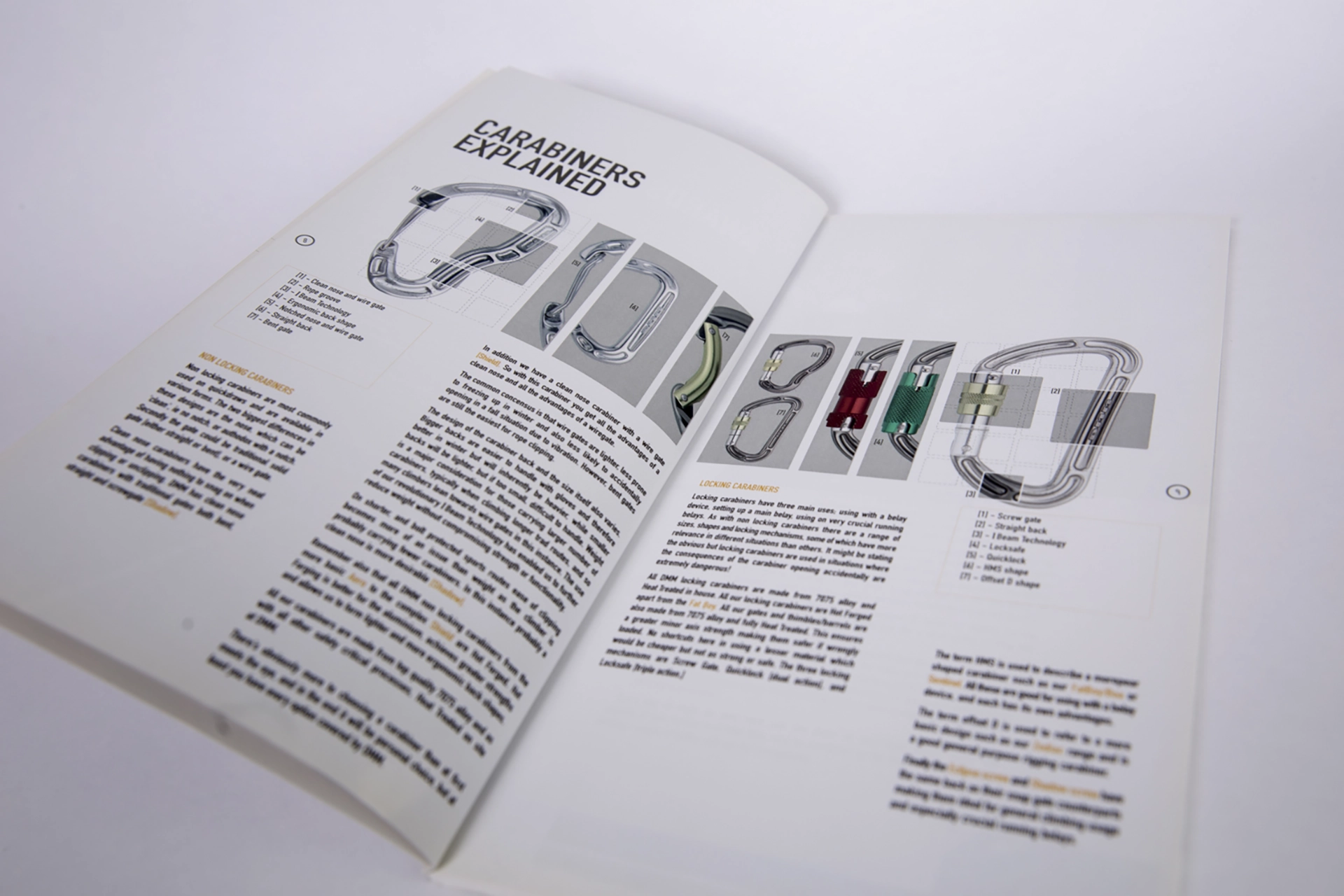
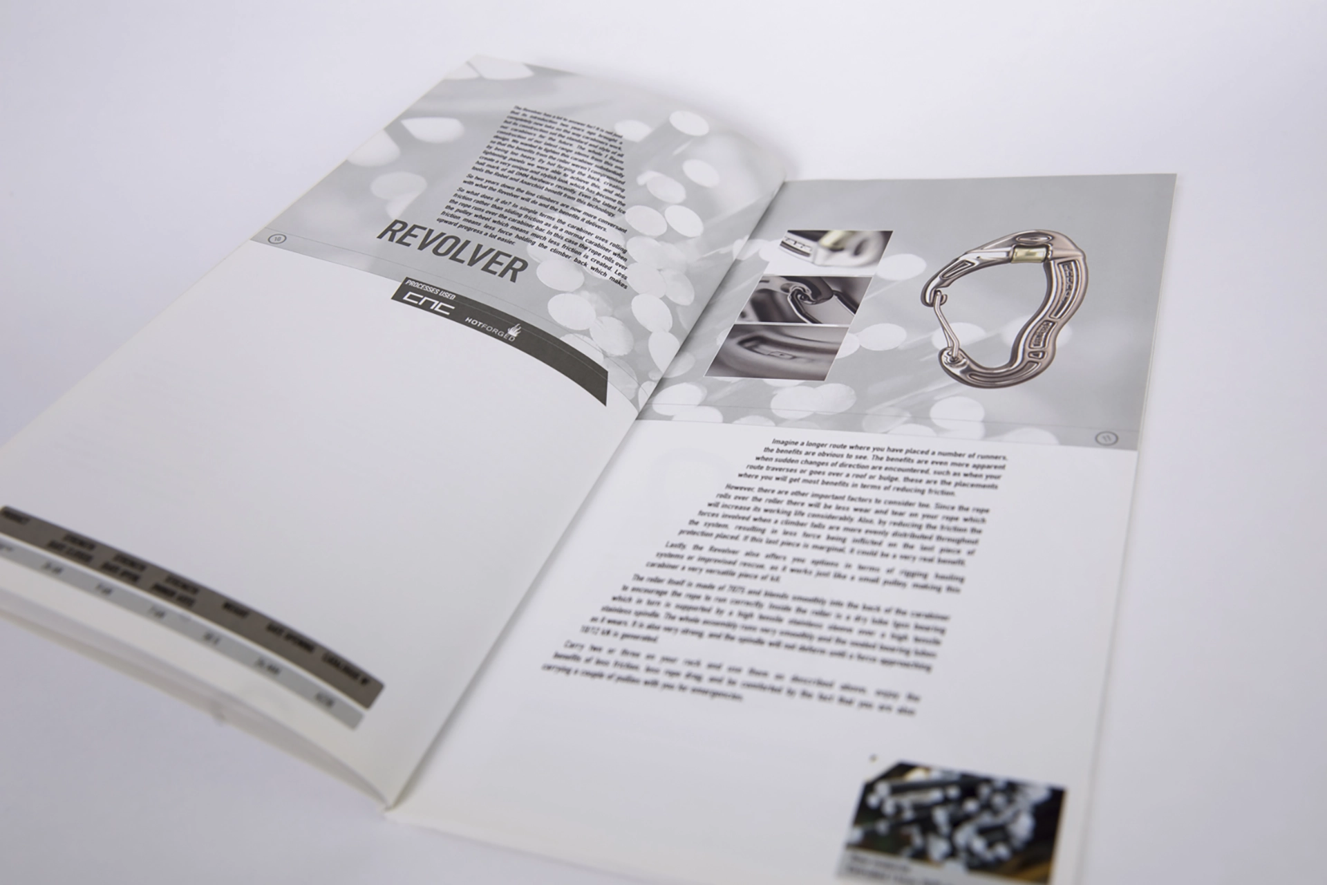
The creative concept was to visualise the idea of climbing routes throughout the catalogue. Angling text boxes, typography and creative droppings of the images all designed to reinforce this idea. The finishing touch was the spot UV of a carabiner on the front cover to add a bit of grit to the polished design. The design used Din Engschrift throughout to add a degree of contemporary design.
A perfect bound, printed 4 colour process and an unusual format all added to the quality. The design still looks current and we think, rather fab.
We hope you do too.
