The modernisation of a 25 year old brand identity
Sunnybank Plastering
Sunnybank Plastering
Located in Whitefield, Bury, Sunnybank Plastering are a family run business that are specialists in Plastering, Dry Lining and Metal Partitions & Ceilings for business to business.
The brief was that they were looking for a new brand identity, brand guidelines for application on corporate stationery, PPE, signage and livery) and a professional looking website to showcase their work.
Most of Sunnybank Plastering’s leads come through referrals and reputation. There are no significant growth plans at this stage. They recognised that, for a business of their scale, it was important to have a professional offline and online presence. It would add validation for any future enquiry, potentially creating new opportunities to support a future pipeline for their business.
They had no online presence at all and a logo that had been created 20 years ago. It was time to see what we could do after our client, Manchester Brick Specialists had referred us.
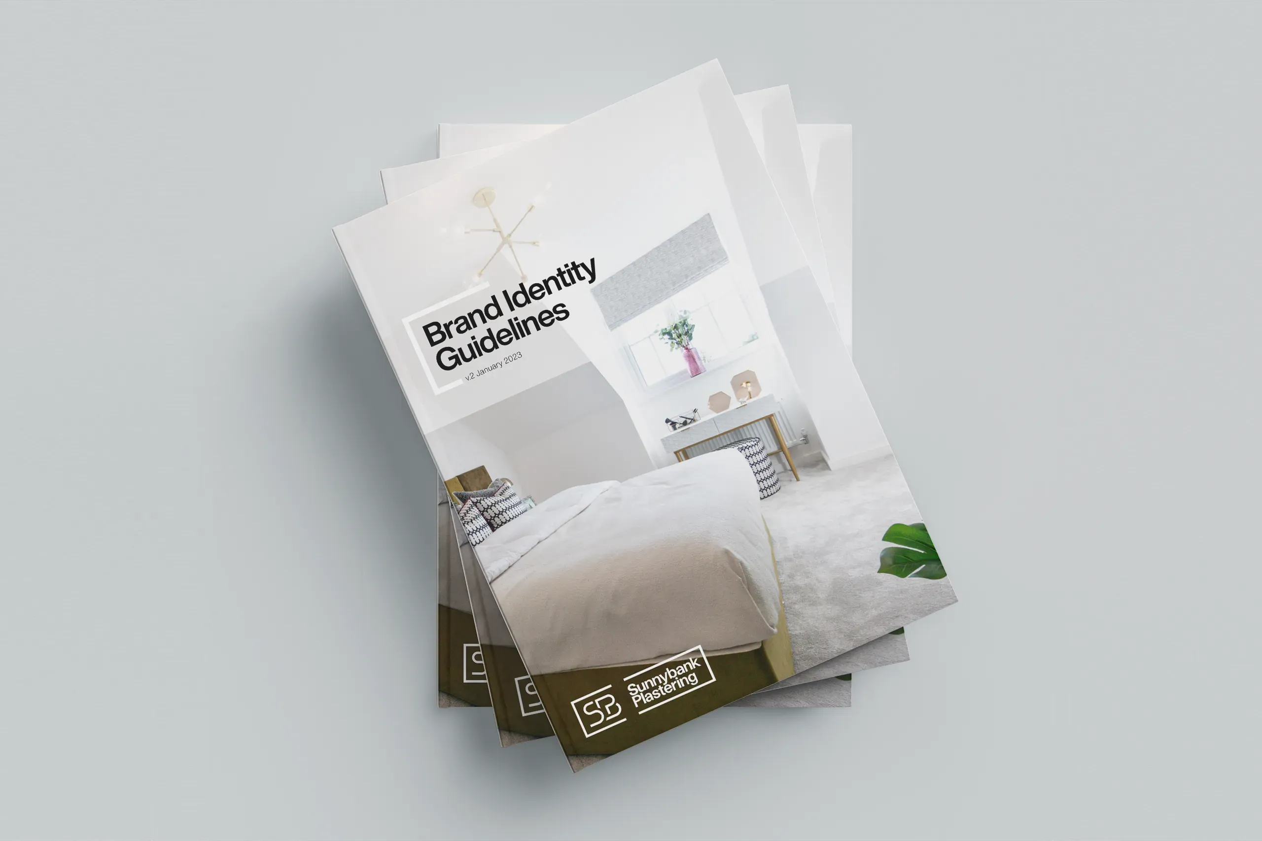
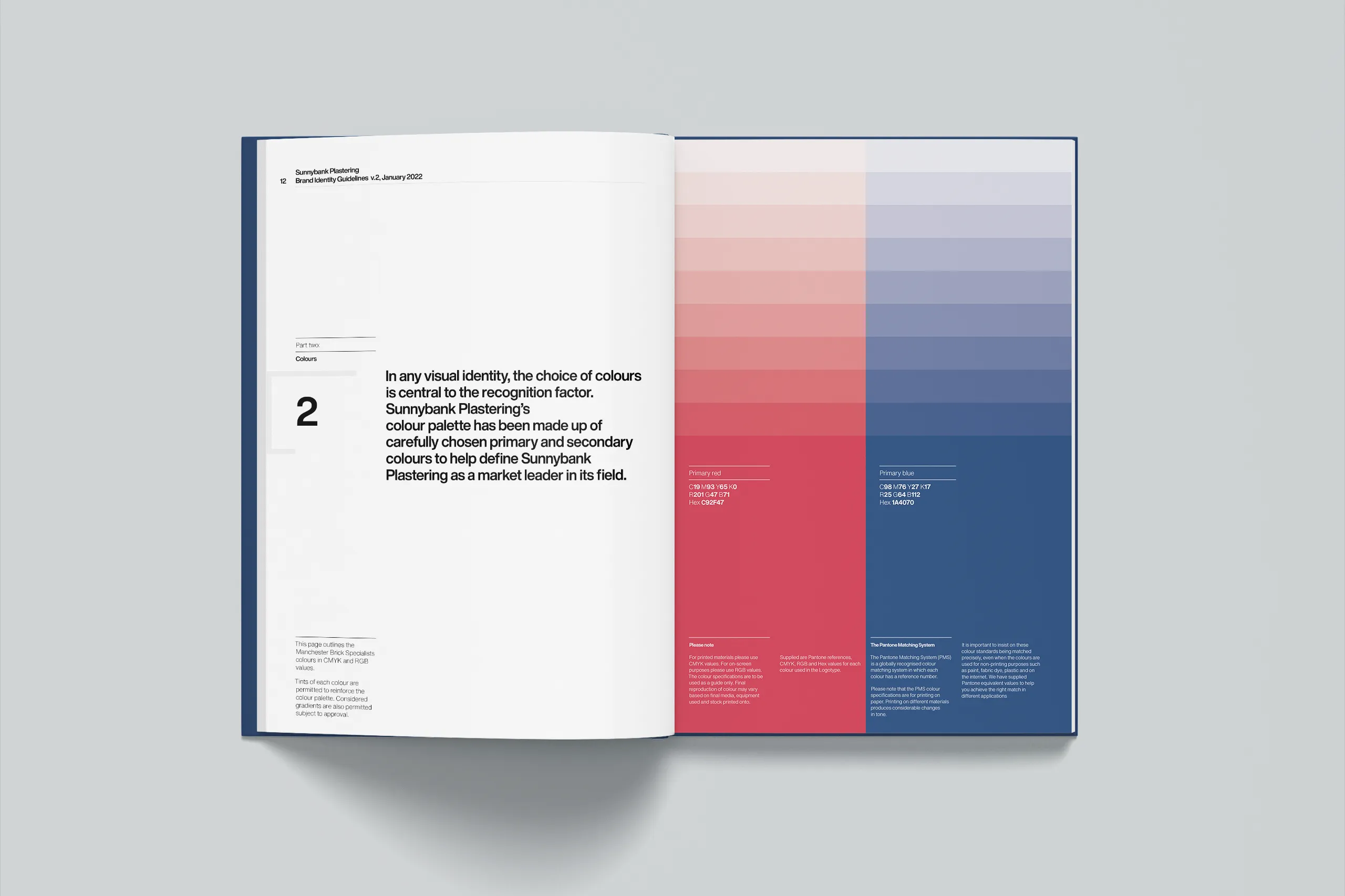
We love working with small businesses, particularly family-run businesses, such as our own. There is often a real sense of engagement with the process. This is because you work closely with the key stakeholders – the owners.
However, this does come with its own set of challenges though. The big one in the case of SP was convincing their father, the founder, that it was time for a change. Once this particular hurdle had been overcome we were able to get started. The only caveat being we need to retain the red and blue colour scheme.
Since a brand strategy was not required alongside the growth plan for SP, we were able to proceed directly with the creative design process.
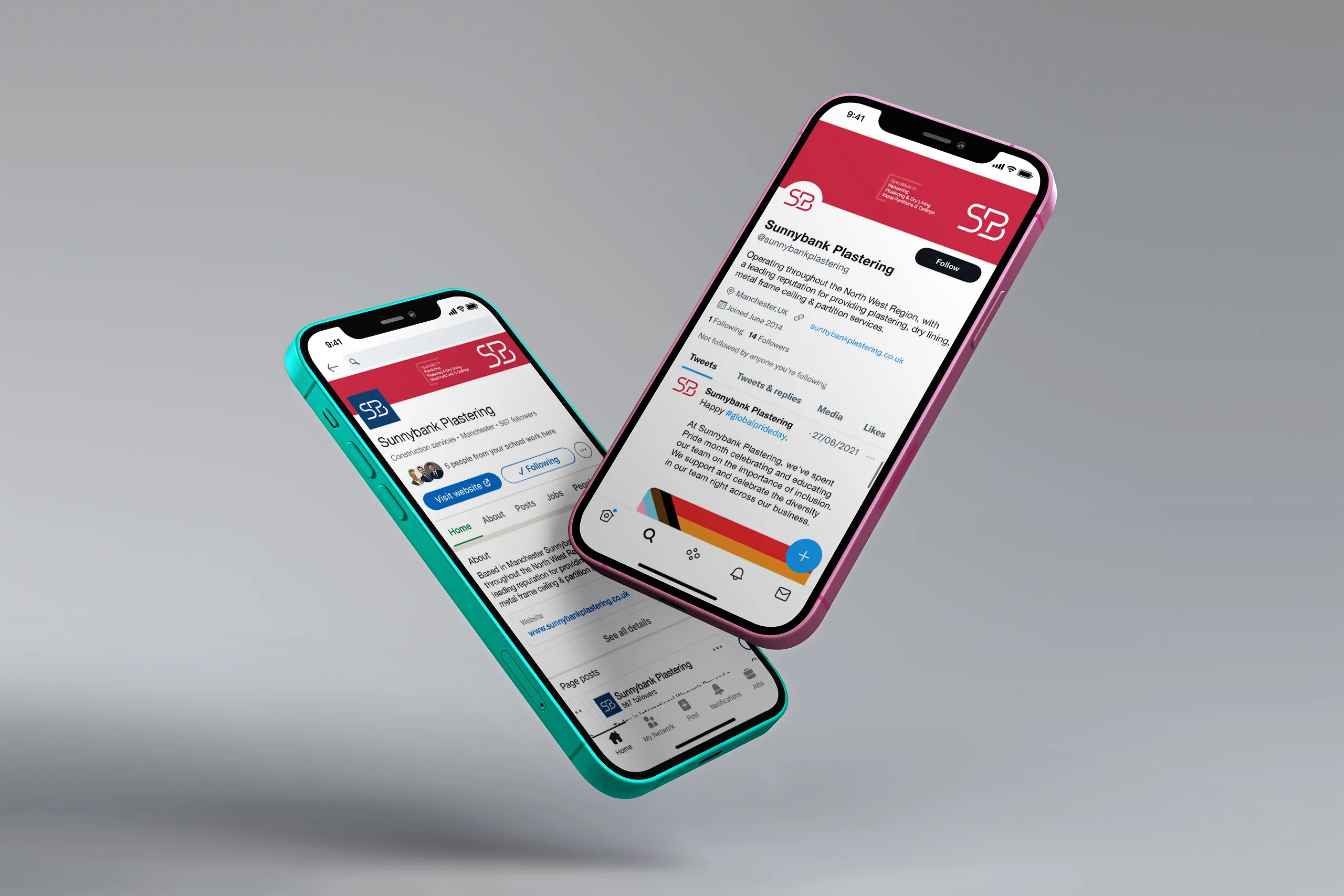
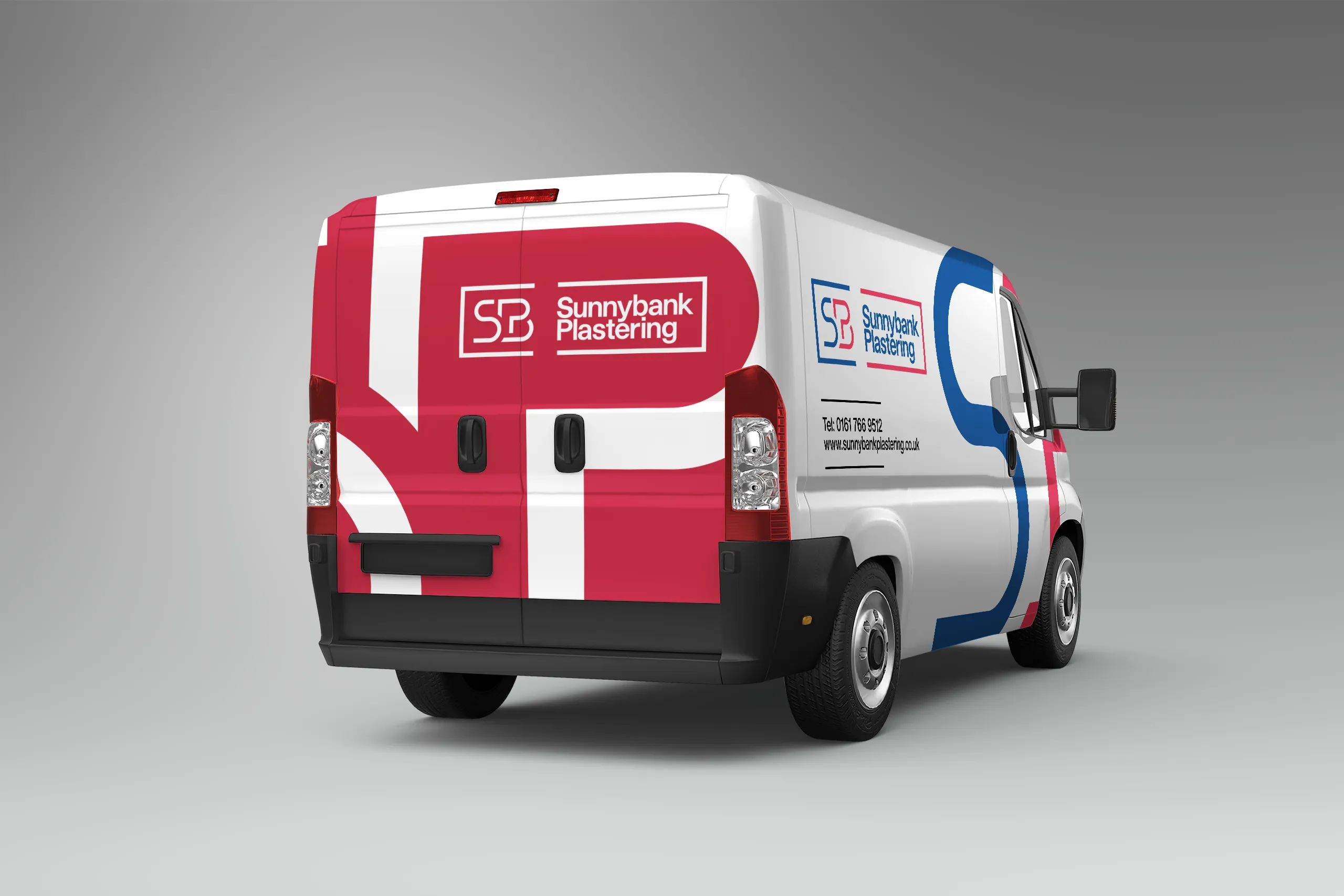
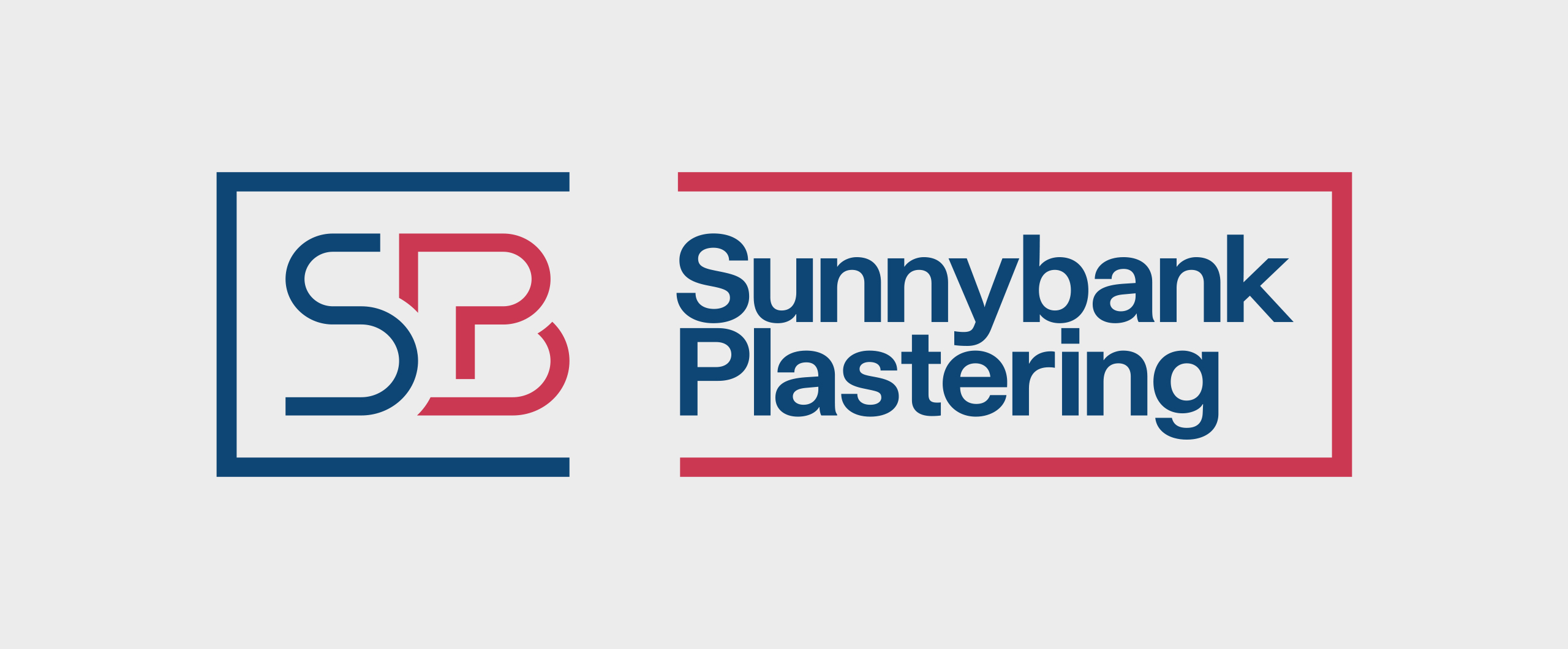
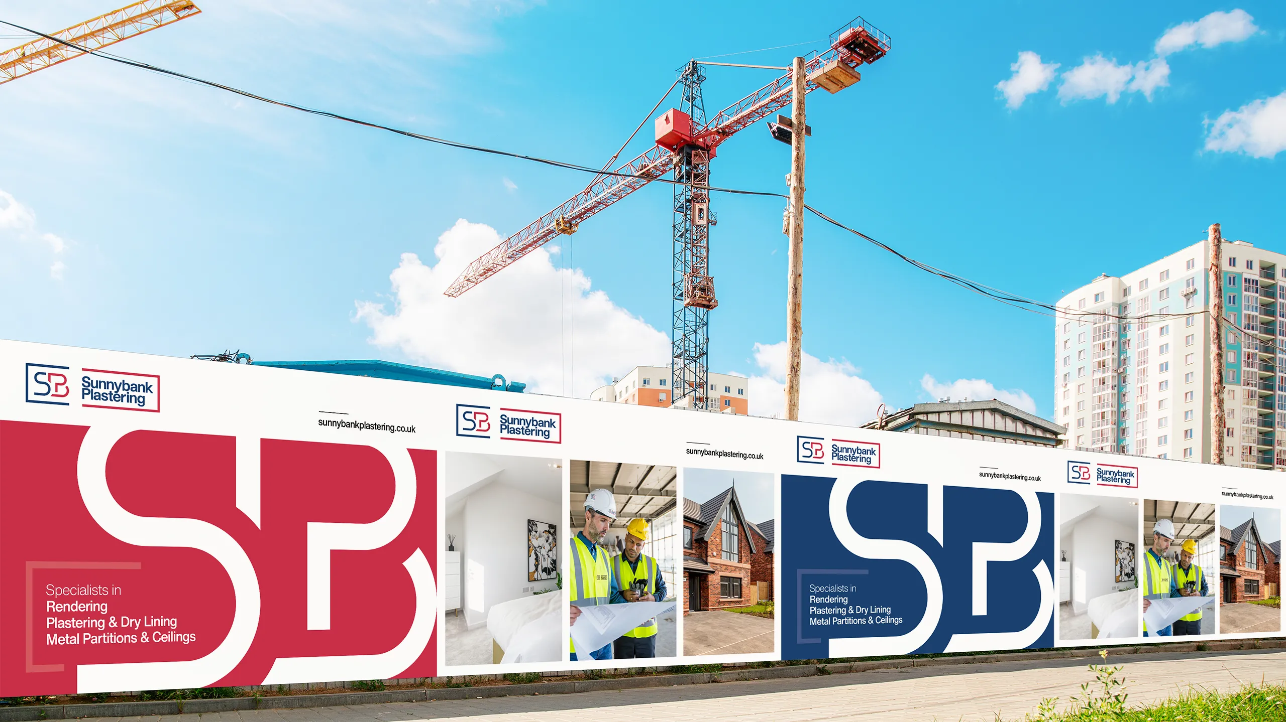
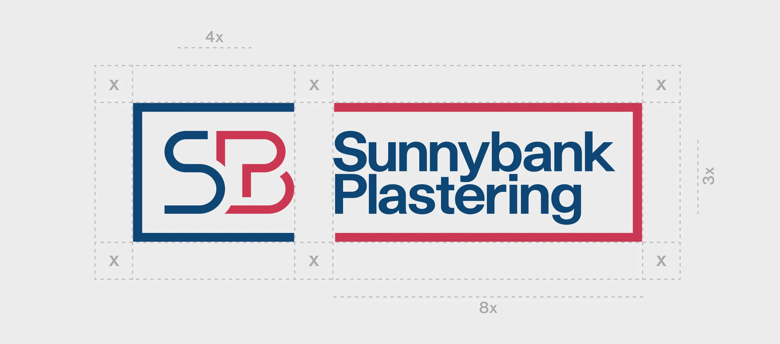
The business was presented with several design options, with the final concept drawing inspiration from a floor plan—a widely recognised visual reference within the industry. A monogram was developed using the company’s initials, which was then expanded across the brand guidelines and applied to construction site hoarding, signage, vehicle livery, corporate stationery and the website.
The website has just launched but they have been using the new brand for a year. In a project like this, the key element for us is if the client has fallen in love with the new brand.
