A rebrand to reflect Korniche’s engineering excellence
Korniche
Korniche

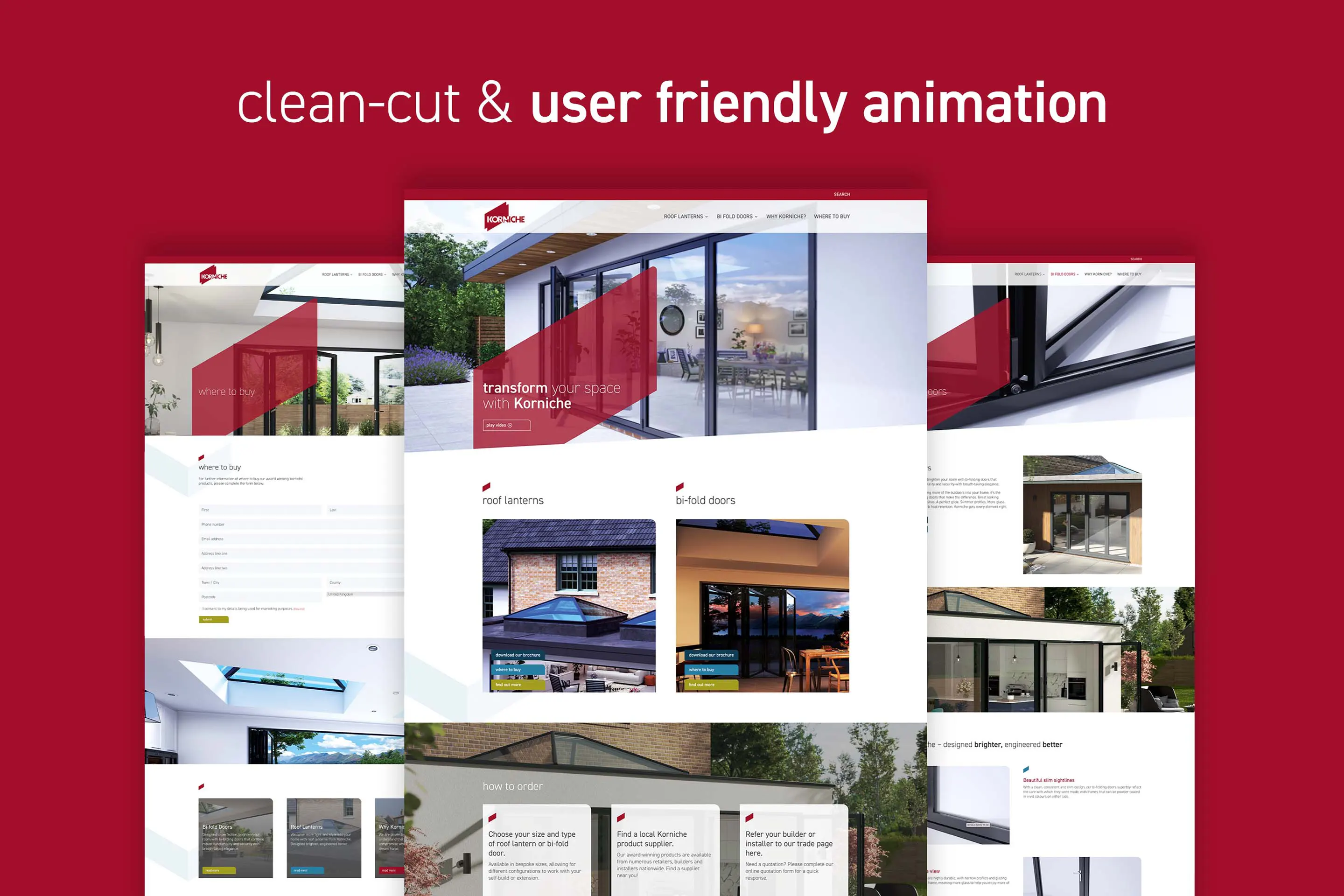
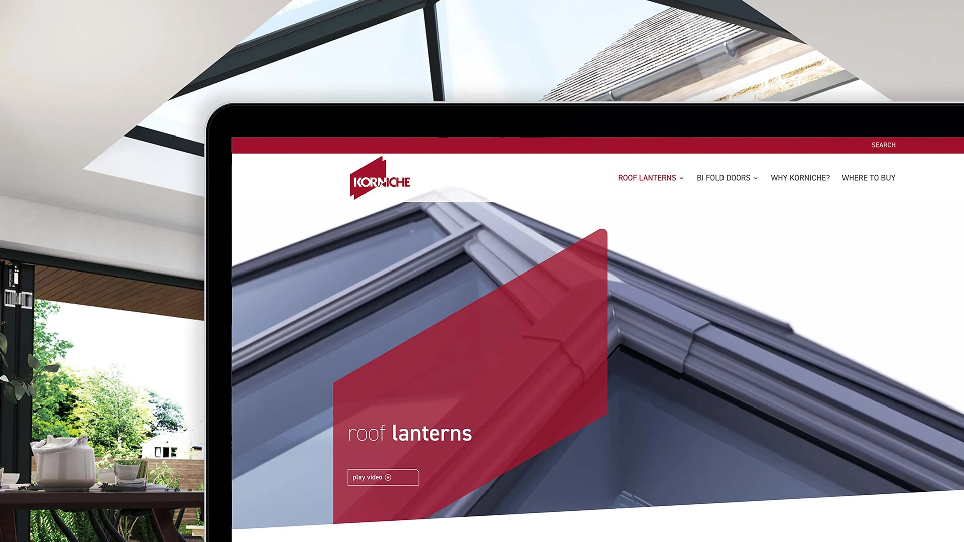
Made for Trade, home of the Korniche roof lantern, originally approached Think to develop a new website and produce some slick CGI walkthroughs of their product range, the roof lantern and upcoming new product launch, their aluminium bifold doors system.
The Korniche roof lantern is widely regarded as the best in the industry, by trades and consumers alike, due to the high quality engineering and attention to detail. After our initial meeting, Think suggested that in order for the website and CGI to be effective in showcasing their products and improve brand perception, we needed to redesign the brand to support its position as the industry leader and communicate precision engineering.
Working with the Korniche team to understand their target audience and the product USPs, we developed a new brand positioning and consumer facing strap ‘Designed Brighter.’
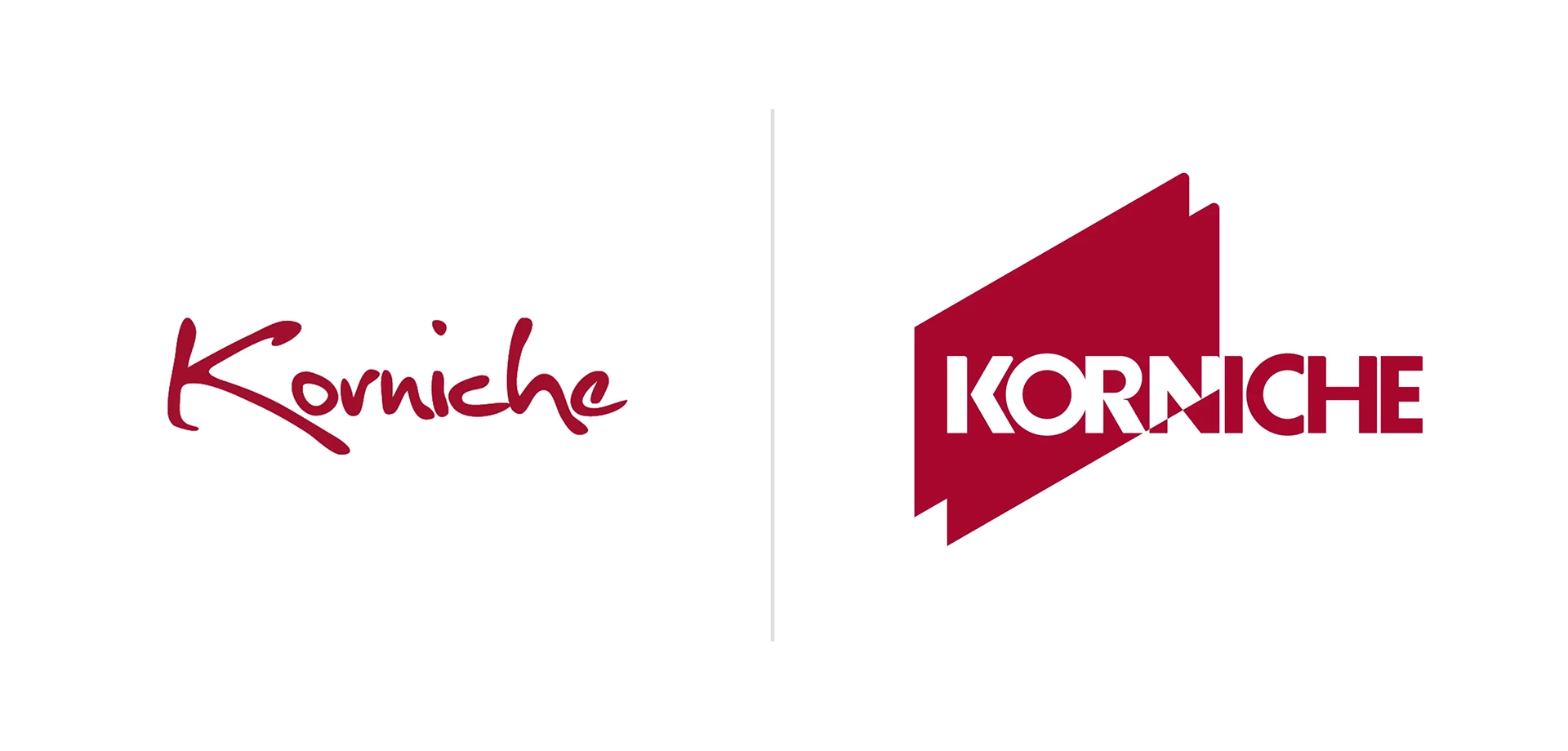
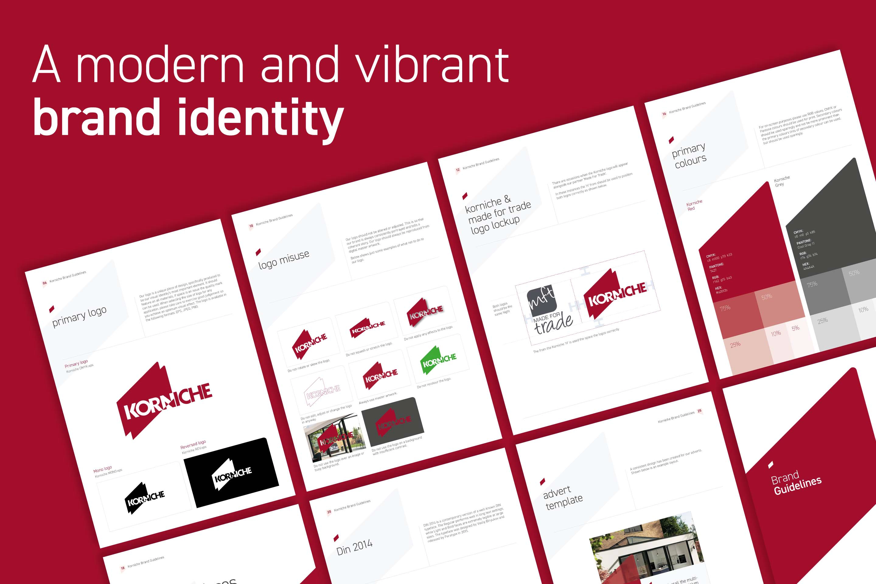
The brand identity was redesigned using the the profile of an aluminium frame, straightened and simplified to create a wireframe for engineering. This resulted in an overlapping dynamic device, implying forwarding thinking, clean lines, quality and confidence. The filled shapes of the final logo also implied double glazing.
Three CGI walkthroughs, 2 of the products and one brand journey with a high spec single story extension, were produced to showcase the products in all their glory. These animations featured as the hero on the homepage and product pages of the redesigned website. The website content and user journey was simplified to provide the right information at the right time, striking a balance between engineering detail and customer aspiration. Korniche wanted their audience to be in no doubt that their products were the best on the market and it’s their engineering prowess at the heart of this.
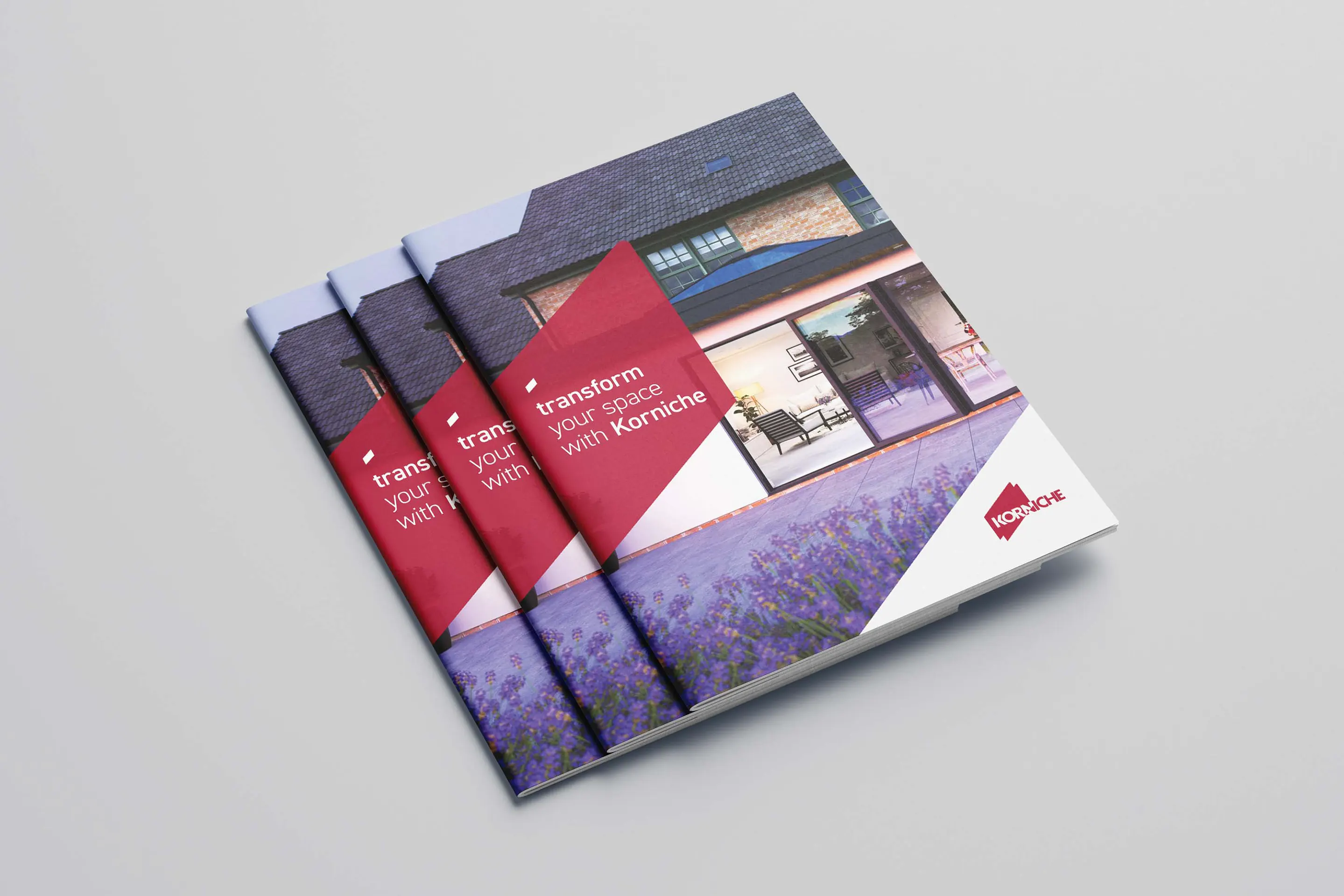
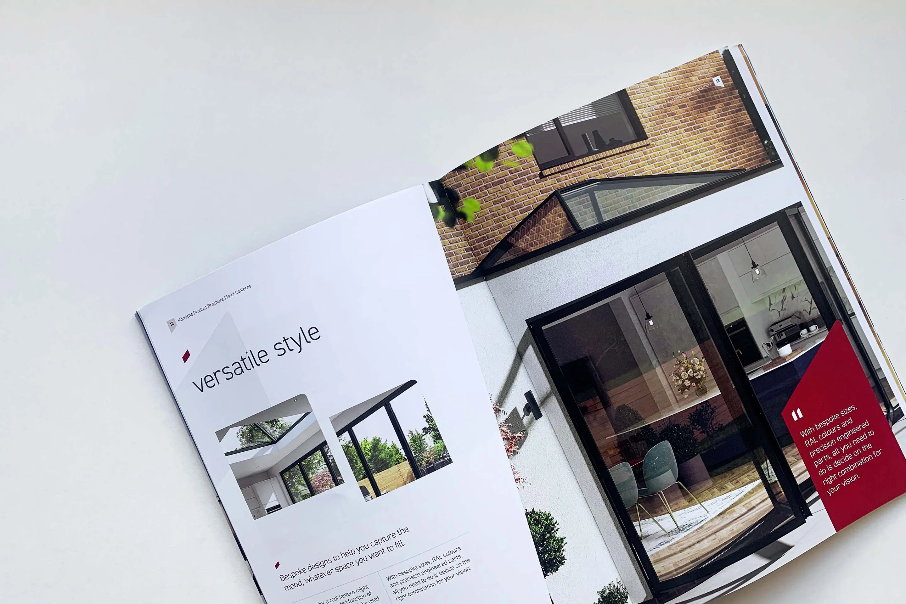
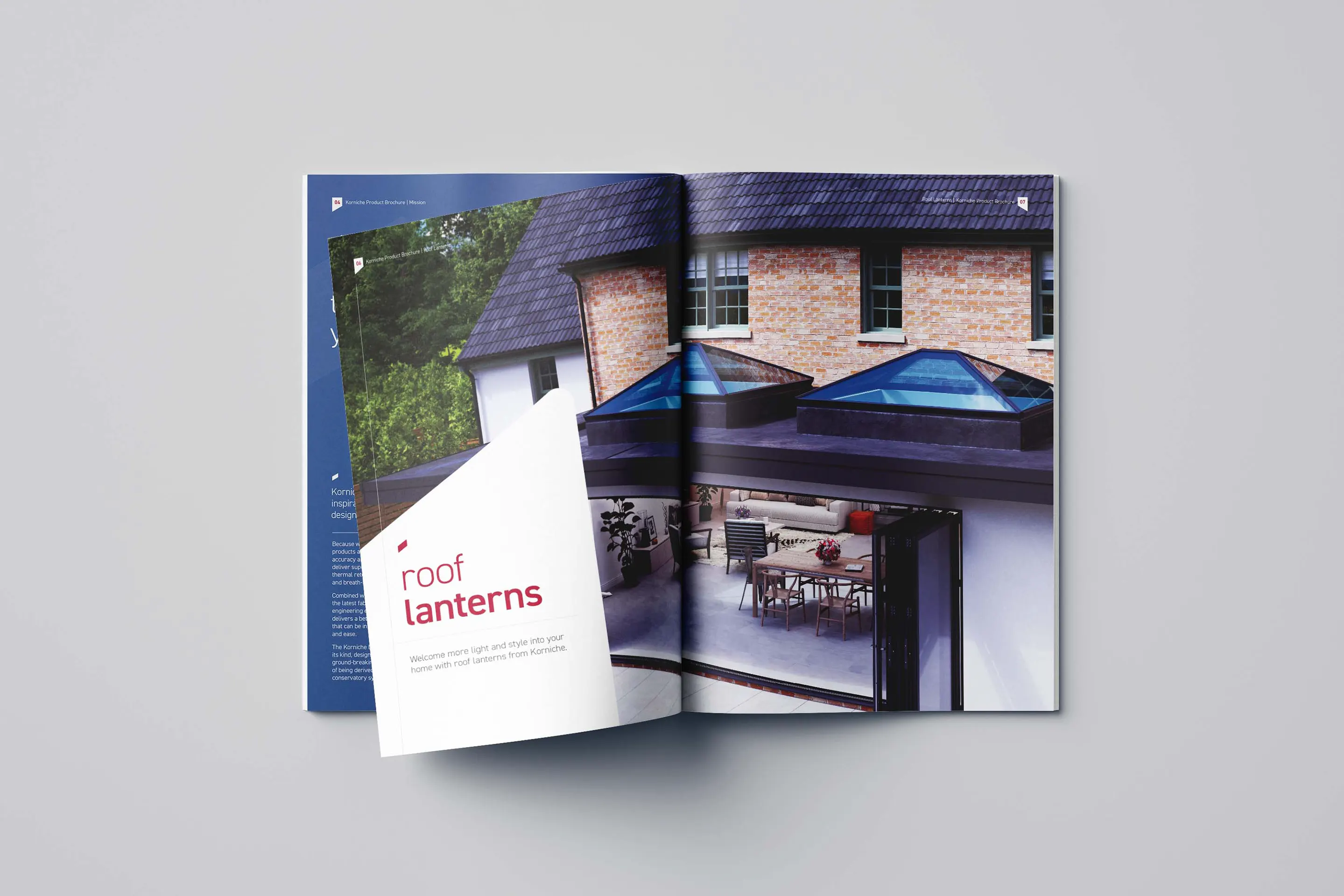
The final brand style was also rolled out to brochures and exhibition graphics for the Homebuilding & Renovating show in September 2021, with the website launched in time for the show.


The feedback at the Homebuilding & Renovating show was phenomenal with stand visitors commentating on the sleekness of the new brand design. The website has also exceeded expectations in leads generated per day. Following the success of this project, Think went on to rebrand Made for Trade.
