Keymer
A complete brand and website overhaul to reflect the premium nature of the Keymer roof tiles.
A complete brand and website overhaul to reflect the premium nature of the Keymer roof tiles.
Keymer wished to be seen as the first choice in handmade clay roof tiles.
However, their existing website had some limitations so we were approached as a website agency to explore improving the website experience.
The objective of this website project was to improve the perception of an already powerful brand and widen its reach within a younger, more tech-savvy demographic. This would establish Keymer’s prestige in a market saturated with cheaper and less authentic imports, whilst increasing its market share and volume of Keymer tiles sold.
This was against the backdrop of a very challenging supply chain, suppressing capacity and increasing pricing. Expectations needed to be carefully managed to avoid harming the brand’s reputation.
During discovery, we suggested, as brand positioning agency, that to achieve Keymer’s objective, the brand proposition should be explored to understand whether the existing brand identity could actually achieve this.


We approached this project using our 3 step process:
1. Immersion and persona development – What we already know / review on existing Keymer marketing ambition/what do our audience thinks.
2. Brand strategy – How do we need to position ourselves in the market? We achieved this through a workshop that explored cultural, audience, competitor and brand insights to shape the development of the brand.
3. Brand identity and communications – How will our visual language change to support this? Development on new branding informed by the brand strategy. How does the new brand impact the look and feel of our channels and content?
Keymer has a rich history with people at its heart; it’s about craft, care and quality.
The brand builds trust through both its enviable credentials and partners and provides dedicated expert support on every project. It is authentic, British, considered, and understands the needs of architects, homeowners and developers through communications, product development, the buying process and CPD. It’s a brand that moves with the times; both with the source of its products and the types of buildings they bring to life. Proximity to the raw material, coupled with the handmade processes, means that Keymer’s carbon footprint is minimised.
A trusted and considered brand with progress at its heart; Keymer’s team of passionate, caring and technically brilliant experts are what makes the brand truly unique.
Culture Insights
We’re seeing a return to nature, greater emphasis on provenance and rise in eco-conscious choices in high-end buildings.
Audience insights
Architects
“There’s the top 5% of the marketplace, obsessed with materials and how we interpret traditional building techniques and make them contemporary. It’s a very young audience, endorsed by maybe 30 or 40 of us across the UK delivering high-end architecture.”
Home owners
Increasingly, homeowners will make the final decision and it will come down to customer service – hand-holding and reassurance that this product will retain/ enhance property value etc. Home owners are fulfilling a personal vision and need a trustworthy, human partner.
There is a huge opportunity to inspire and educate the high-end home renovation audience who want the best-of-the-best to maximise the beauty and value of their home.
Competitor insights
Competitors make similar claims (British, handmade) although many lack ‘proof’ of their ‘brand story.’ This lack of transparency makes the brand’s claims questionable.
They feel either small, old-fashioned or large and also corporate. They lack that emotional connection and a personal, human touch.
Tudor is probably the closest competitor offering a cheaper alternative although they cannot match the expert support or professional image of Keymer tiles.
Competitors lack inspiration and a human touch. They remain stuck in the past and fail to convey the credibility that only Keymer can offer.
Larger manufacturers such as Marley maybe the biggest threat as they capitalise on the lack of competition in the sector. However, they can’t compete with Keymer’s USP, their heritage service.
Whilst standing out from the crowd is getting easier, this could be dangerous for Keymer. It’s in our interests for the market to be buoyant, with strong competition. To future proof the brand, it must become visually synonymous with its brand attributes, unrivalled specification services and the ultimate in high end luxury products.
The next stage was to ask the simple but challenging question, what is the brand opportunity and how do we create a brand strategy?
To significantly increase the reach and appeal of Keymer tiles, educating and inspiring both homeowners and architects on their uncompromising quality (attracting the ‘only Apple will do’ crowd) A contemporary classic.
Keymer has an opportunity to position themselves as a timeless classic and future-proof against imitation. To become the ‘Aston Martin’ of handmade roof tiles – an aspirational heritage brand that’s moving with the times. From this, we identified what we could legitimately say about Keymer tiles:
What – We lead the way in quality British handmade clay tiles.
How – We are uncompromising / We are progressive / We are authentic / We are bold.
Why – Become a catalyst for Britain’s architects to push creative boundaries. In essence, restoring and designing some of Britain’s most iconic buildings.
From this we constructed the brand proposition and brand essence.
Creating a new British history
Once we finalised the brand proposition, we audited all of Keymer’s communications to ensure alignment with this brand essence and assess how well they reflected it.
Keymer has earned a strong reputation in the industry, synonymous with exquisite craftsmanship, luxury, and top-tier quality for those in the know.
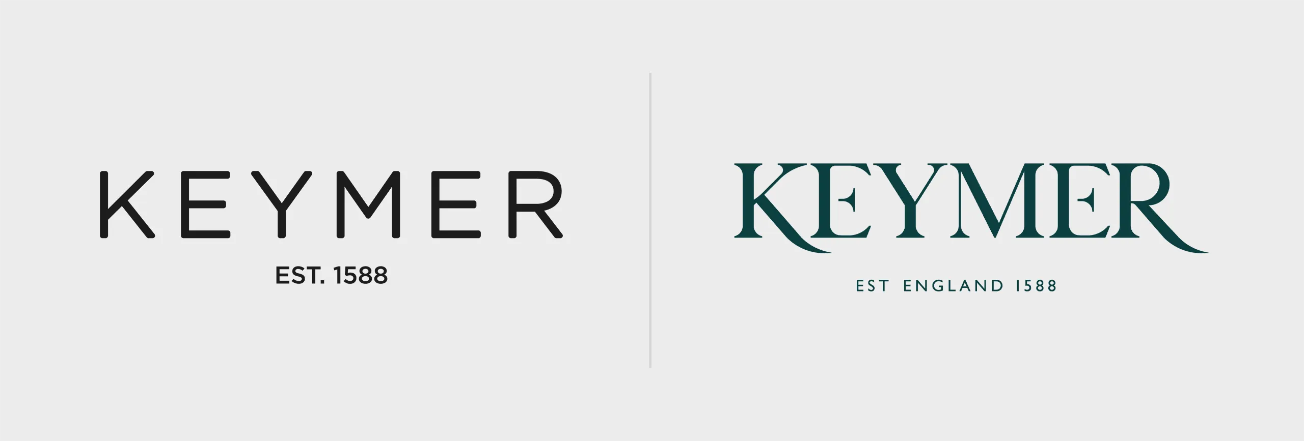
However, the visual representation of the brand didn’t fully reflect these qualities. Although the brand incorporates ‘handmade’ elements, it doesn’t convey the bold, contemporary, and premium feel expected from such a distinguished name.
We recommended creating a unique and ownable brand mark and visual language. The brand mark should reflect the same high-end, uncompromising quality and attention to detail as the product itself. This would play a key role in expanding reach and positioning the brand as synonymous with the best in the market, in the minds of consumers.
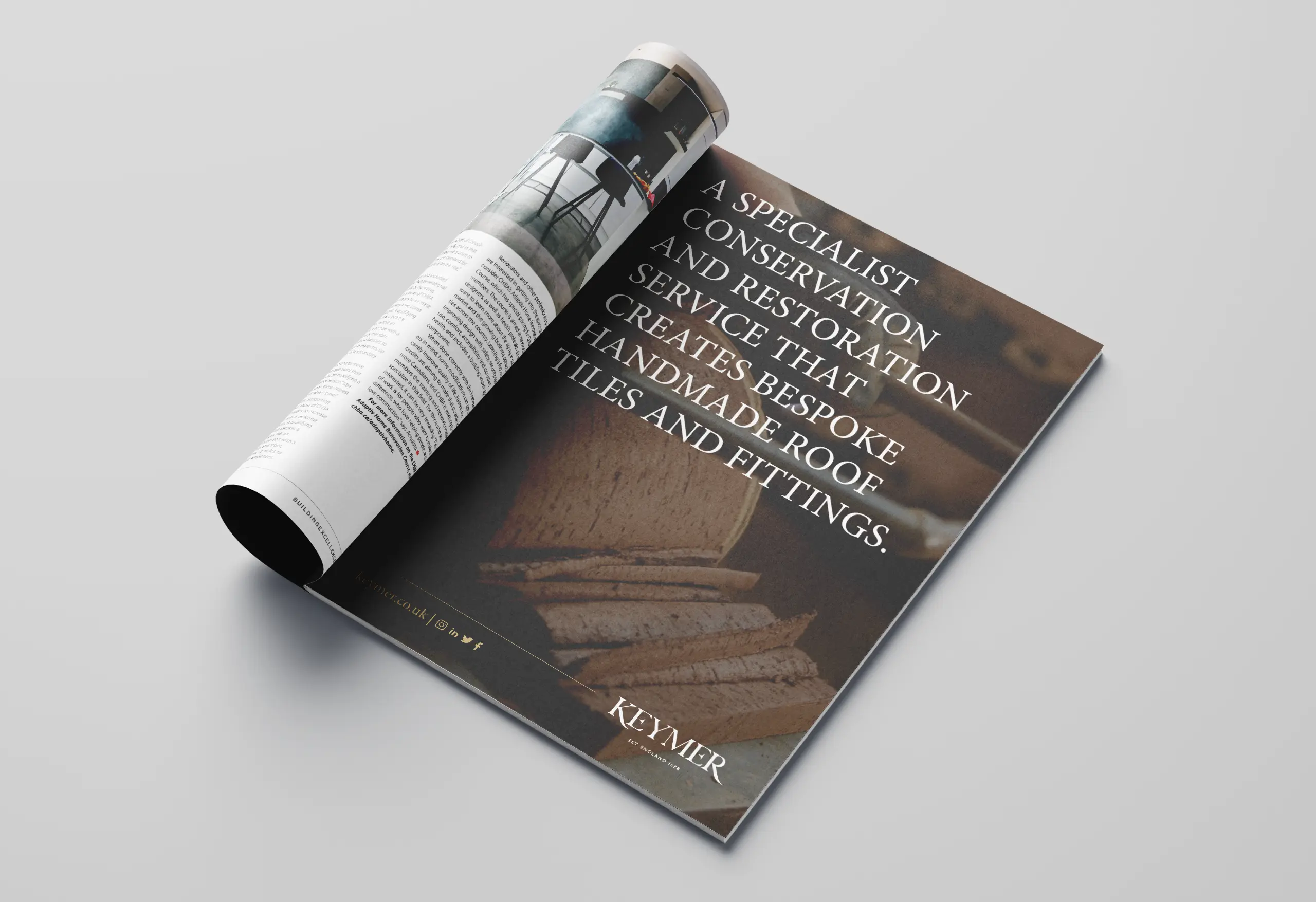
The visual execution needed to be more contemporary, communicate superior quality and be as thoughtfully designed as the products themselves.
This direction, along with the brand wheel, served as the foundation for the creative development of the brand identity.
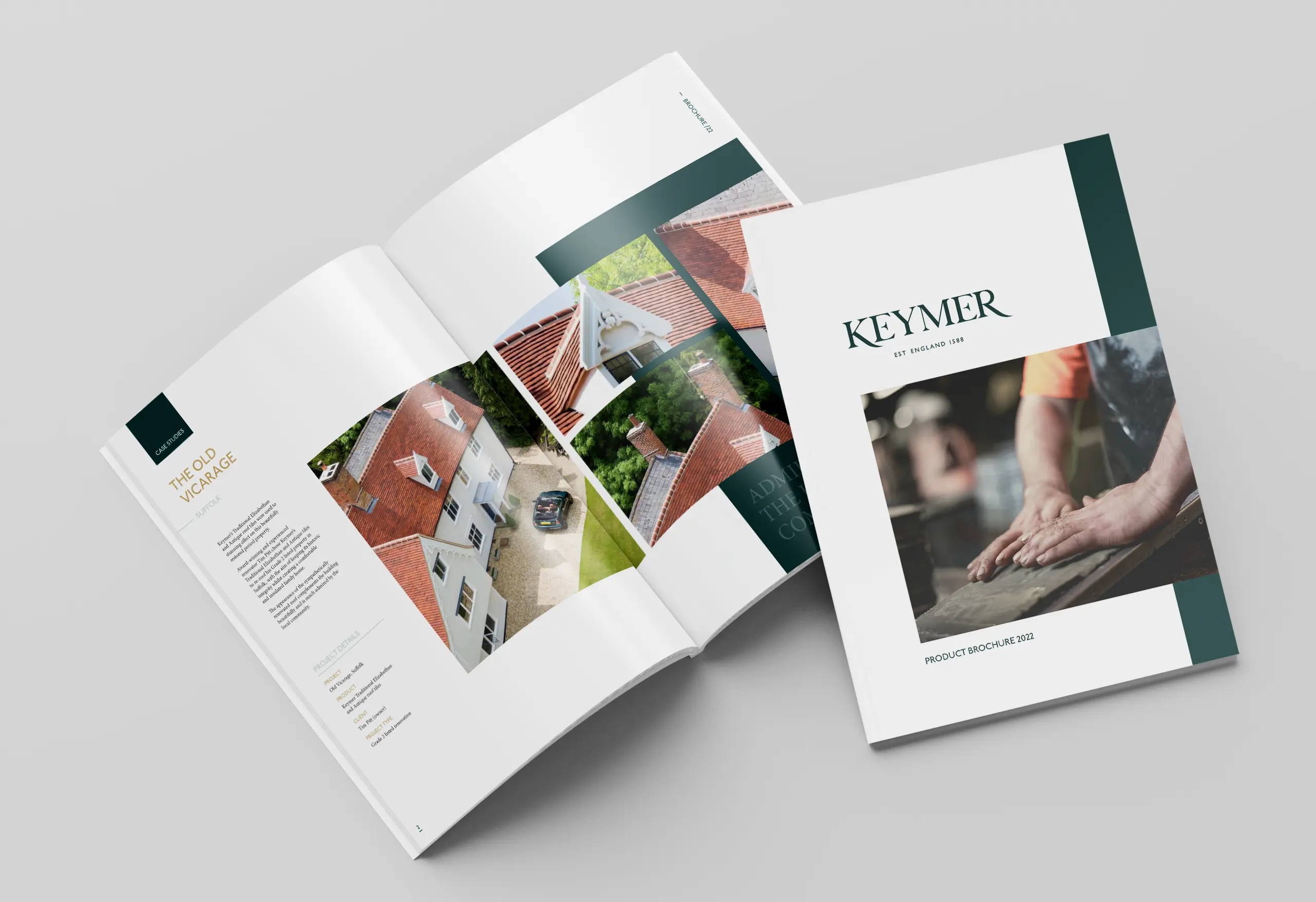
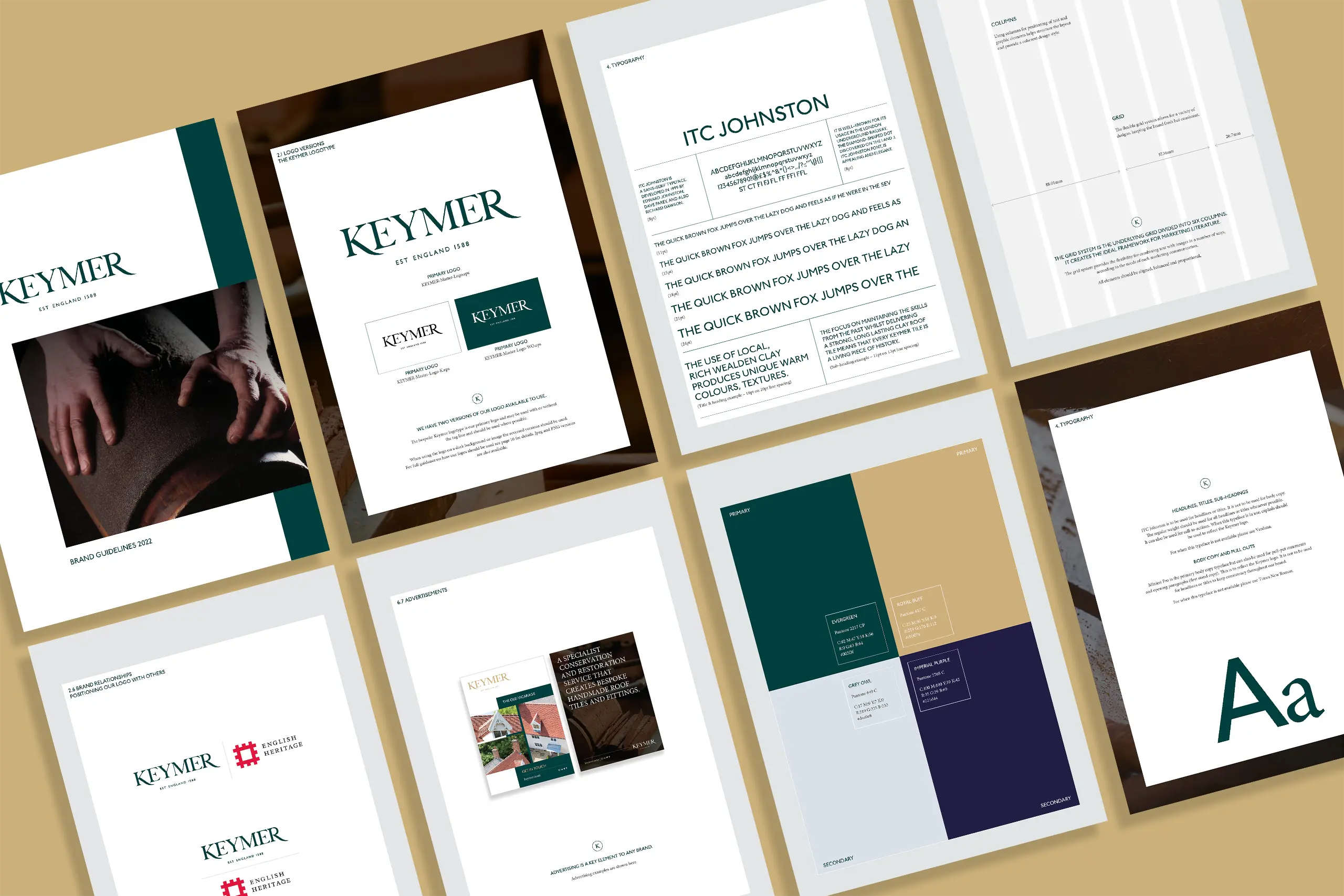
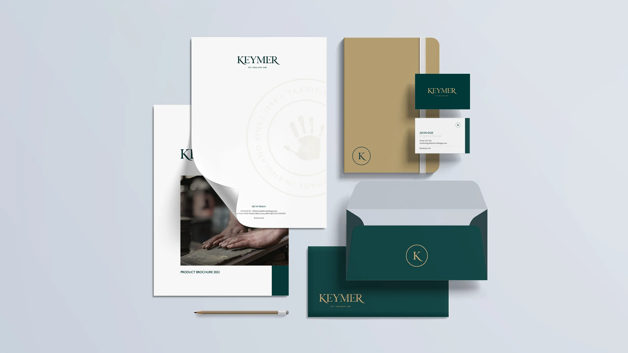
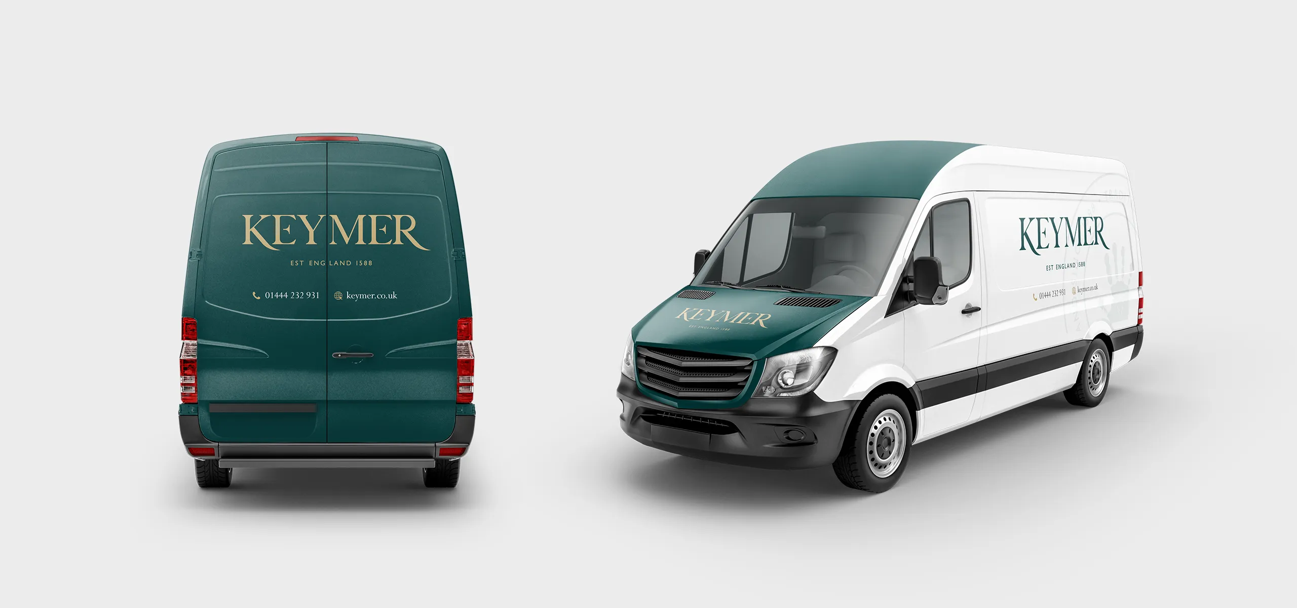
The brand
We began by proposing several designs that answered this brief, with the final chosen route having its foundations in heritage as deep as Keymer’s.
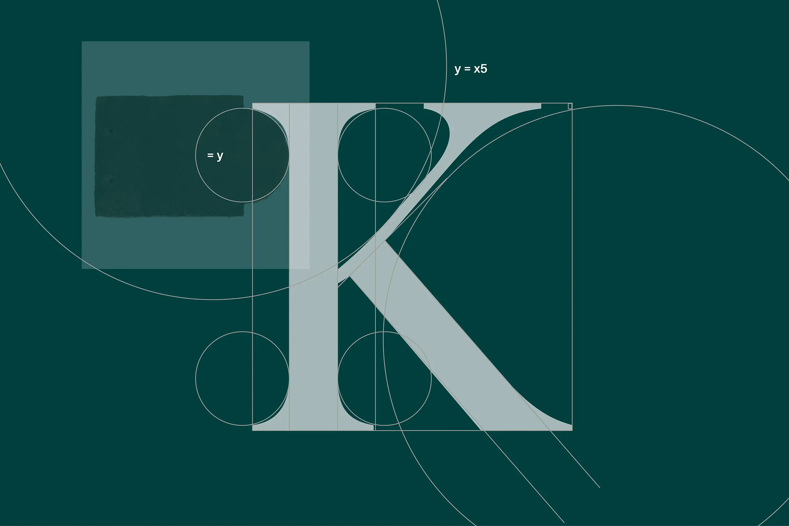
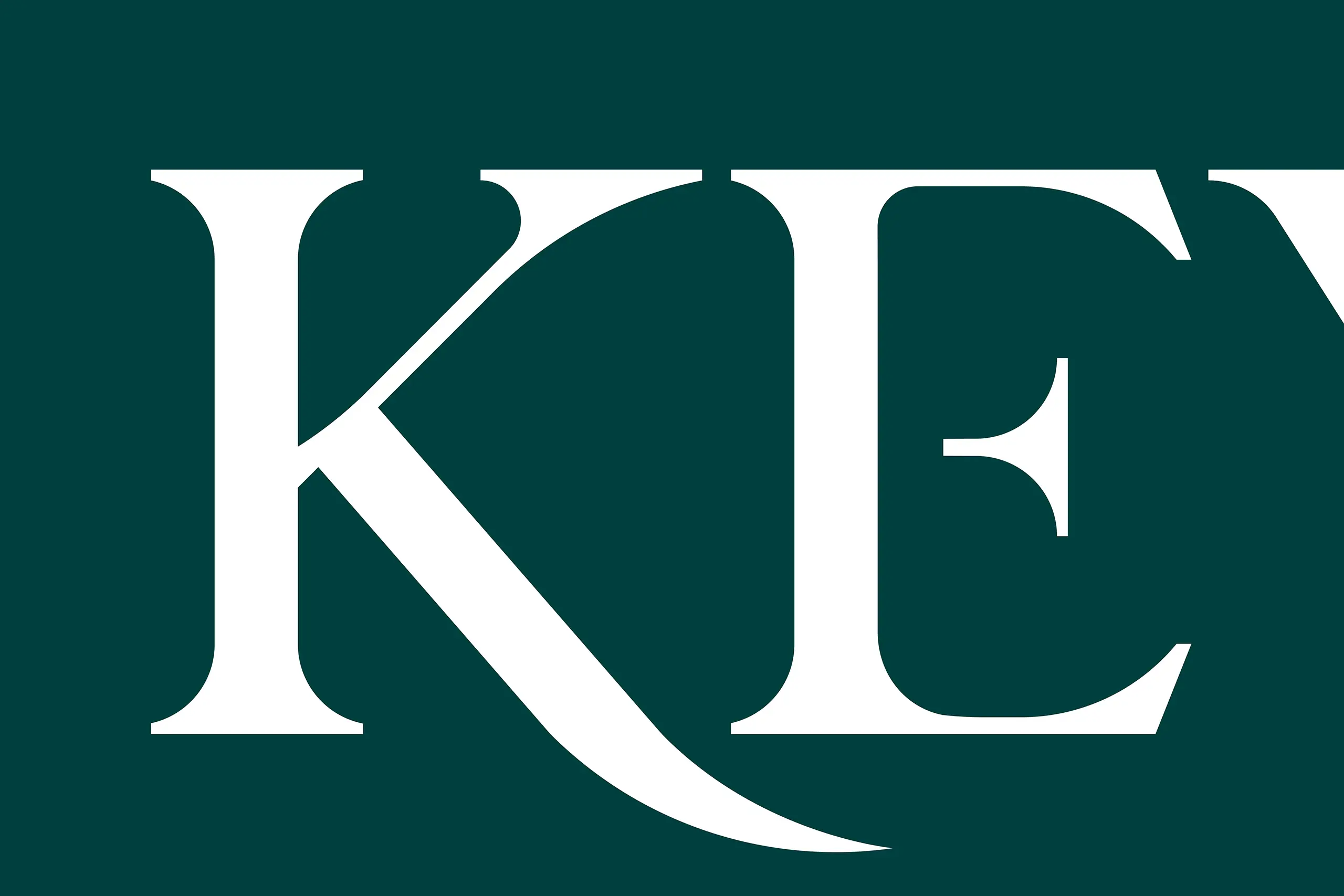
The logo design is based on the first original English typeface, Caslon (designed in 1722). Inspired by this we created a beautifully handcrafted design, integrating Keymer’s tile shapes, to inspire, influence and create a brand-new British typeface and logotype for Keymer to take them into the next decade.
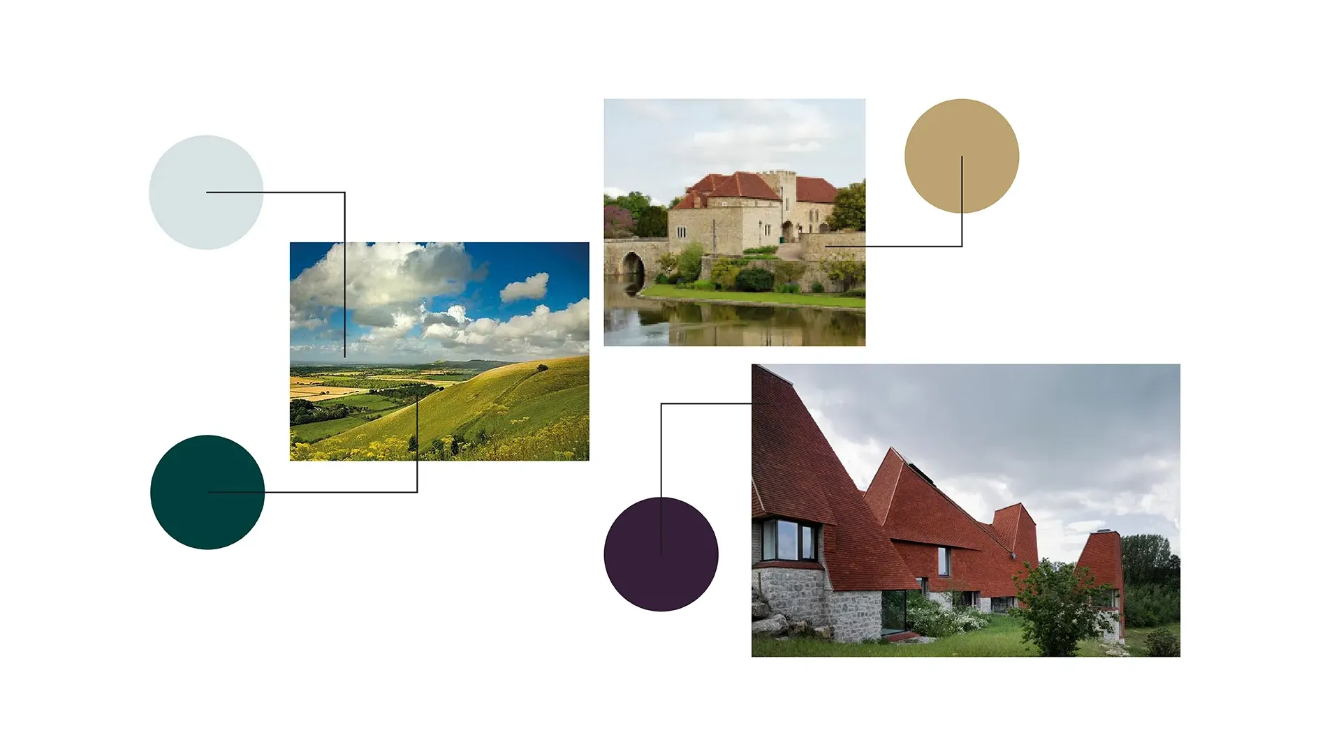
Colours were inspired by products in use as well as the British countryside, to shake off the previous earthy tones. Marrying both Minion and ITC Johnston (another British classic), we created a Brand Toolkit and Guidelines which oozed the missing ‘high-end product’ feel.
The website
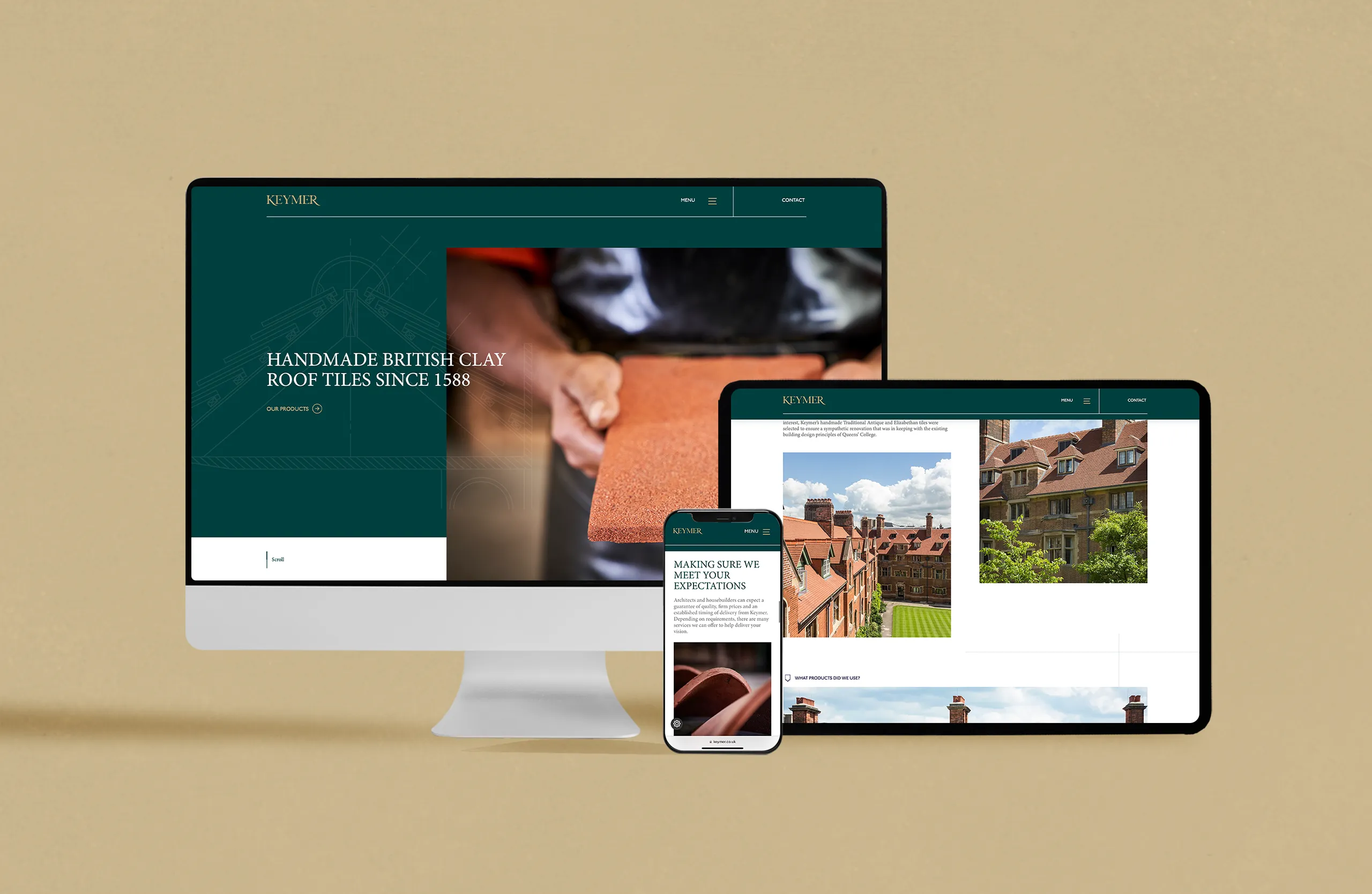
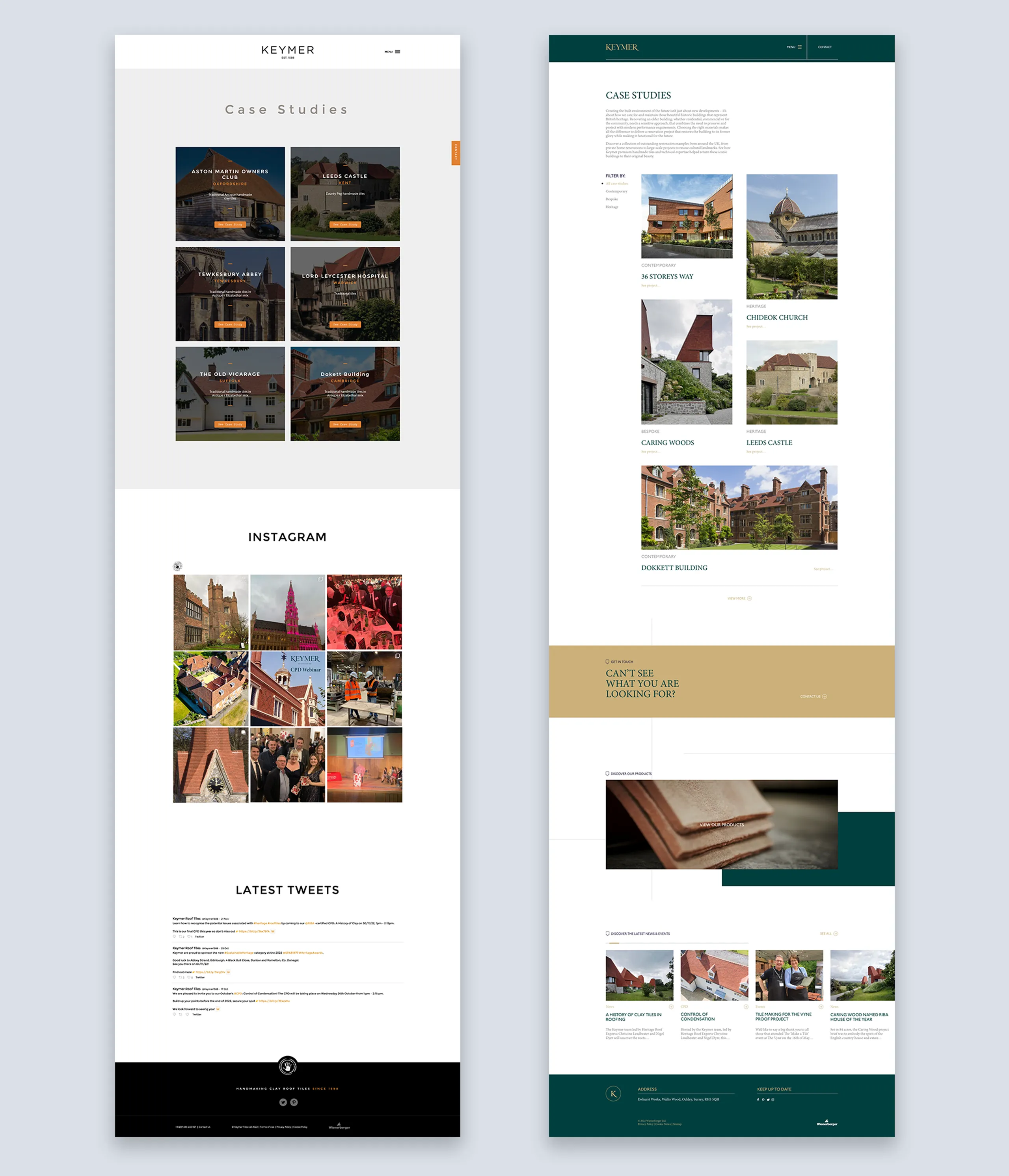
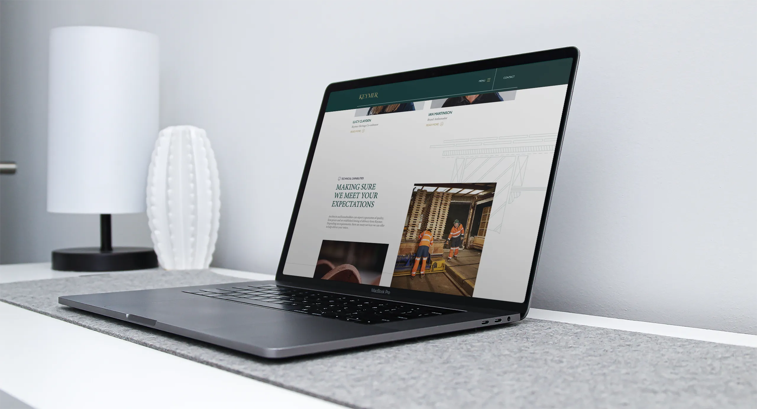
The key to the website was to create a site that appealed to the next generation of architects. Simple and effective user experience to access product information, services offered by Keymer and case studies.
A late addition was to have the ability to ‘shop’ for samples. UX was designed to easily allow users to add products to a ‘shopping cart’ and checkout. All these elements would ultimately allow the Keymer marketing team to track website use and engagement.
Photography
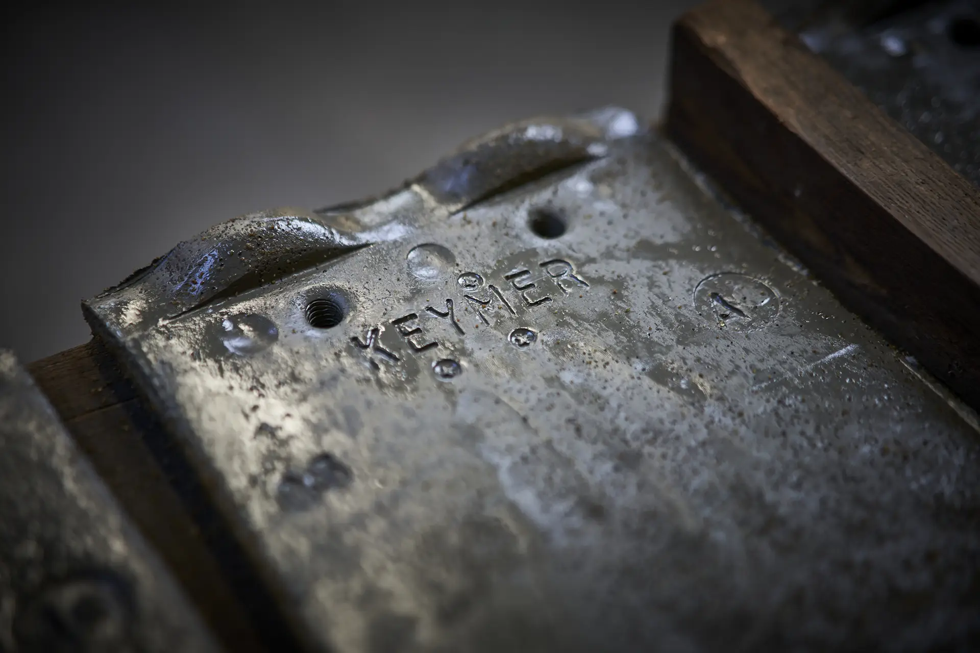
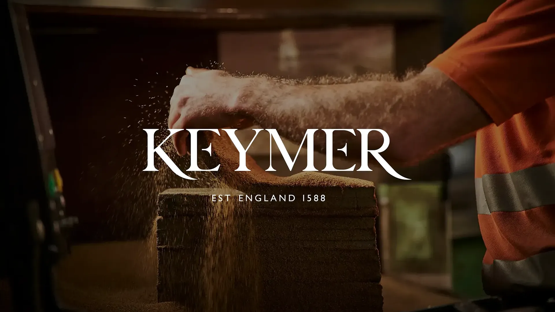
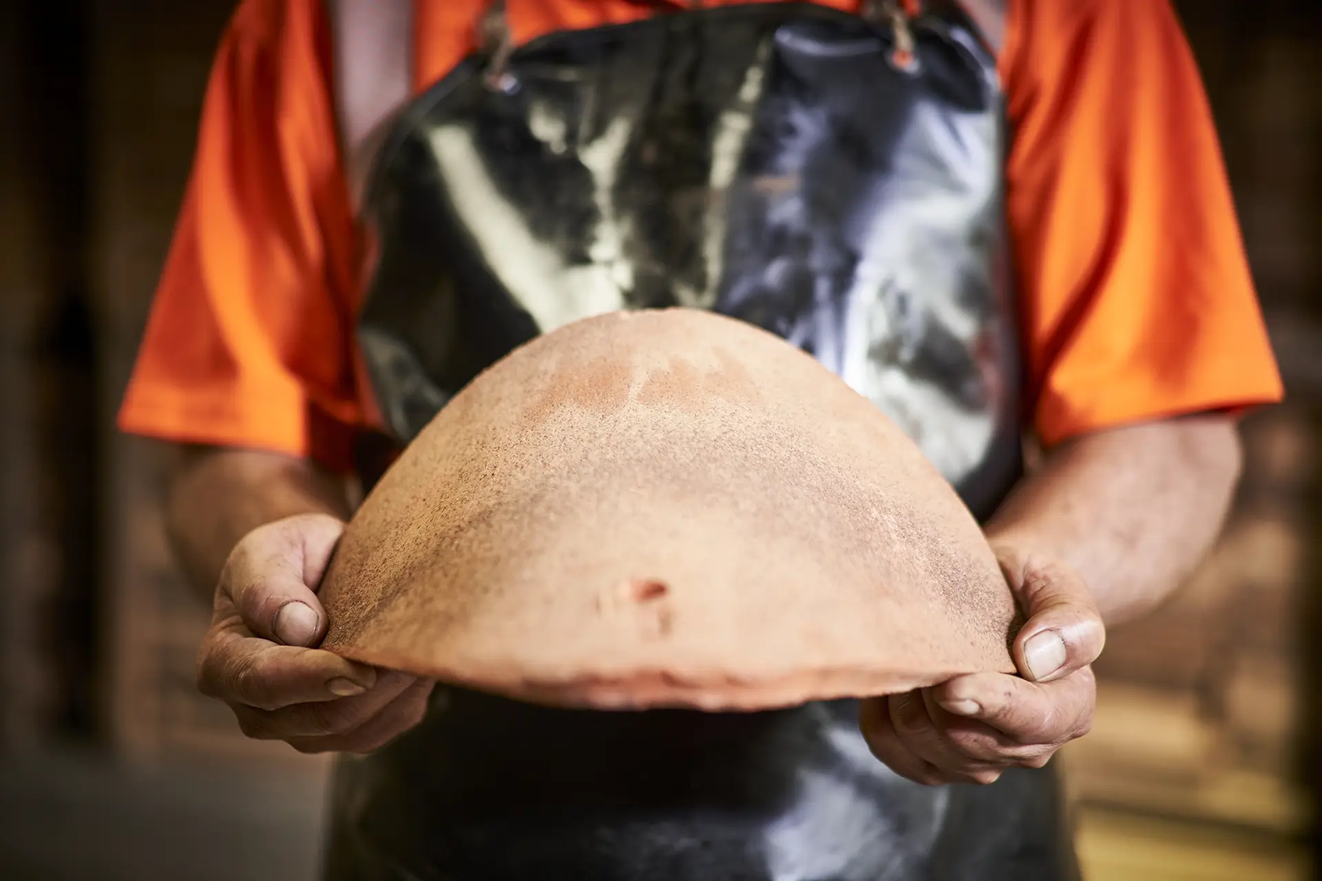
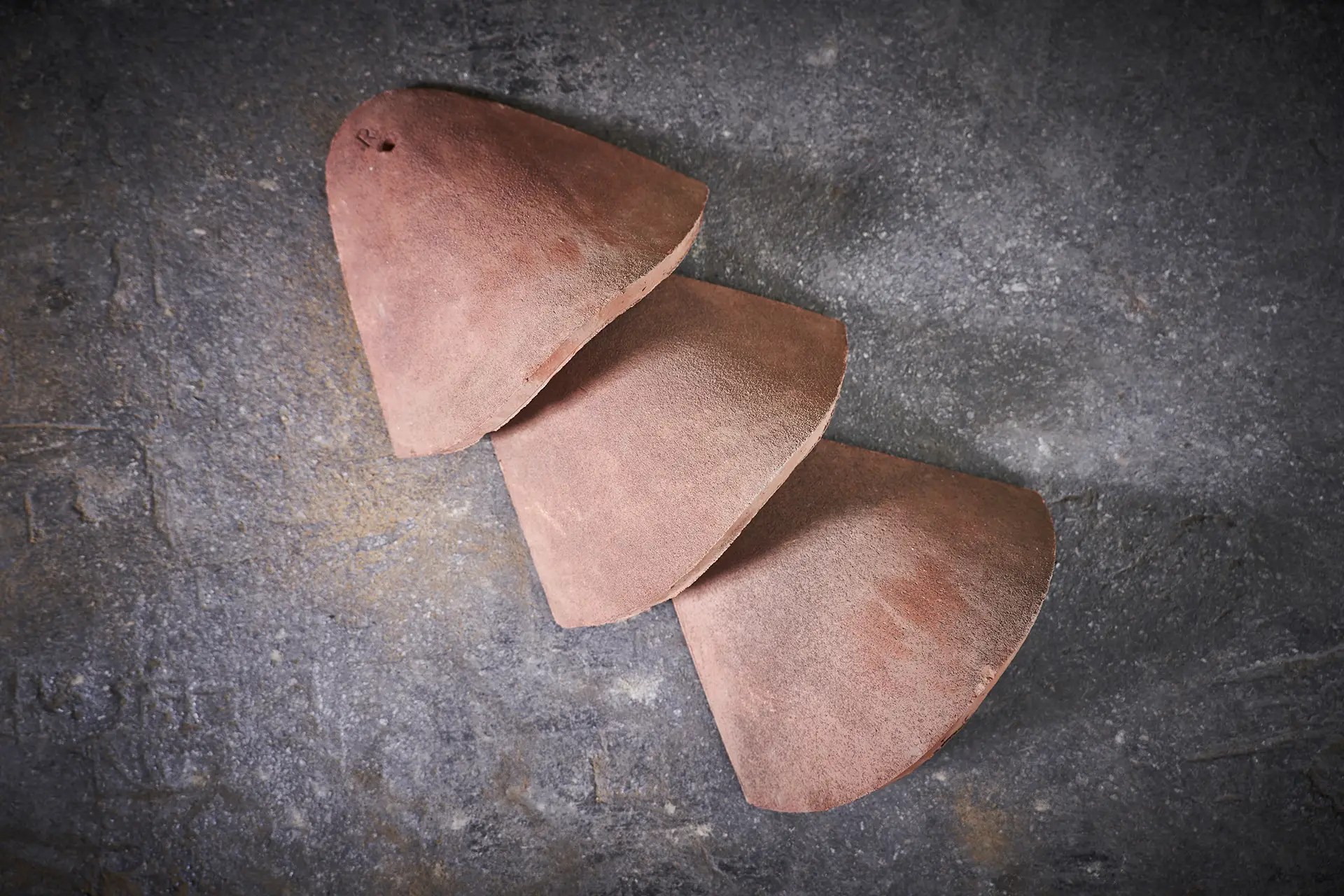
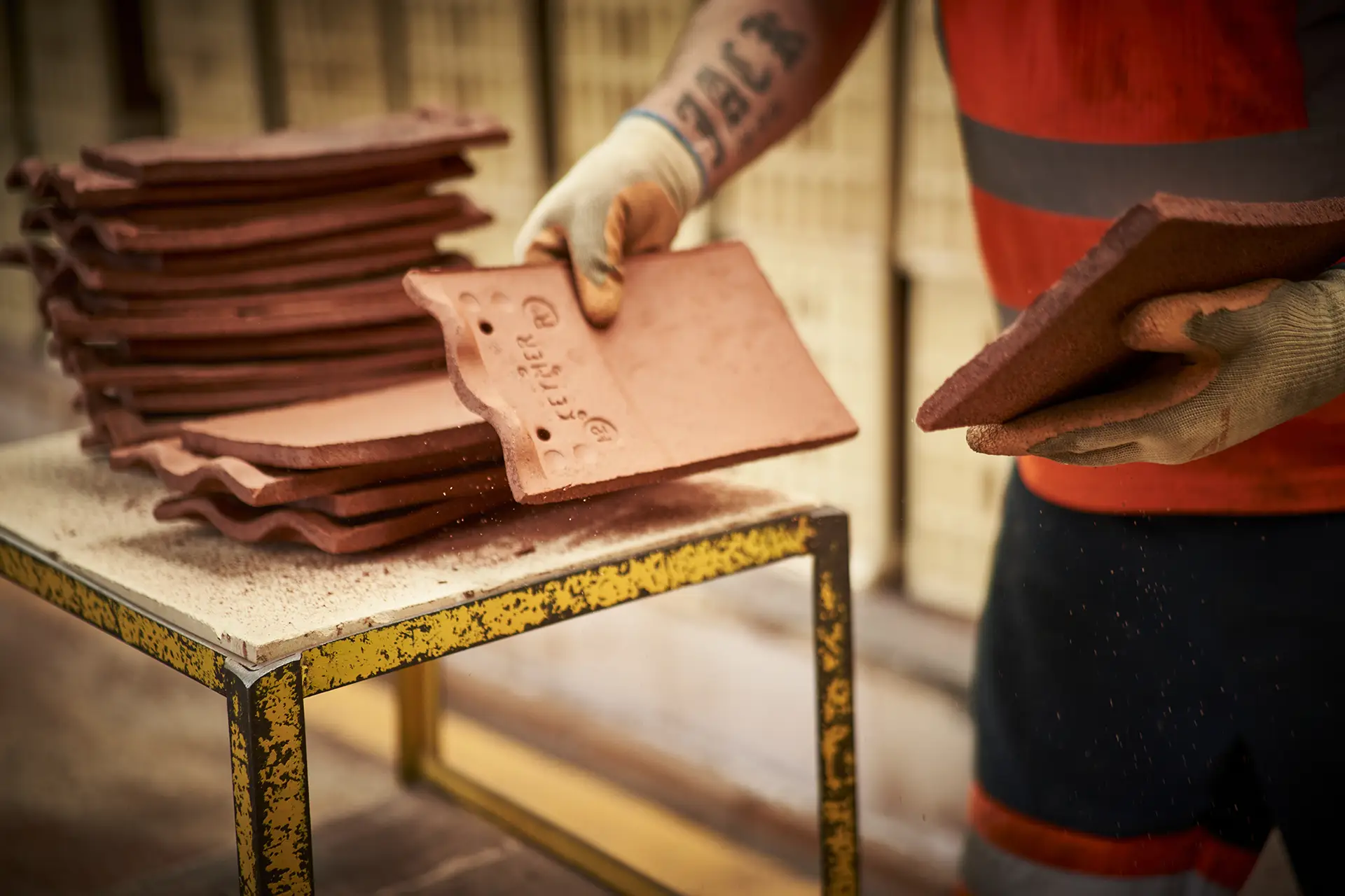
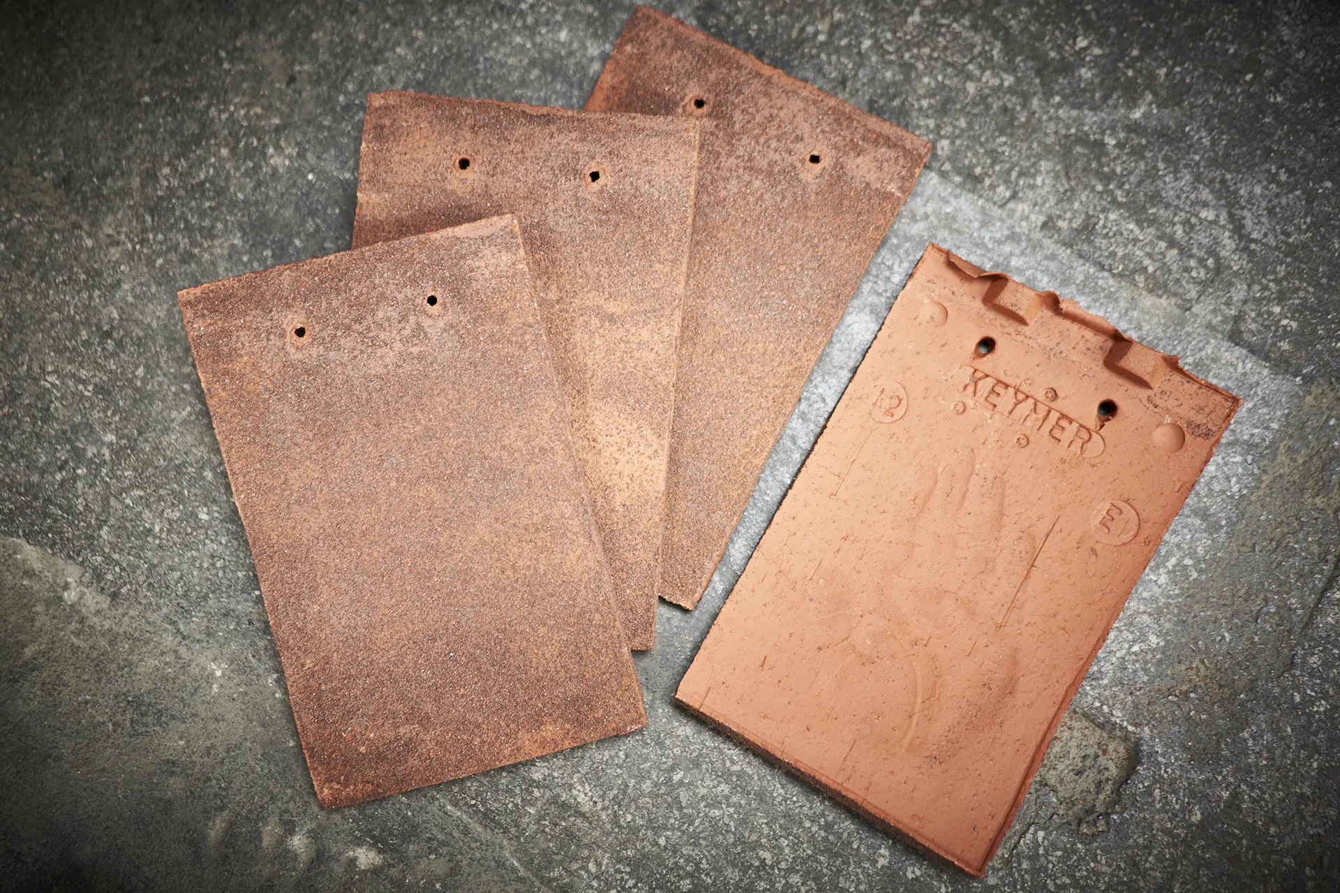
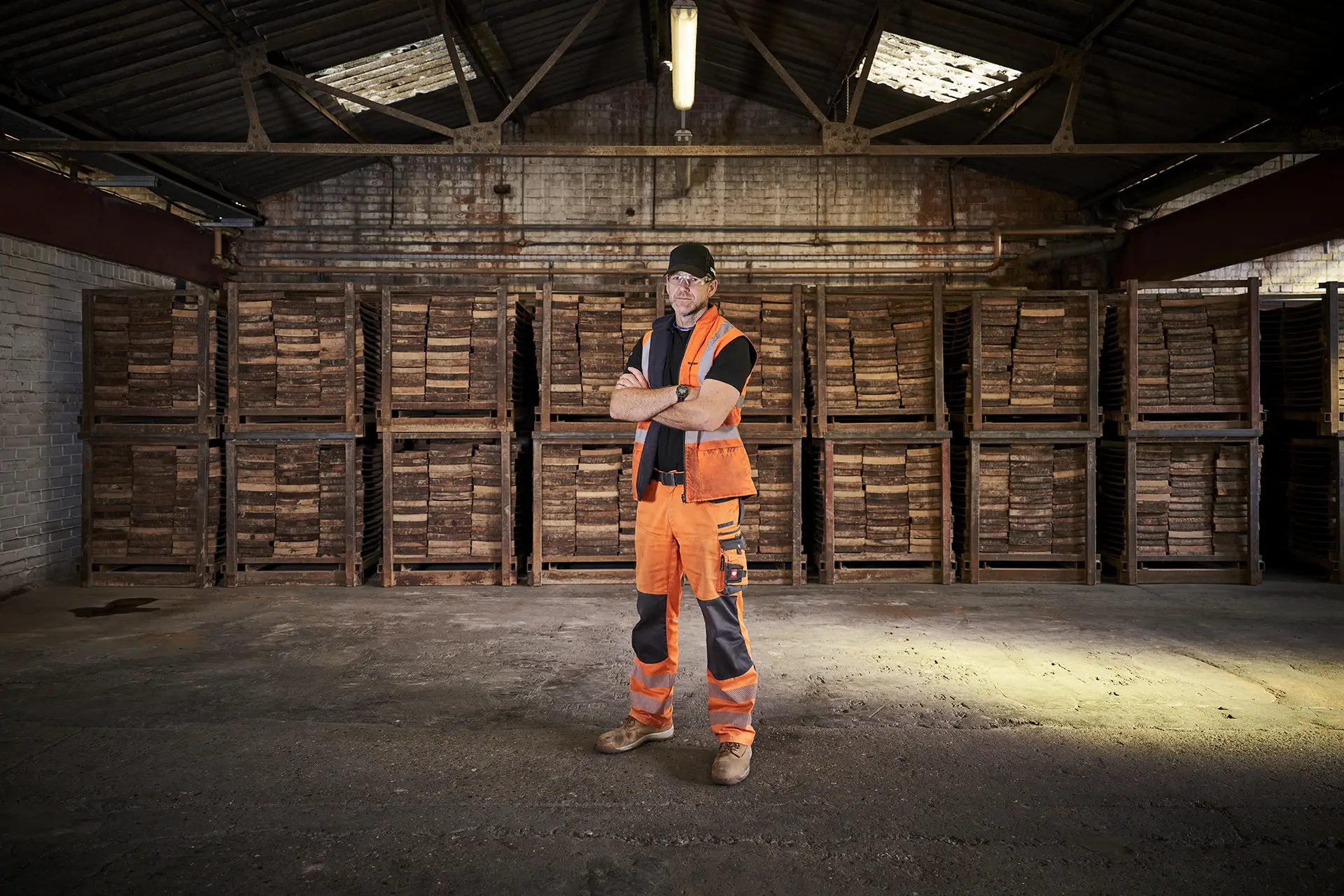
A two-day location photoshoot was arranged at the Ewhurst Factory in West Sussex. The concept was to capture the Keymer tiles being made by the team of tile makers within a real environment. Natural light, Keymer employees and a working factory added to the drama of the imagery.
