Guralp
Visual identity overhaul for a global PLC
Visual identity overhaul for a global PLC
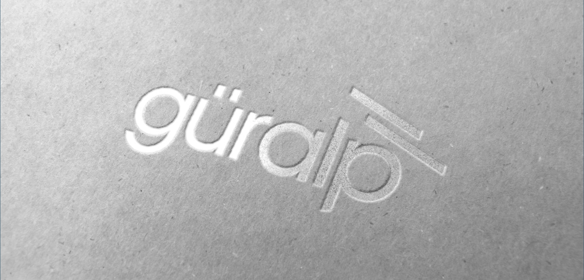
Founded in 1985, Guralp has been in the business of designing, manufacturing, delivering products, services, systems and solutions for seismic instrumentation for nearly 30 years. With an enviable global client list that includes governments, academic institutions, nuclear power plants, oil & gas facilities, geothermal energy plants, dams and buildings to name but a few they felt it was time to bring their original hand-drawn logo and whole visual identity up-to-date.
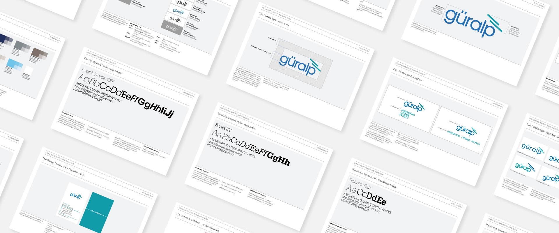
We began by carrying out a detailed examination of the visual identity including a logo health check, analysis of the brand, competitor research and a detailed look into seismology as a science.
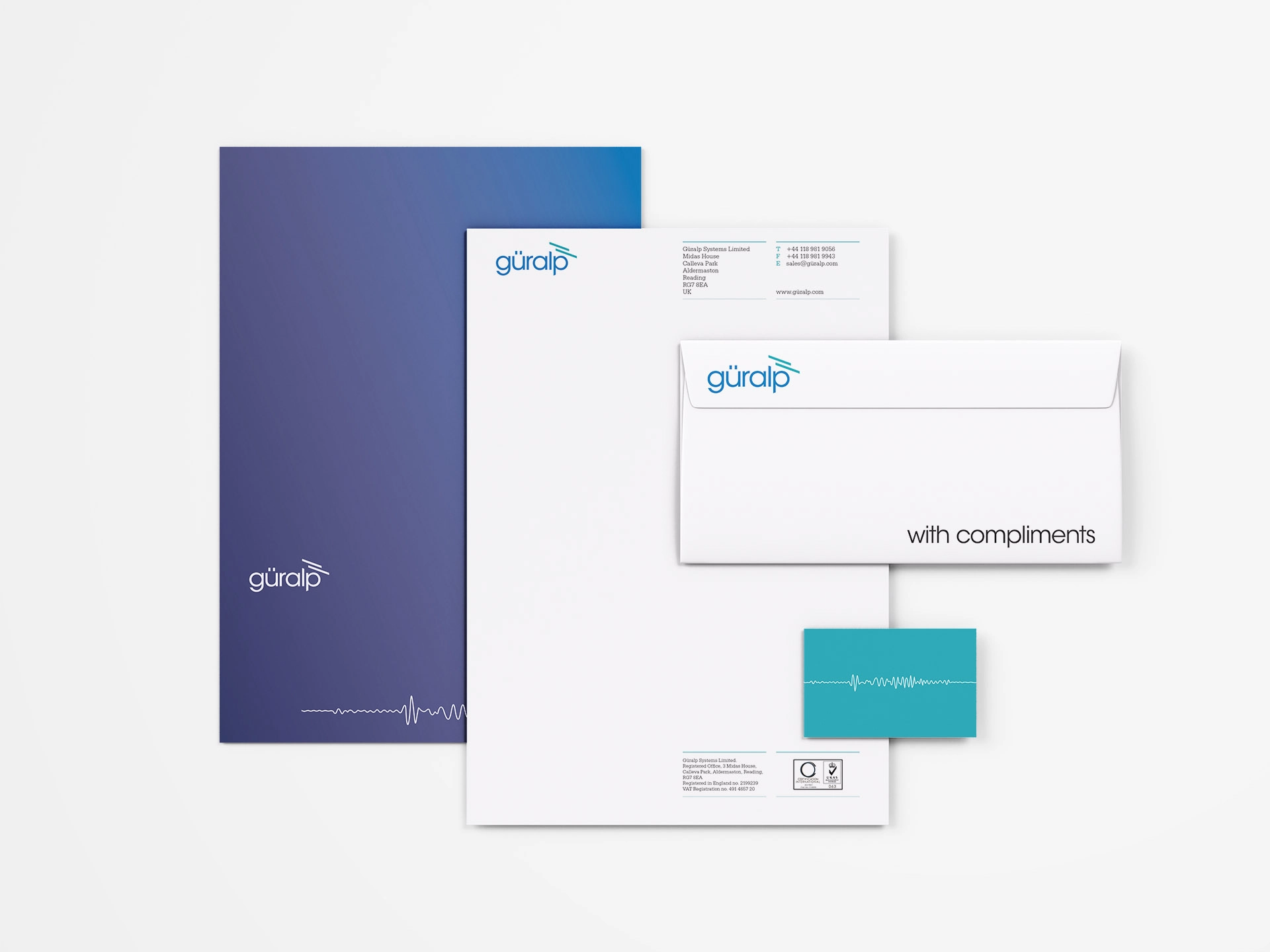
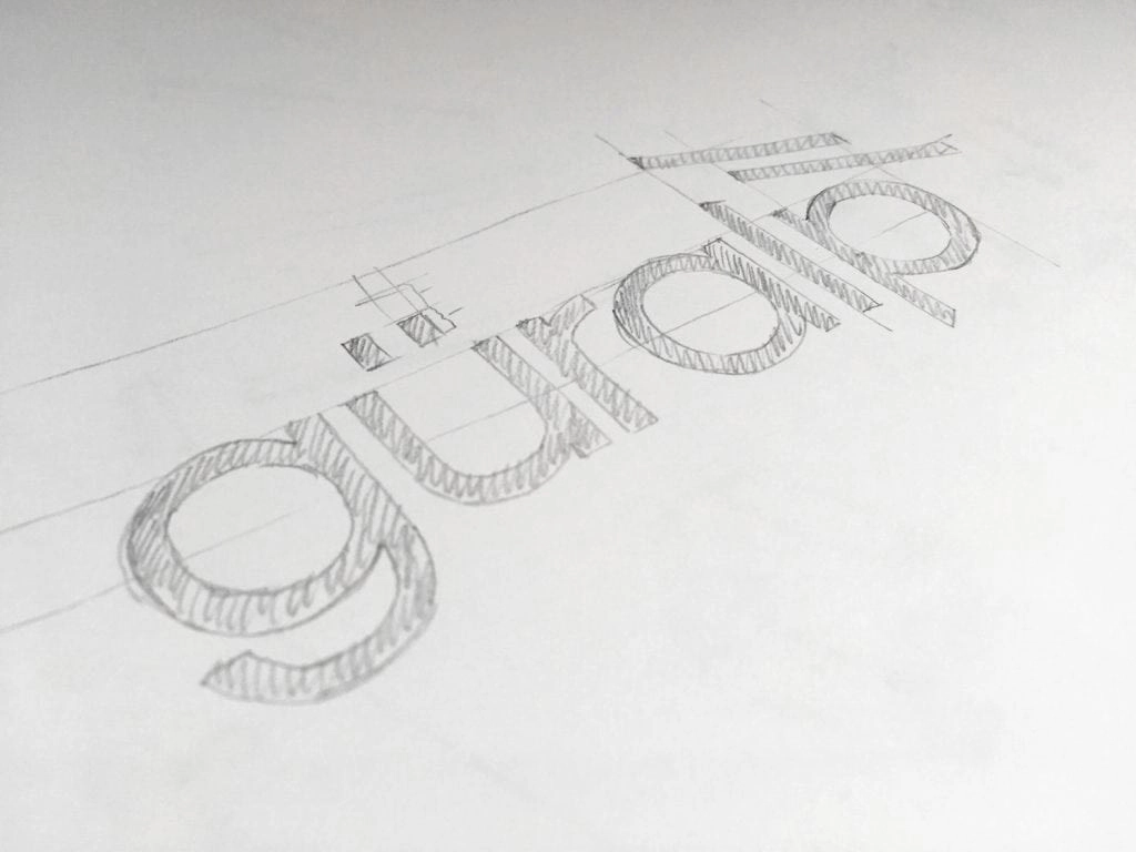
It was soon very evident that there was the potential for some design options from an evolution point of view, so we created a number of logo designs that answered the brief in various ways. The logo device creates a seismic shift visual. Visual connotations of shelter, efficiency, progress and protection. Negative space implies a ‘more than symbol’, or unlocking discovering potential, increasing understanding. typographic style of strength and elegance.
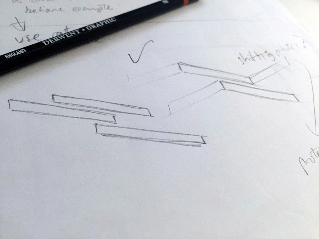
Guralp’s executive board concluded that the preferred concept was a design that took a literal interpretation of the Guralp spring, one that had been inspired by a shifting seismic plate diagram.
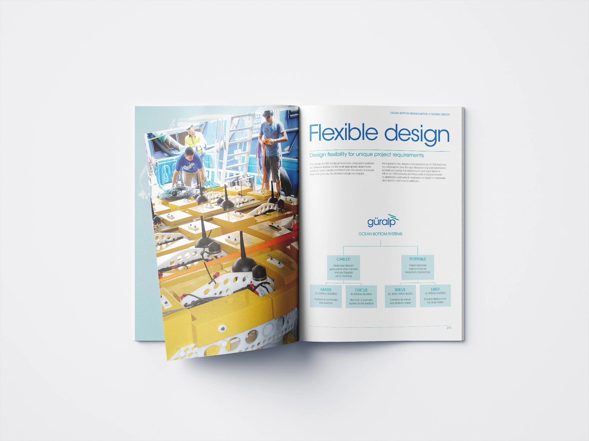
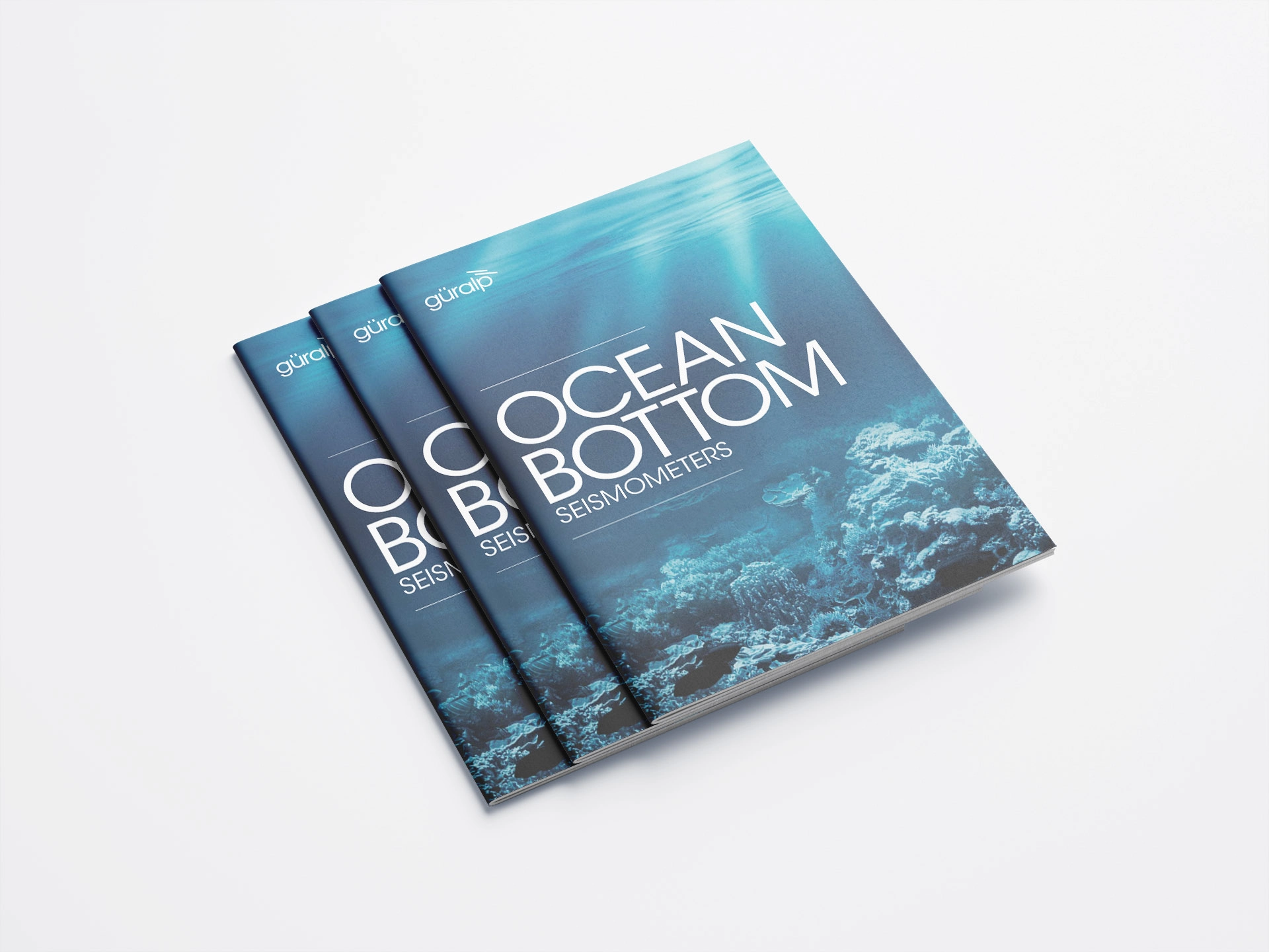
The rebrand has received fantastic feedback from customers here and in the US.
