GNDR
Increasing the reach & awareness of GNDR to support global disaster reduction
Increasing the reach & awareness of GNDR to support global disaster reduction
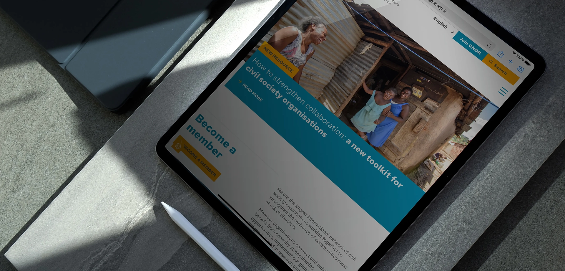
GNDR wanted to be perceived as a credible and influential organisation and create a safe space for Civil Society Organisations (CSOs) to learn from each other. They approached Think to design a more intuitive website experience that met the needs of their audience, supported the goals of their 5 year organisational strategy and increased the reach, advocacy and awareness of GNDR campaigns.
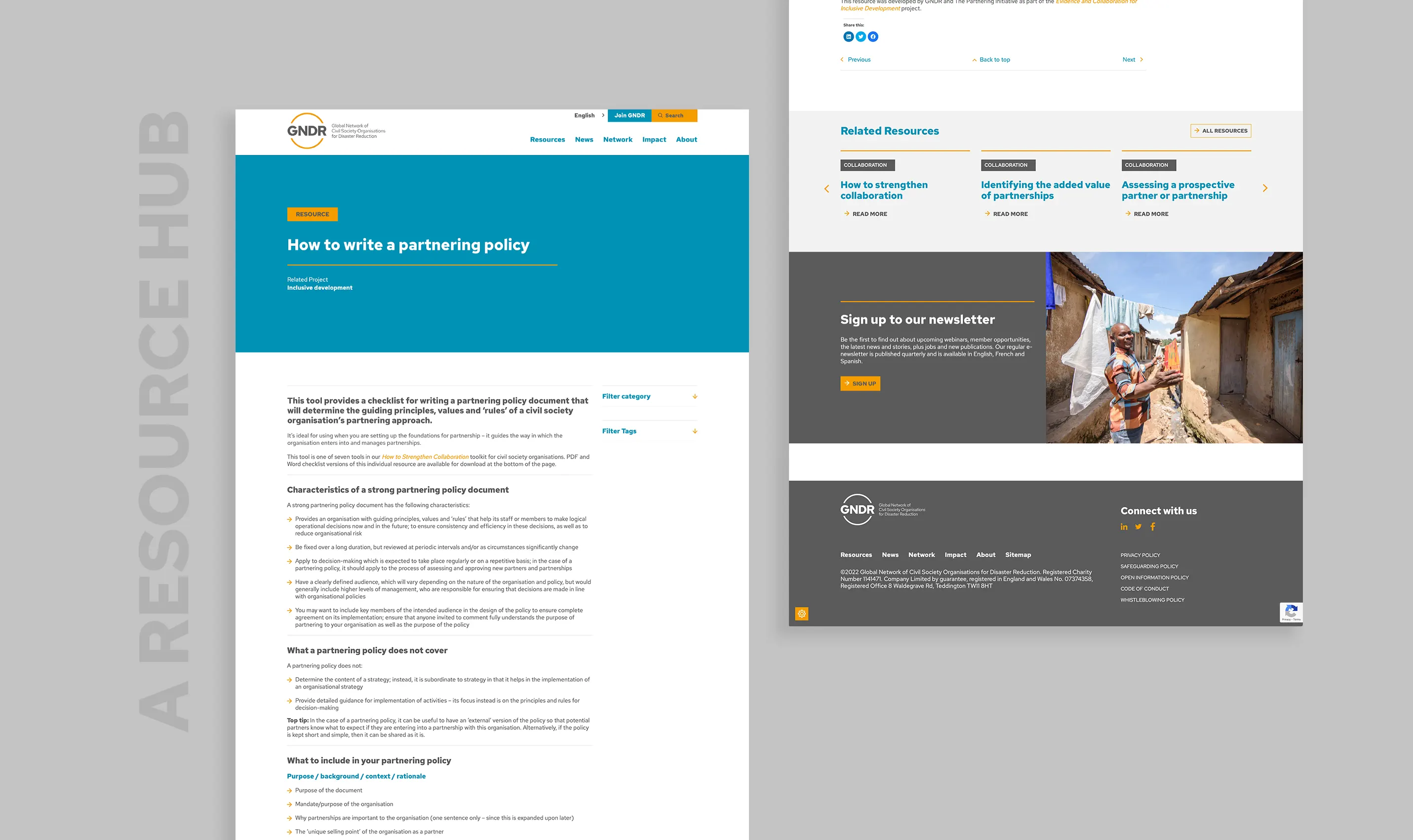
Their existing site was dated, clunky with limited functionality and required updating individual pages per language. GNDR wanted a platform that streamlined the ability to upload, categorise and find the latest reports, whitepapers and campaign activity across all territories. A solution to produce more comprehensive reports with their own navigation was also required, something that could easily be replicated by the GNDR team.
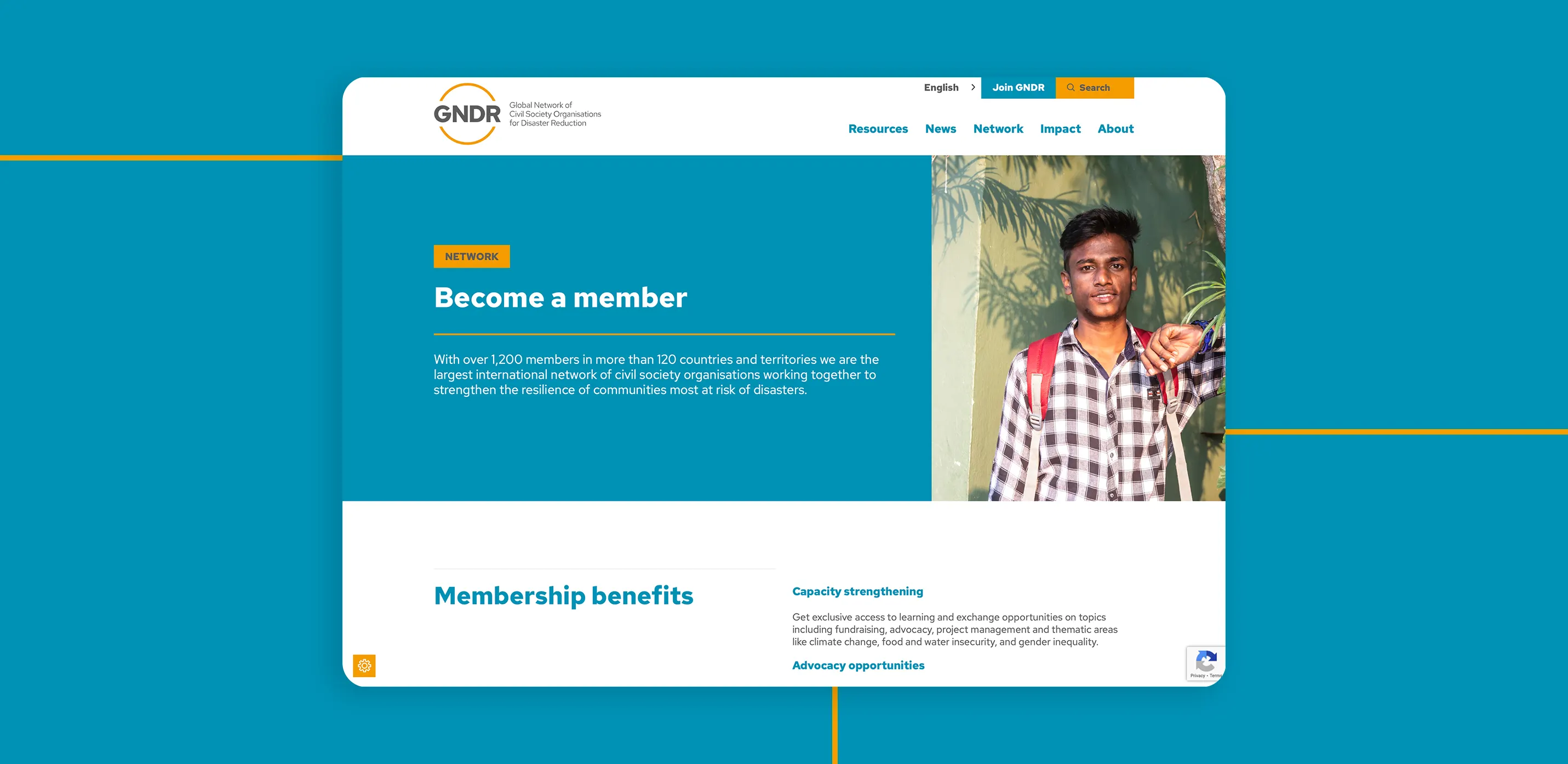
We begin any website design project by understanding the role of the website and our audience needs so we can plan optimal user journeys. We then rationalise existing content against these – what serves a purpose and what doesn’t? Where are the gaps?
Our audiences were categorised as Funders, Members and CSO’s. Our goal for CSOs and Members was for GNDR – Global Network of Civil Society Organisations for Disaster Reduction, to be a go-to resource for tools to help them solve problems and prevent disasters, and to drive membership by empowering CSOs to be part of something bigger. For Funders our goal was to support them with a simple, clear and engaging overview of GNDRs impact on the ground and be perceived as a credible and influential organisation. A key aim was for our audiences to actively use the resources and share GNDRs advocacy messages.
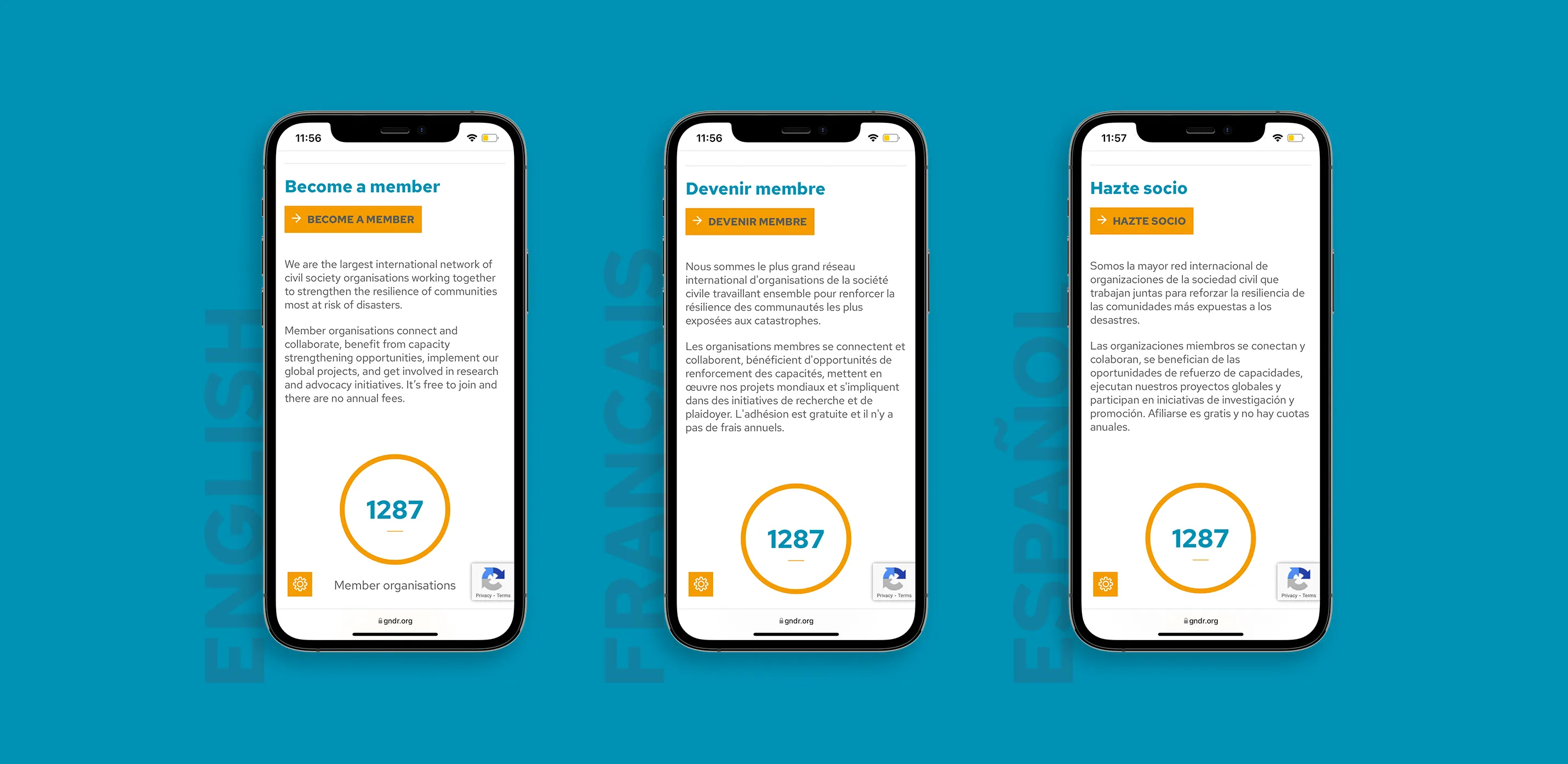
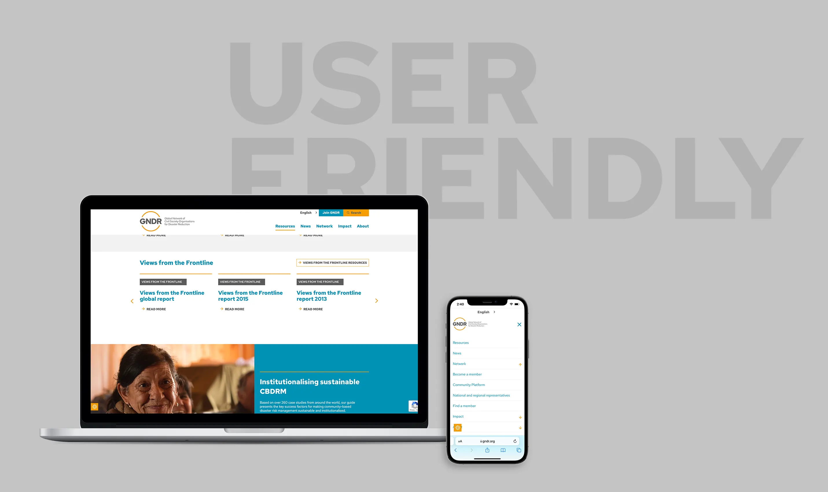
To do this we created detailed user journey maps that stepped through each stage in their journey – Aware, Interested, Active, Advocating. The result was a rethink of the site architecture that put the emphasis on GNDRs impact and strength in their global network. Think developed a streamlined UX that made finding content and related articles a breeze, produced a slick and polished UI and integrated an easy to use language tool that allowed GNDR to update all languages simply from the dashboard.
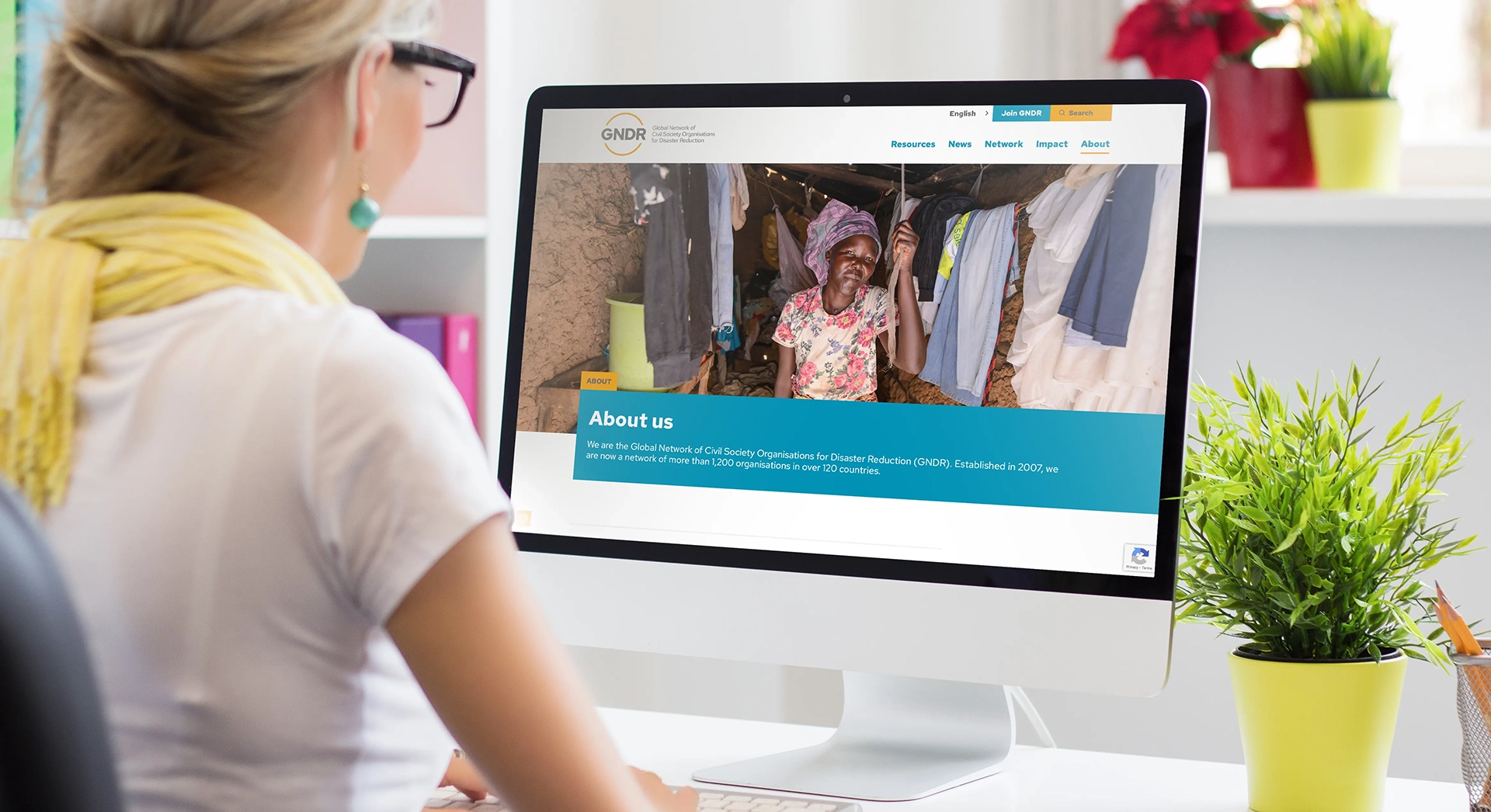
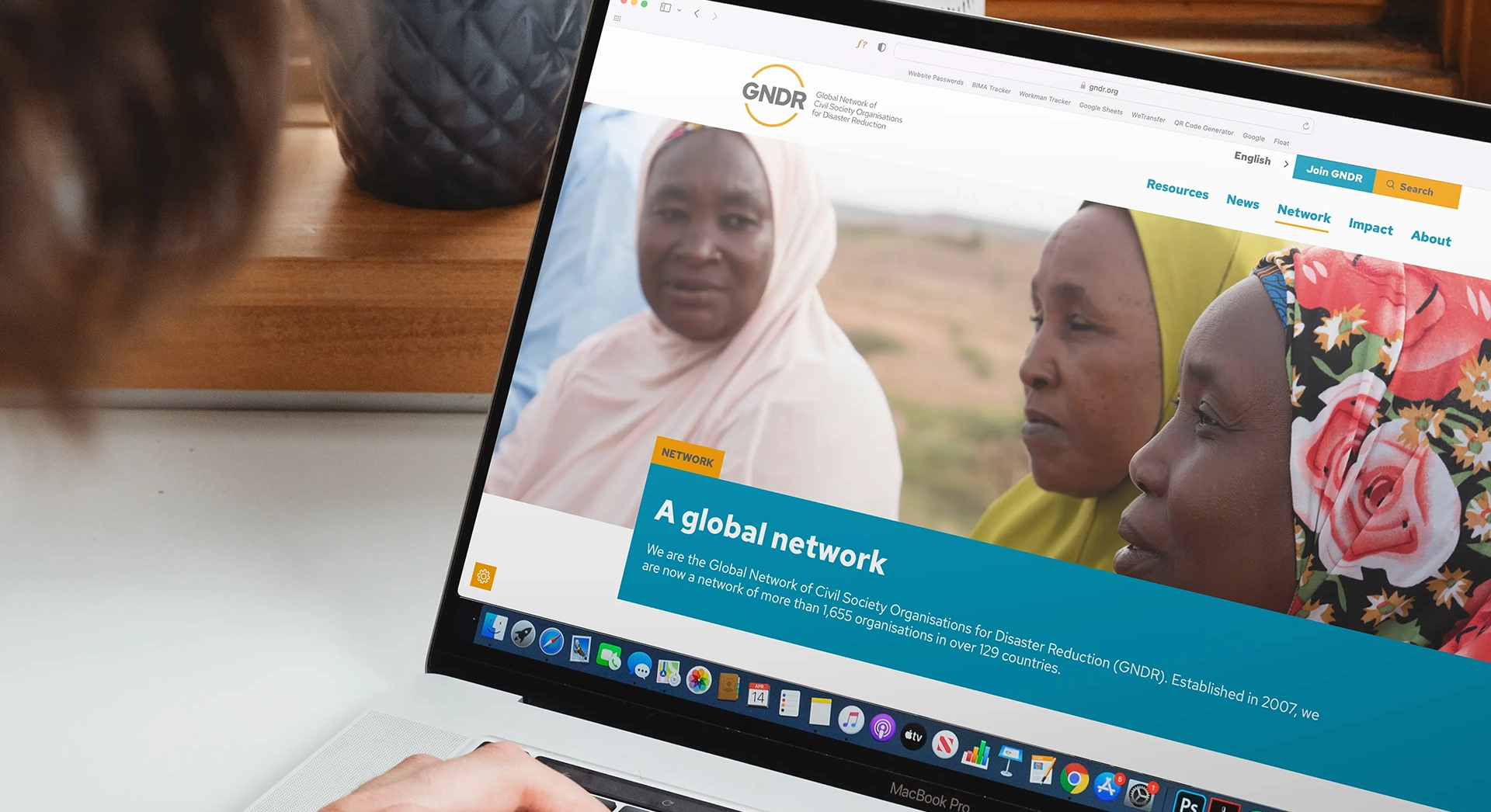
The website has proved a huge success, with international stakeholders commenting on the ease of use, both from an audience point of view and the flexibility of the back end – building report microsites and updating languages. The new platform positions GNDR as an authority on disaster prevention and, importantly, engagement has gone through the roof, with a 185% increase in session duration.
