Charity rebrand brings a smile
Trafford based Once Upon a Smile launches new brand and website to reflect the heart of their charity.
Trafford based Once Upon a Smile launches new brand and website to reflect the heart of their charity.
Once Upon a Smile was founded by Daniel Jillings and Danny Miller, to provide emotional and practical support to bereaved families, after it became apparent that there was a lack of support for families after the death of a loved one, specifically a parent or child/sibling.
They are the only children’s bereavement organisation in Greater Manchester.
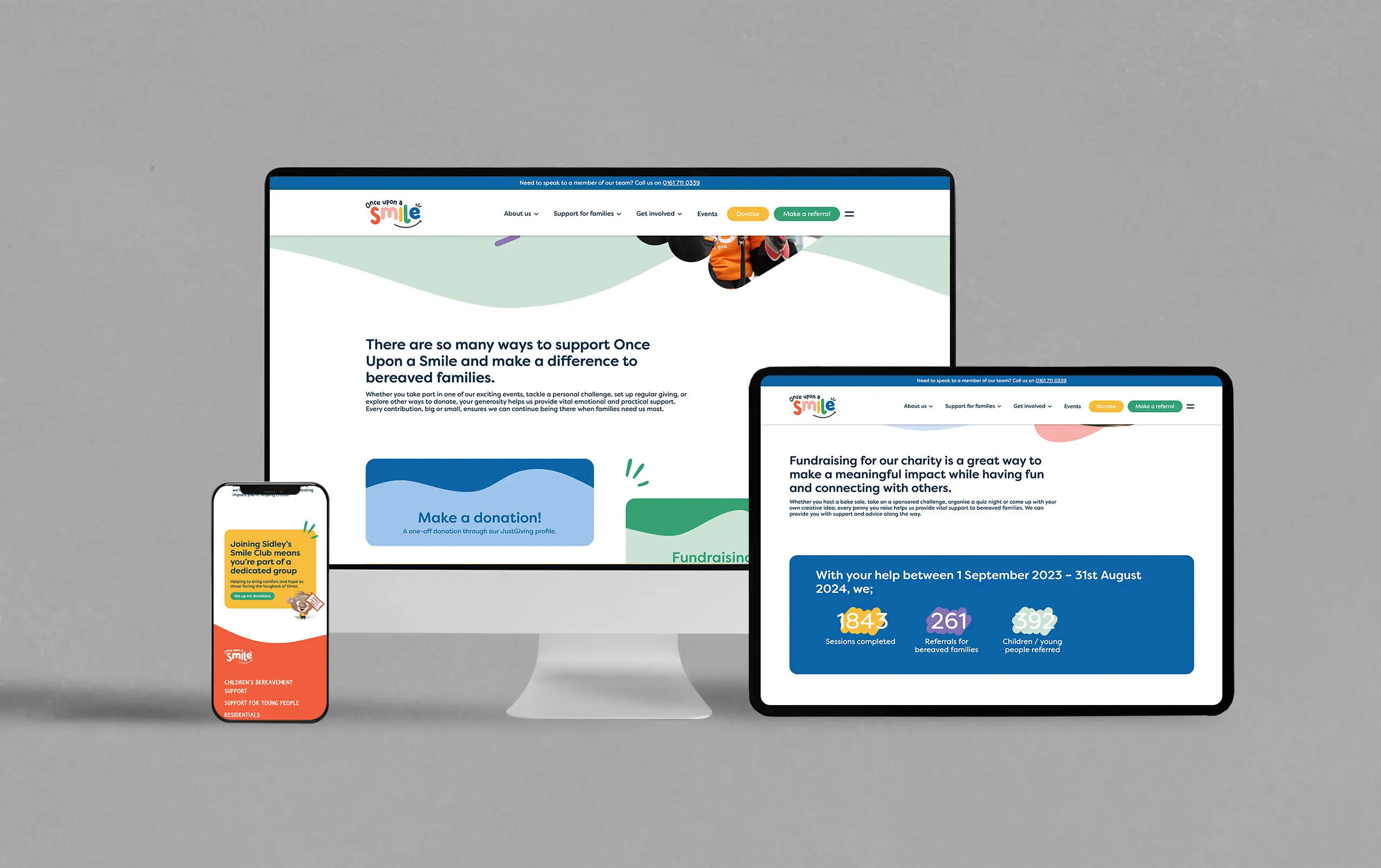
We were referred to the charity by a mutual acquaintance, the initial request was to quote for a new WordPress website. It had become evident that their existing website was hard to update and had a confused user experience. At a time of need, the last thing people want is to struggle to find the information they need to be able to get in touch with the charity.
As a branding agency, we work with a lot of charities, and recognise they have limited funds. So once we had agreed a charity friendly price for the website, we set about doing something we hadn’t been asked to do.
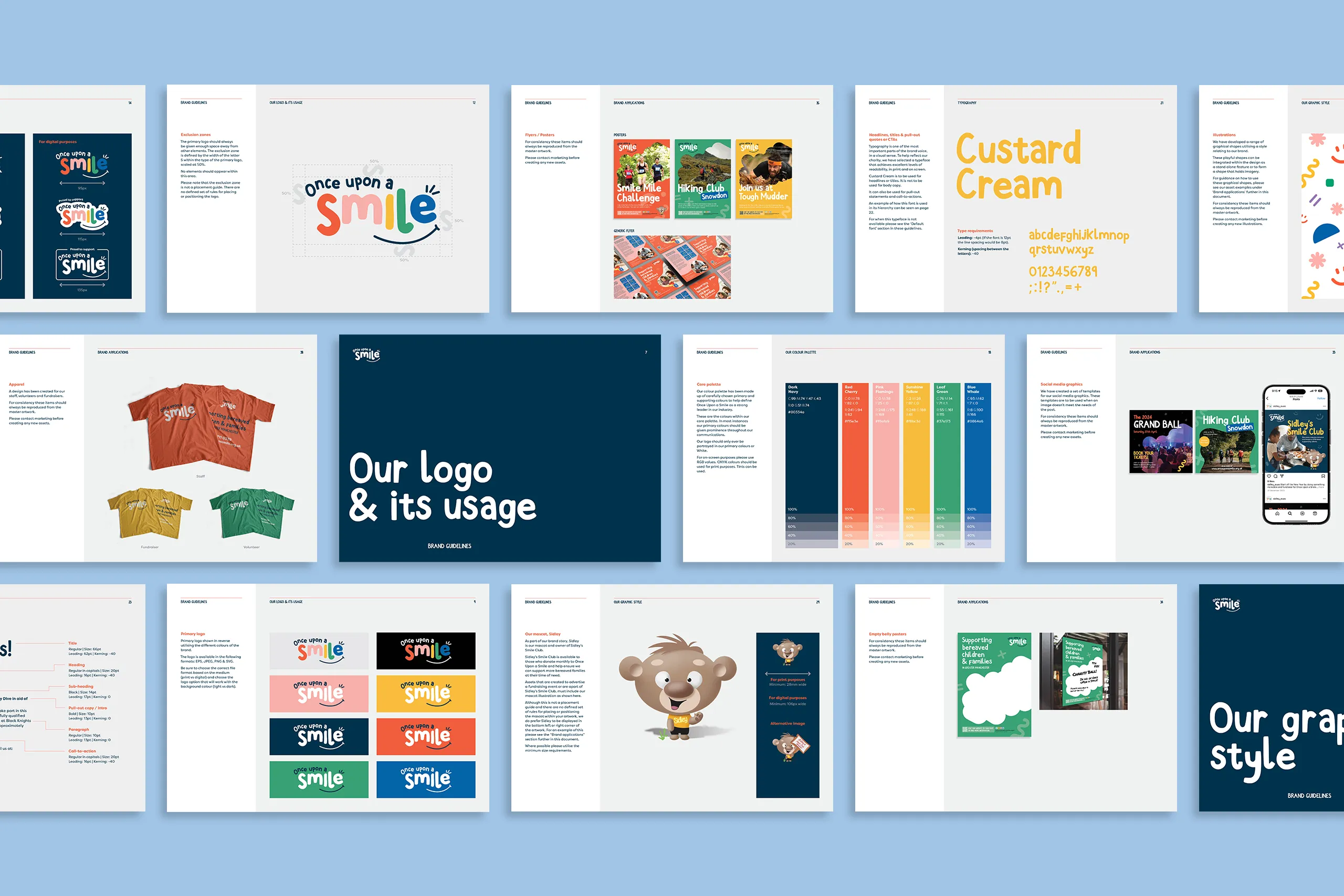
The logo and the entire brand identity, in our opinion, did not reflect the charity, its purpose, or the individuals behind it.
We felt we needed to explore the brand identity before we started the website, so we produced a brand audit and a review document where we presented a brand refresh proposal for the charity.
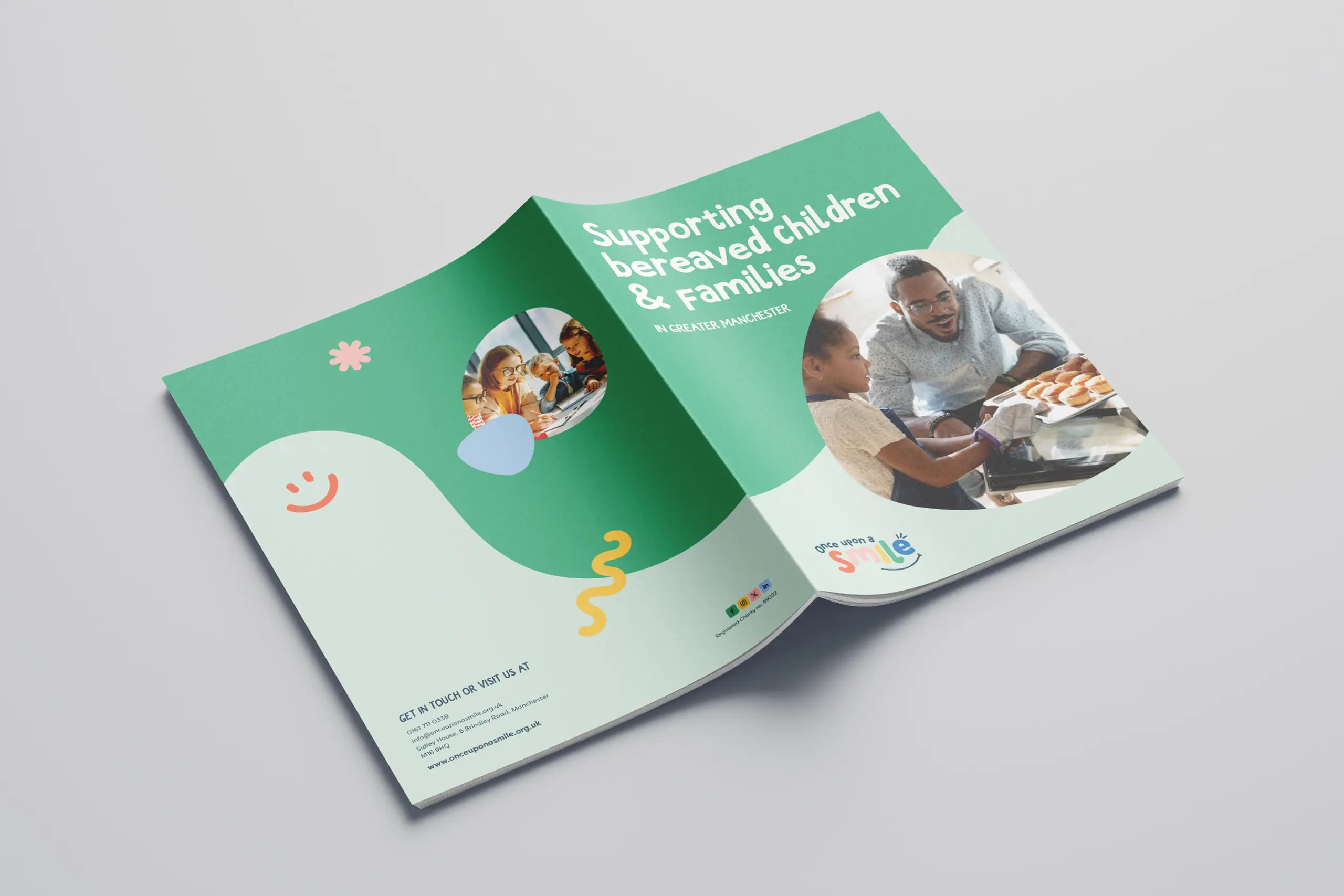
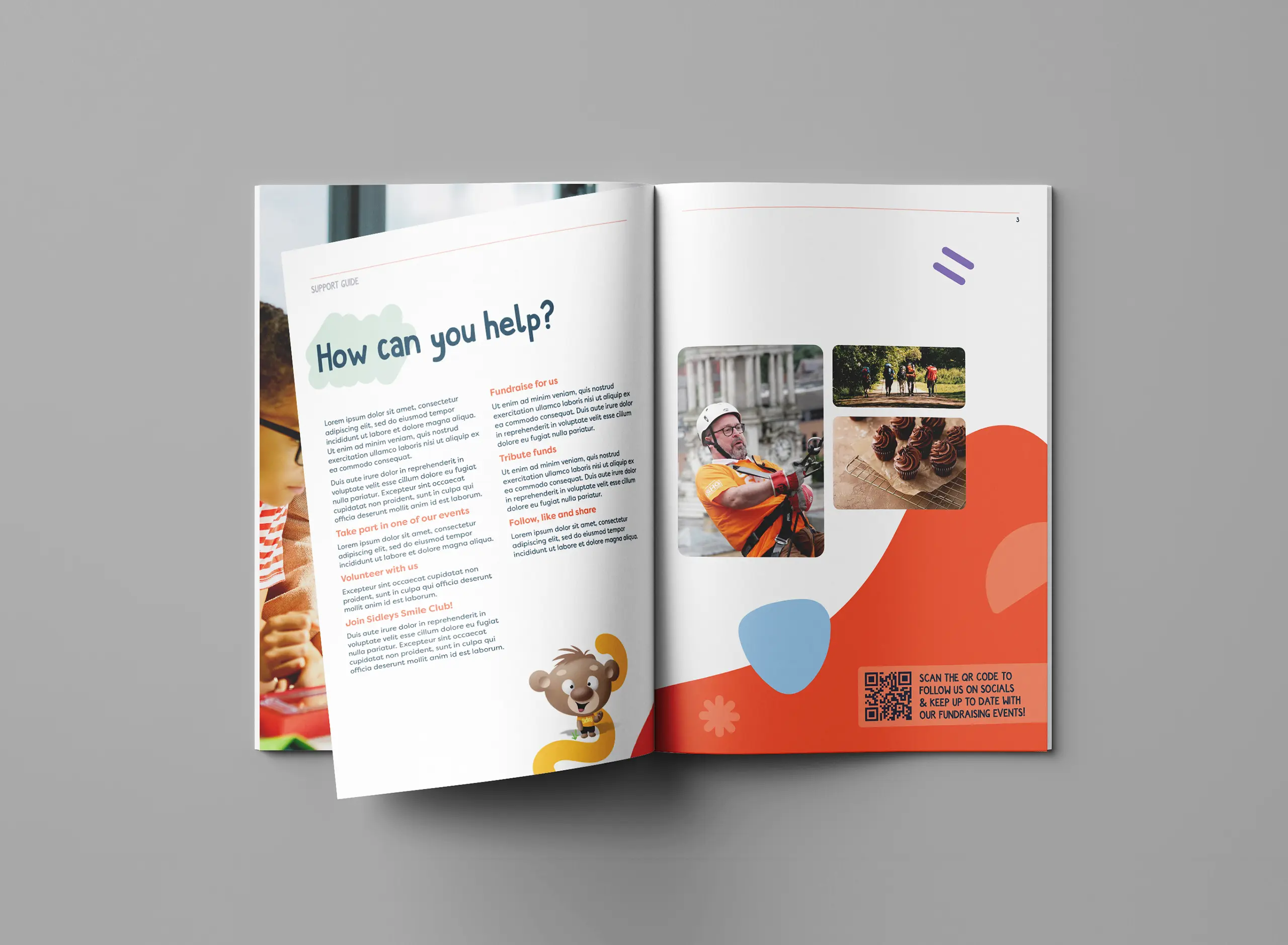
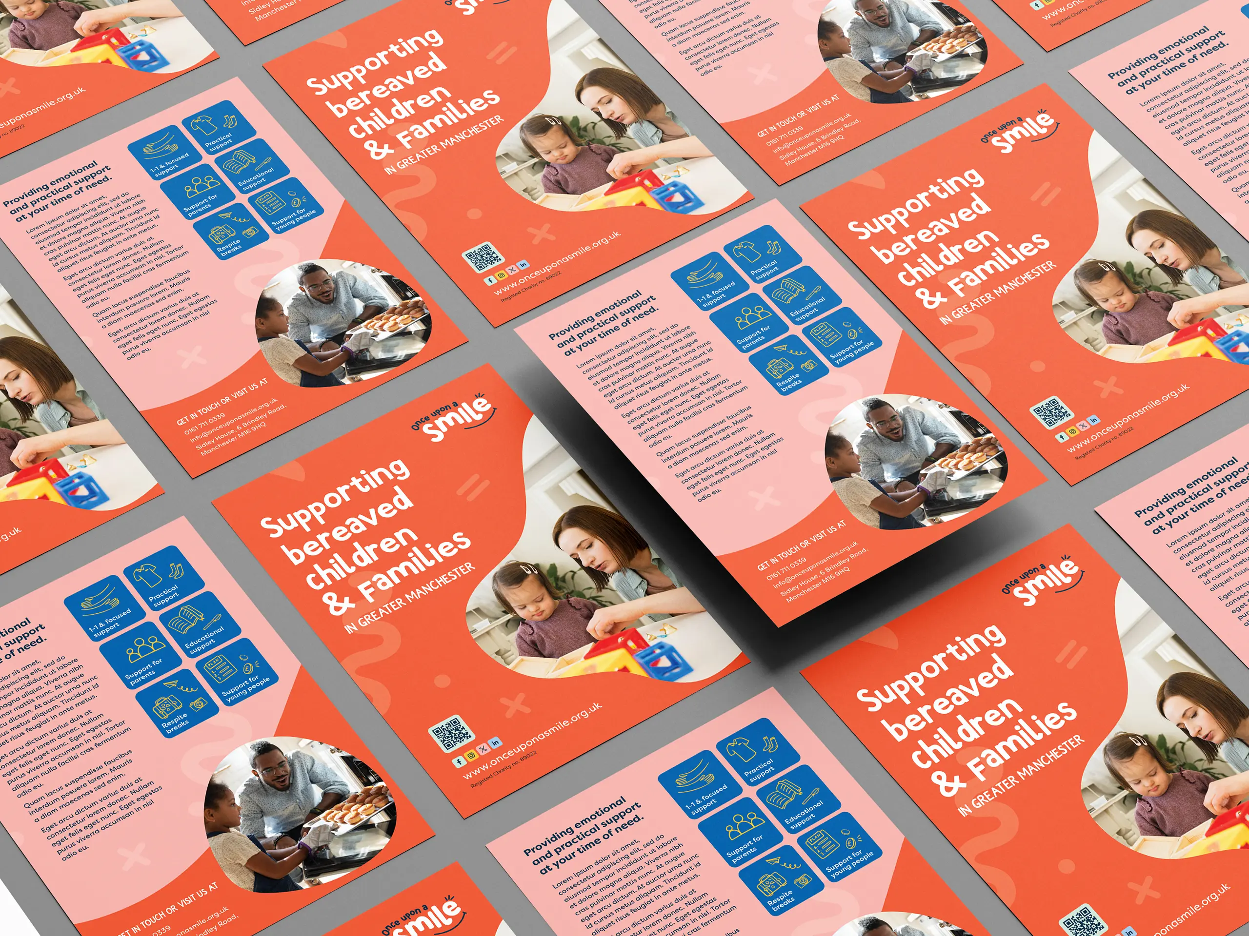
The visual identity needed to reflect the outcome of the support, the sessions and the rooms they have, much better.
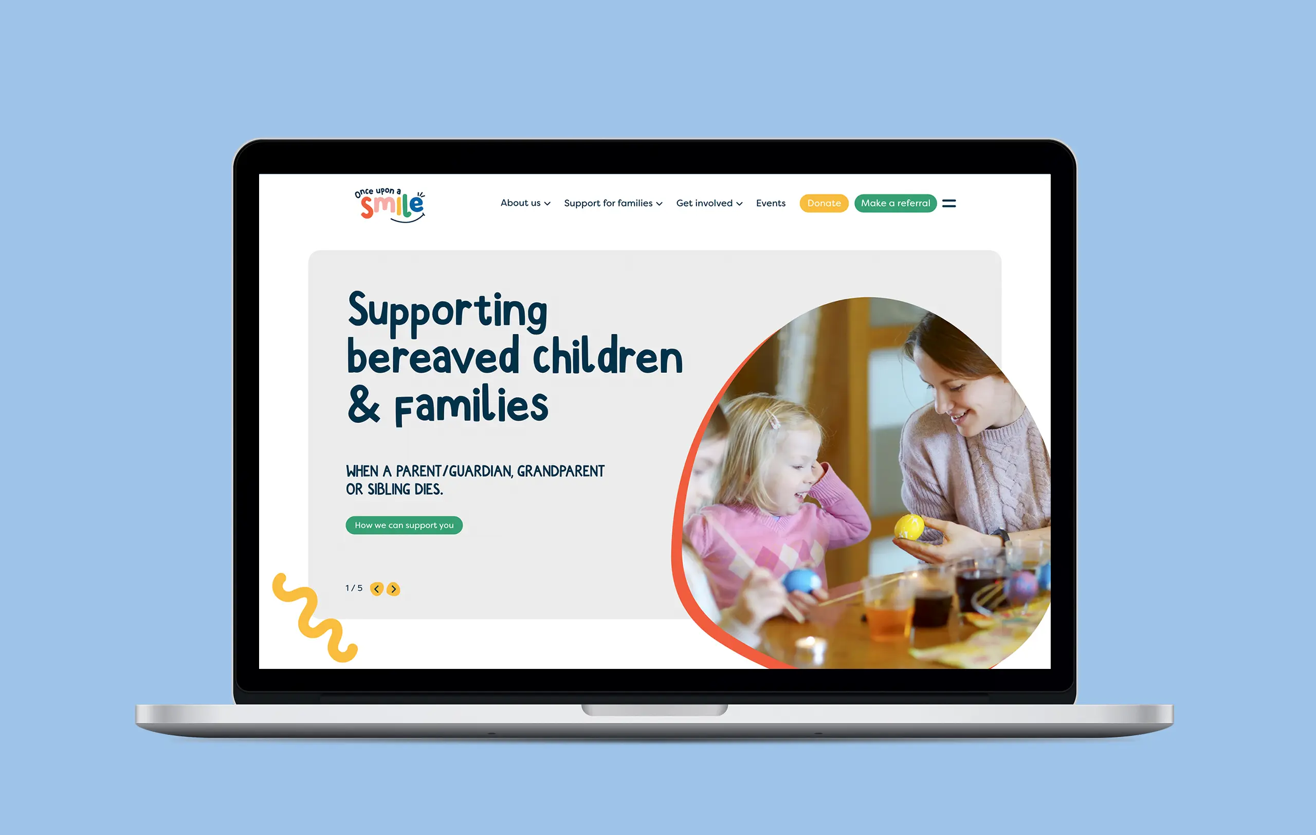
The rebrand process we also introduced friendlier typefaces to the brand style and logo. Designed to appeal to their audience, and also making sure it was legible and accessible to all.
Sidley House, the Once Upon a Smile HQ, is full of different support rooms that are brightly coloured, playful, and calming – tailored to different activities.
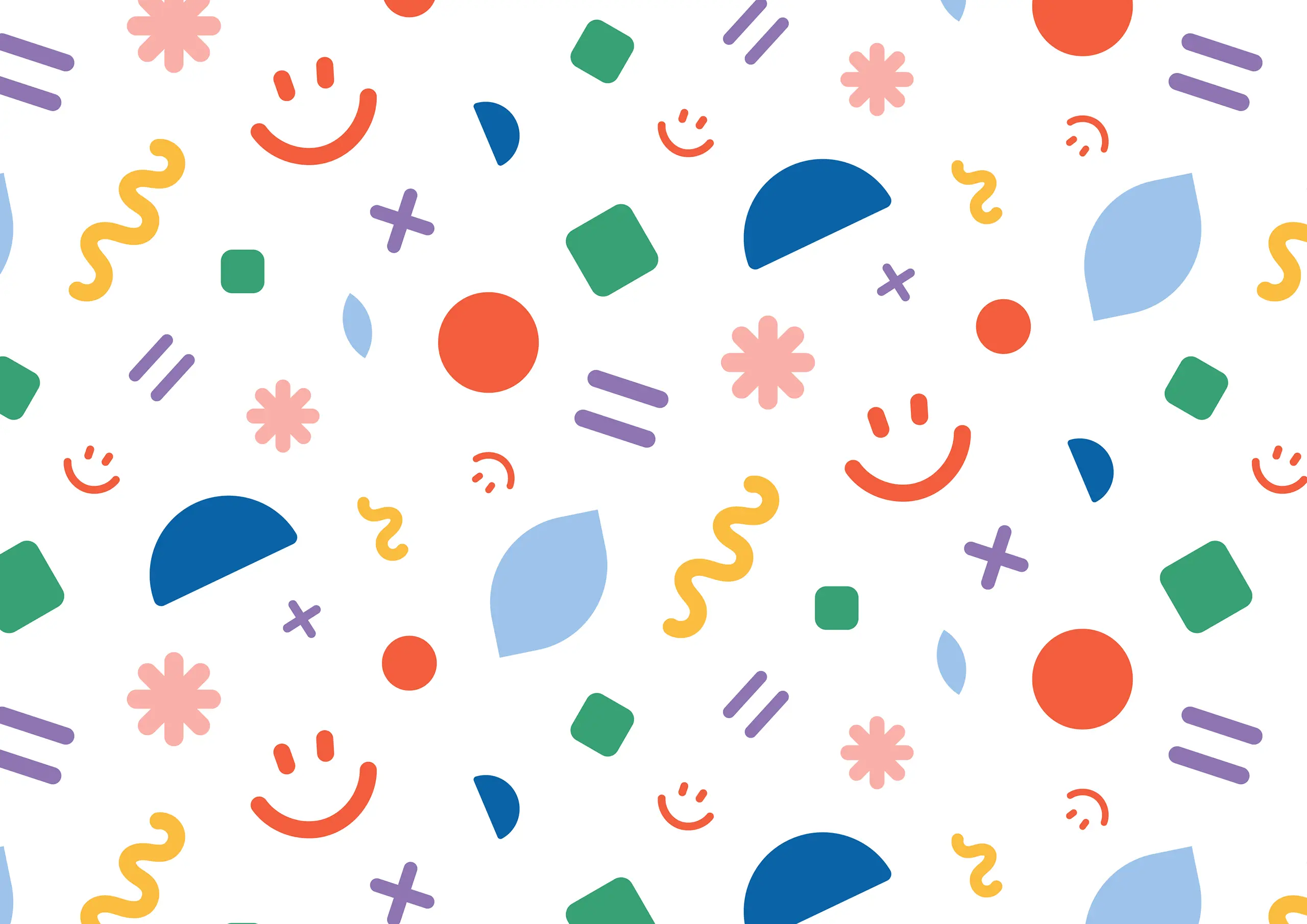
We took inspiration from the simple shapes shown in the children’s artwork and paintings in the art and crafts room. We developed a playful illustration set that could be flexible across all print and digital applications.
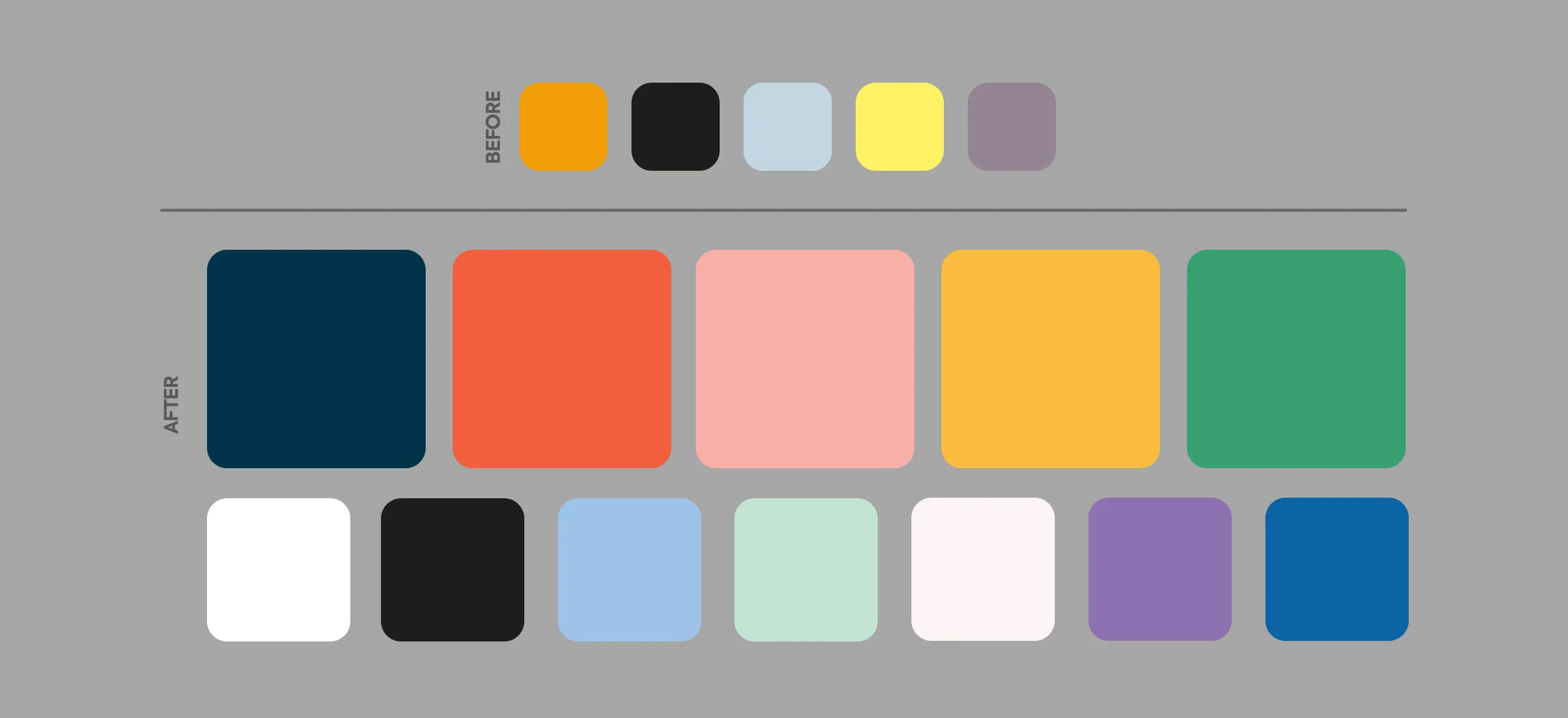
We brightened their colours and added an additional 7 to the palette.
The response from Daniel was simply, “I love it.”
The next steps was to restructure the website to improve how their services and information was accessed. This involved our planning and wireframe process which allowed us to test each user journey.
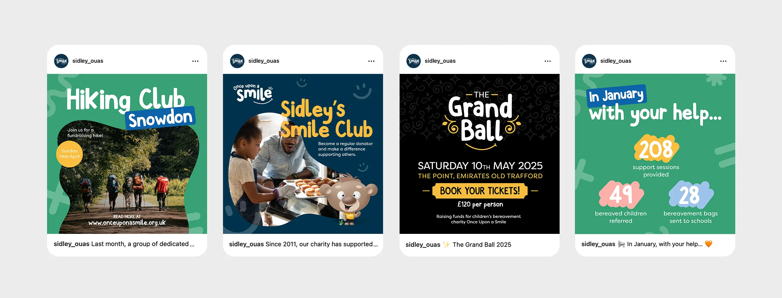
Once approved, we moved to design, and then to the development stage in WordPress. Injecting a new brand identity allowed us to move from the dominant orange of the existing brand identity and create some fun graphics and animations to the website that encouraged the playful but clean brand style approach.
All designed to lighten the mood.
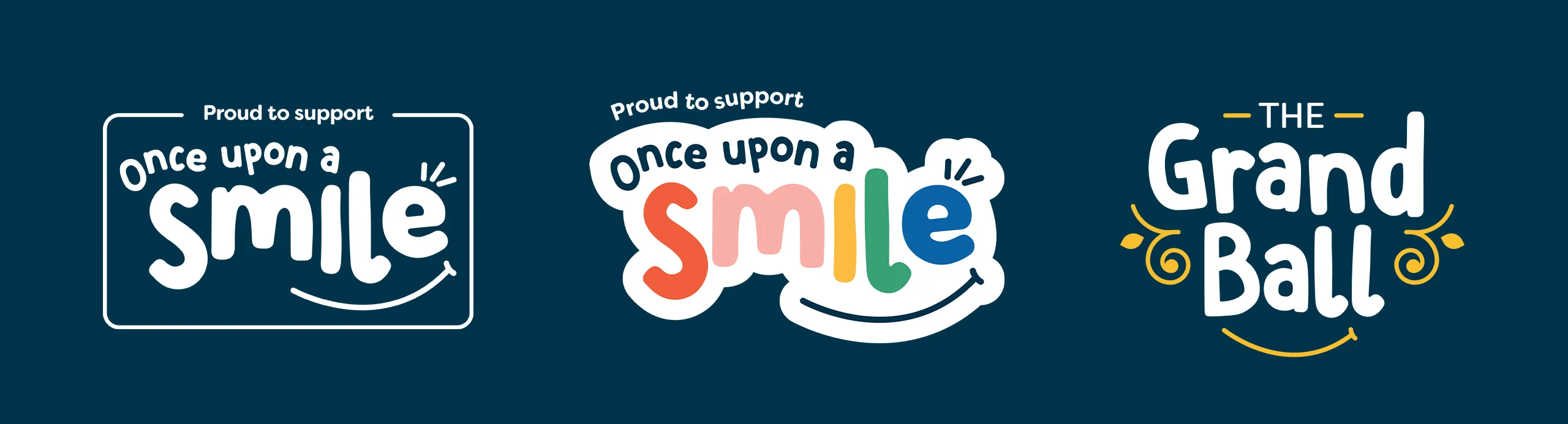
During the website design phase, we rolled the brand identity out across all the assets needed by the charity, including:
And the cherry on top of the project was to bring their main fundraising event, the Grand Ball, under the new brand. Which Daniel commented, ‘You’re good you lot 😂… Danny loves this. So decision made”.
The website and rebrand launched on the 20th February 2025.