A digital delight for the Bird at Birtle
A complete website overhaul to reflect the Michelin Guide Recommended gastro pub’s standing.
A complete website overhaul to reflect the Michelin Guide Recommended gastro pub’s standing.
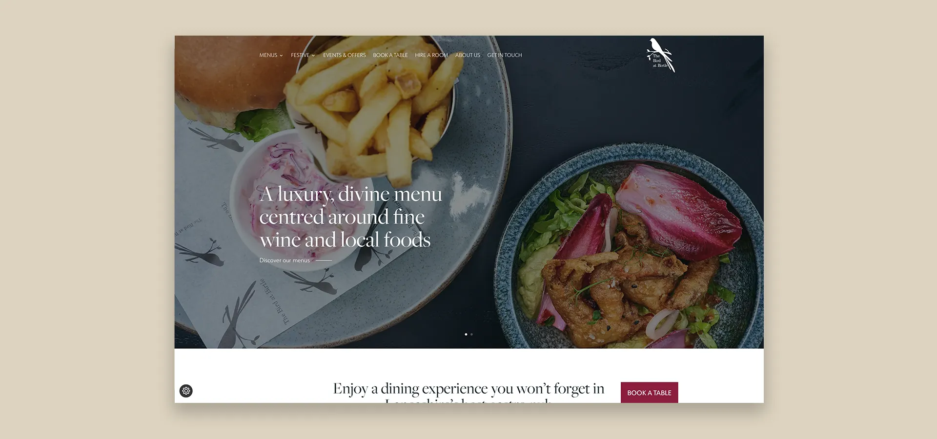
Since Andrew Nutter closed his main restaurant in October 2021, his focus has been on the Bird at Birtle. It had become clear that in the 5 years since opening, the pub’s website was proving to be nearly impossible to update and maintain by the team. This meant they weren’t able to publicise upcoming events or change the menus.
It also didn’t reflect a user experience that matched the dining experience at the Bird at Birtle.
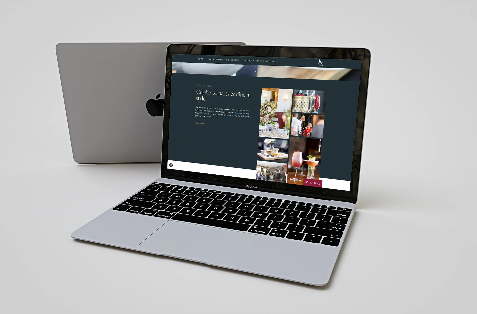
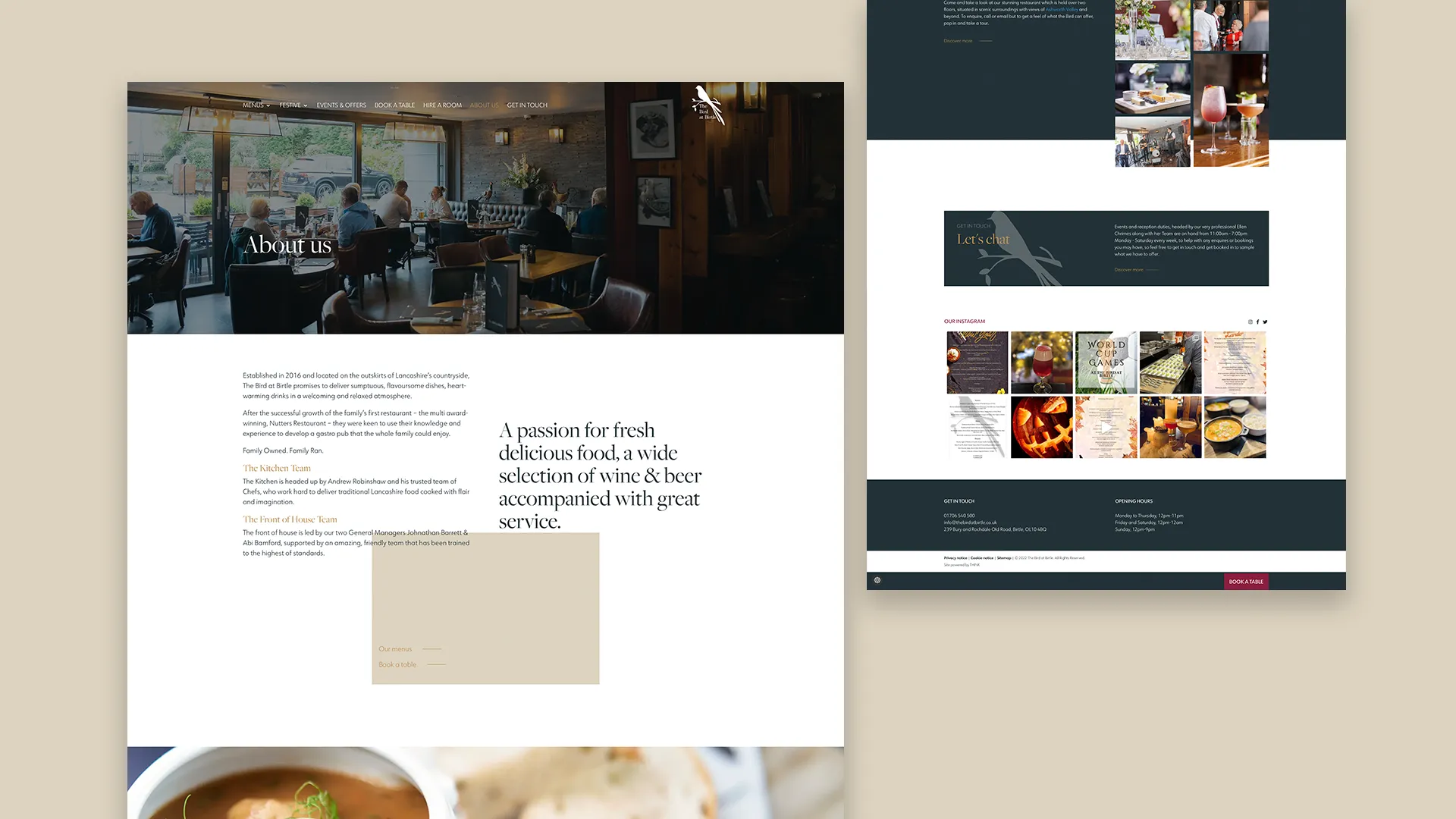
With just a logo to go from, we focused on creating and branding a brand new look and feel for the website design that generally reflected the opening statement on the website – ‘a luxury, divine menu centred around fine wine and local foods.’ User Experience was at the forefront of the creative. Subsequently, the website was designed specifically to ensure booking was a seamless and accessible experience. Furthermore, that the website worked perfectly between devices.
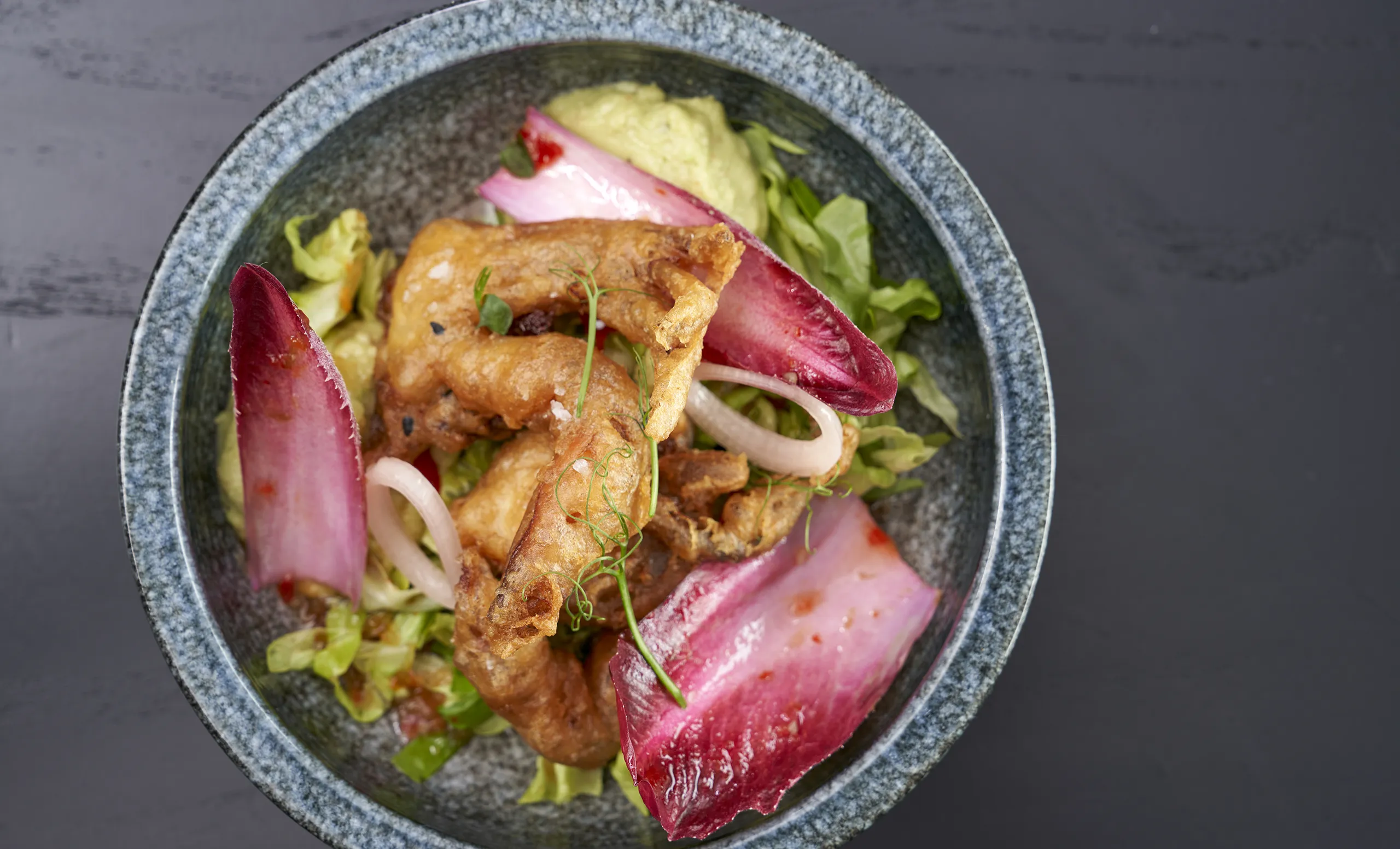
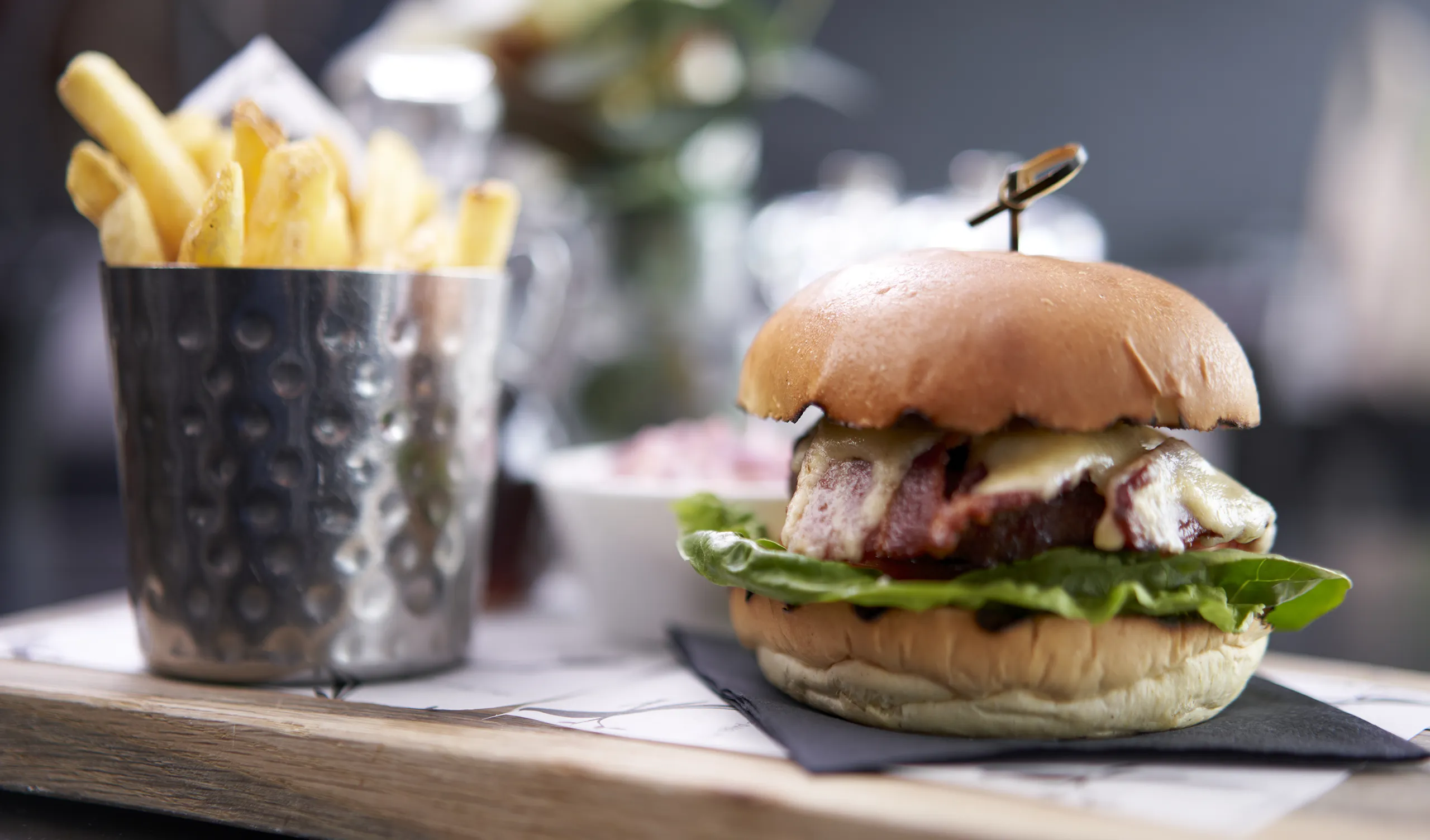
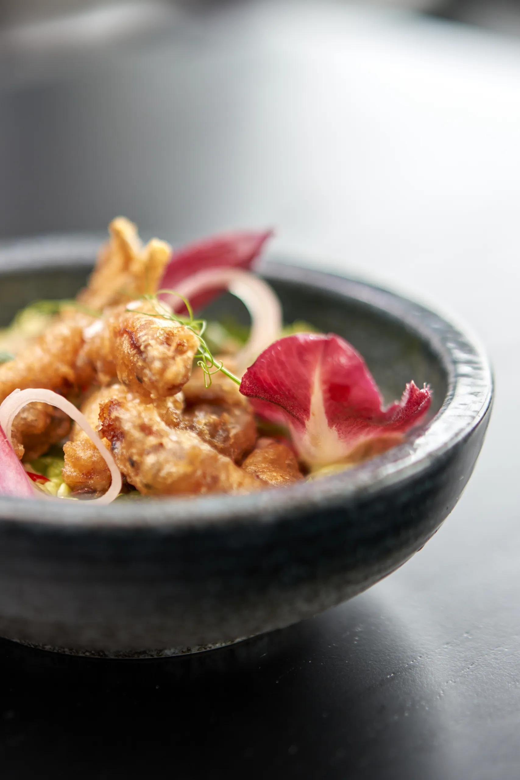
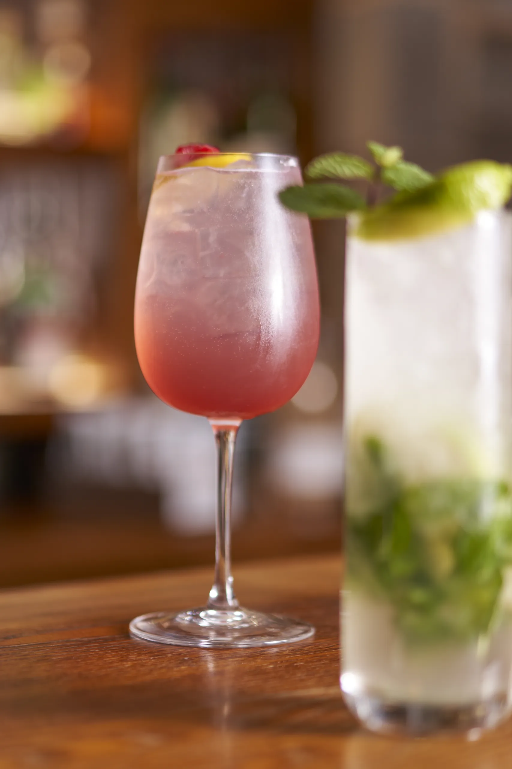
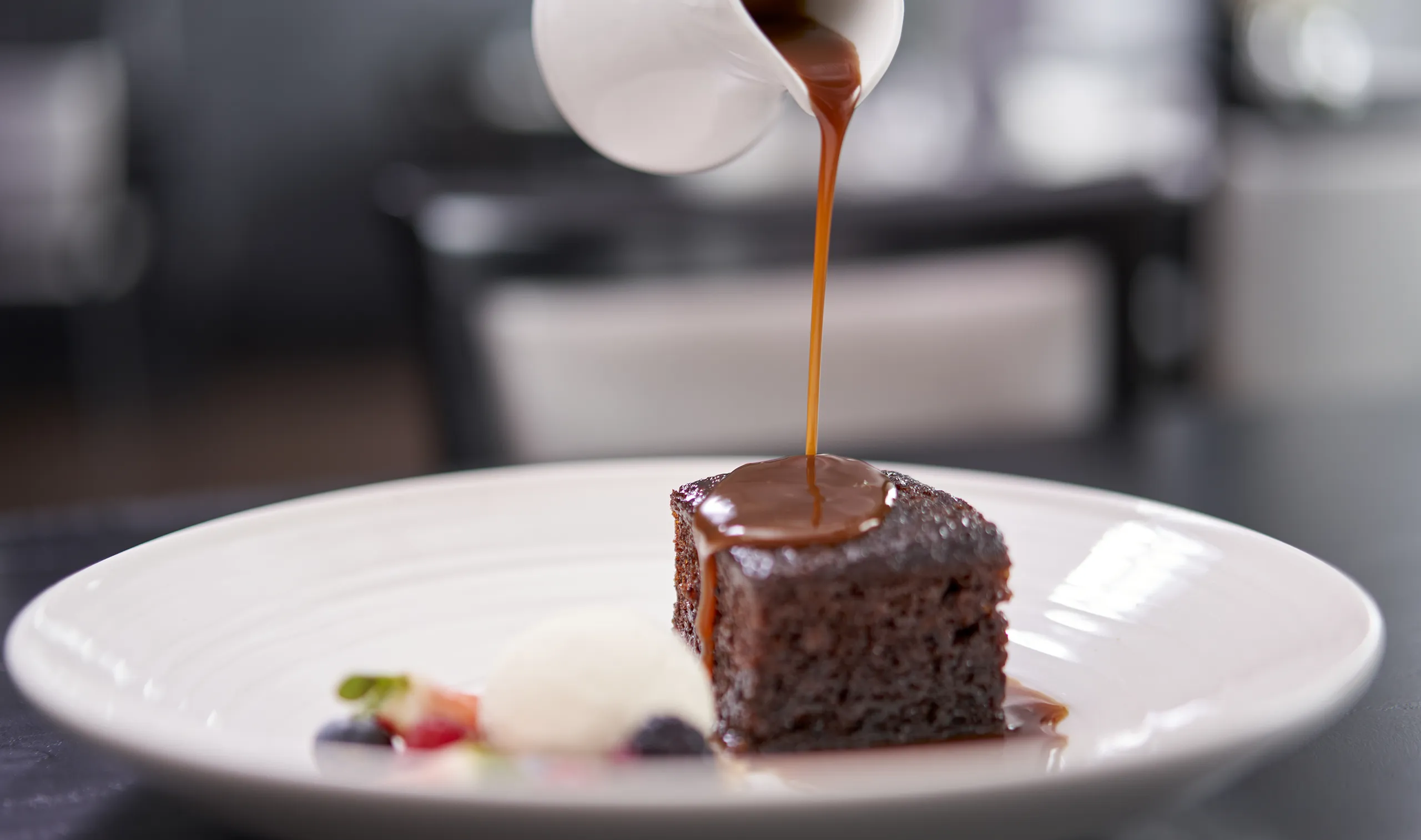
Use of pairing elegant serif typography with an easy-to-read sans serif, acres of white space and stunning food photography, the Bird at Birtle now has a website they can be especially proud of and can show off their incredible gastronomical delights.
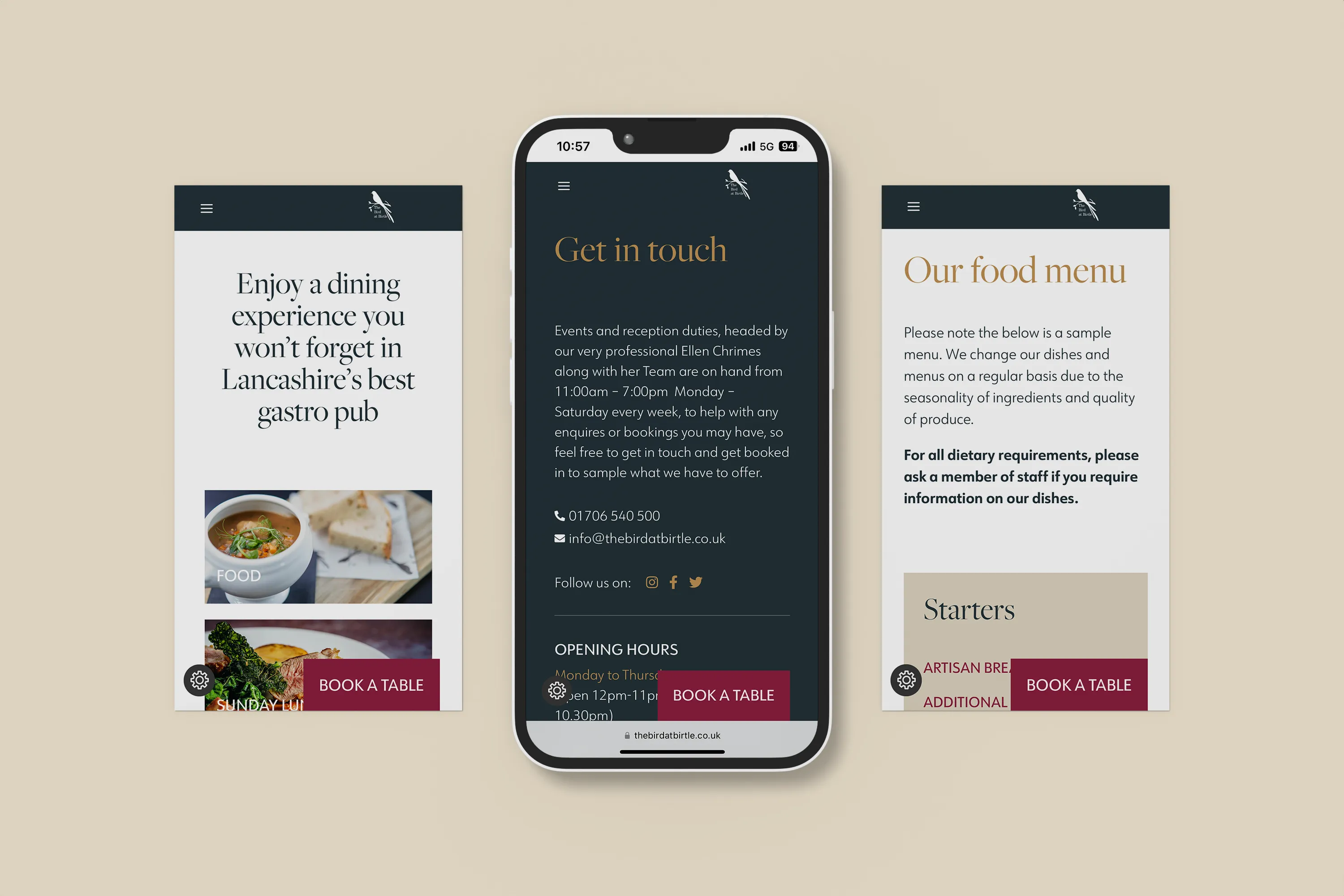
With an updated WordPress CMS, the website is now rather simple to use and loads incredibly fast across all devices. Since the launch we have seen a reduction in the bounce rate by 47%, with the booking page seeing a huge increase in traffic.



Notifications