Abode Property Development
Sales brochure and branding for a exclusive property development company in Cheshire.
Sales brochure and branding for a exclusive property development company in Cheshire.
Abode Property Developments, a small yet esteemed property developer, have a growing reputation in the North West and Cheshire.
However, their sales brochures lacked effectiveness in showcasing the excellence of Abode’s new build properties. In particular, The Paddock development was lacking. Moreover, it was largely down to the brochure design not reflecting the quality of an Abode development.
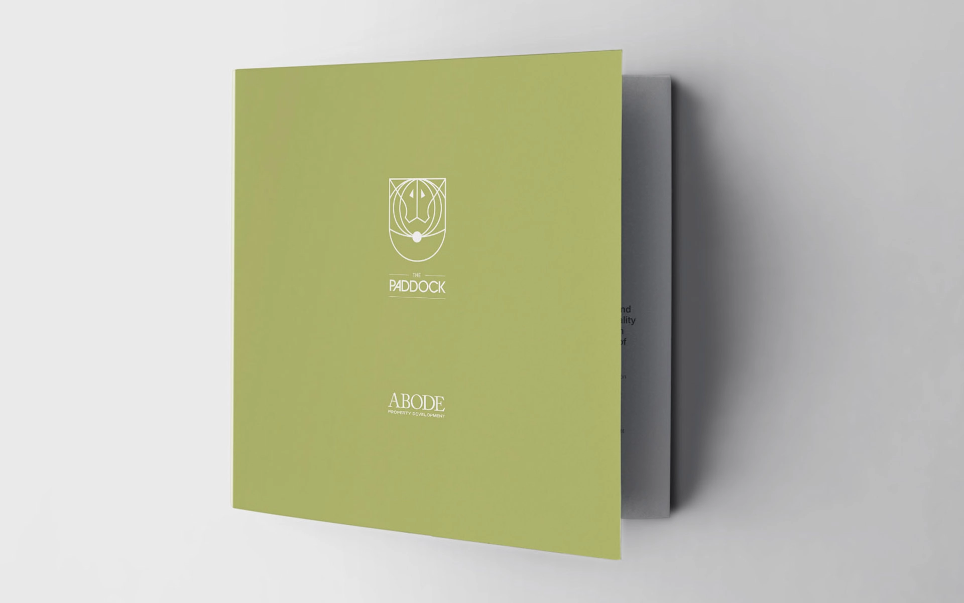
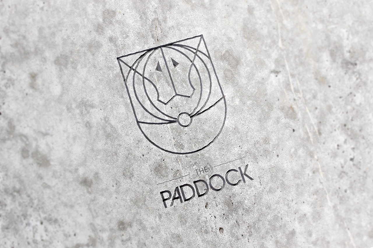
The first issue identified was that the previous brochures marketed the business. Instead, they need to show the lifestyle people buy when they commit to high-end property. So we realise that we can add value to the project by creating the development’s very own brand logo. In turn, this means marketing the Paddock development becomes easier and appeals to the emotion of any prospective buyer.
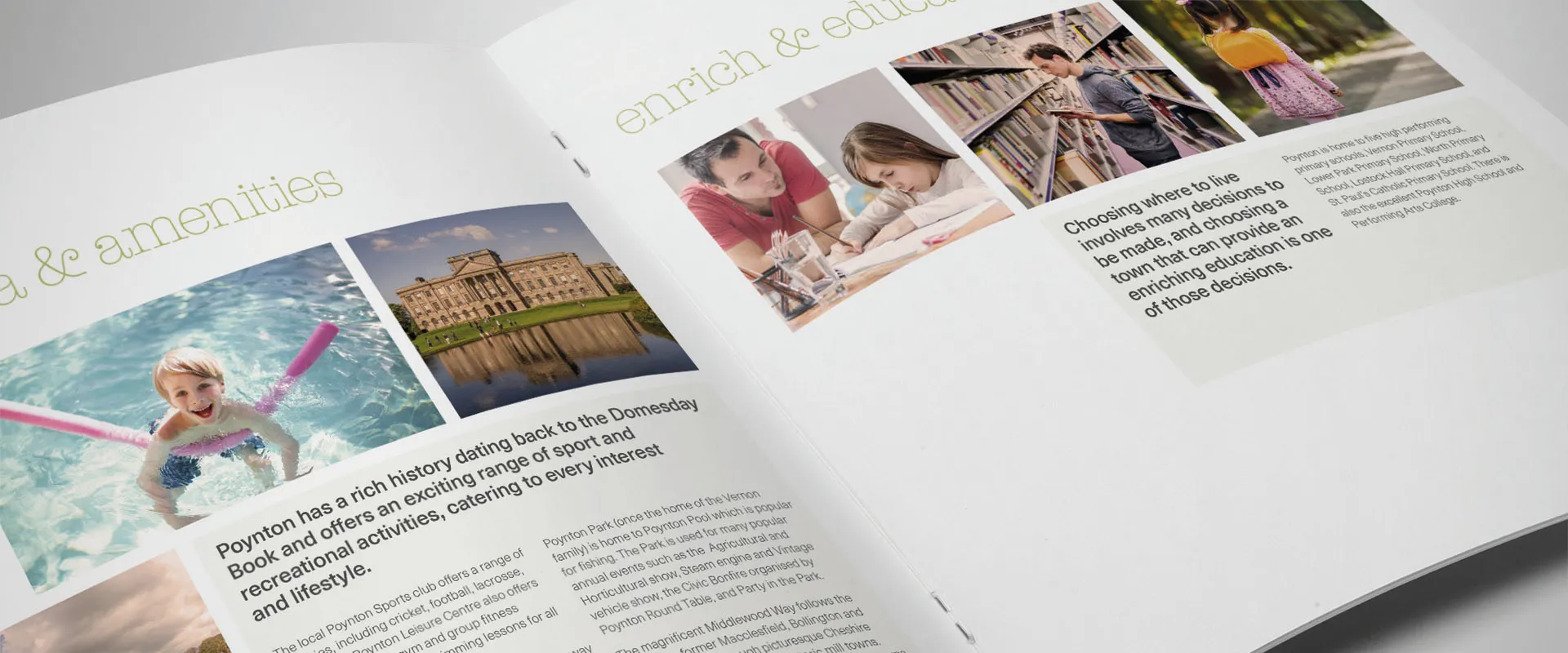
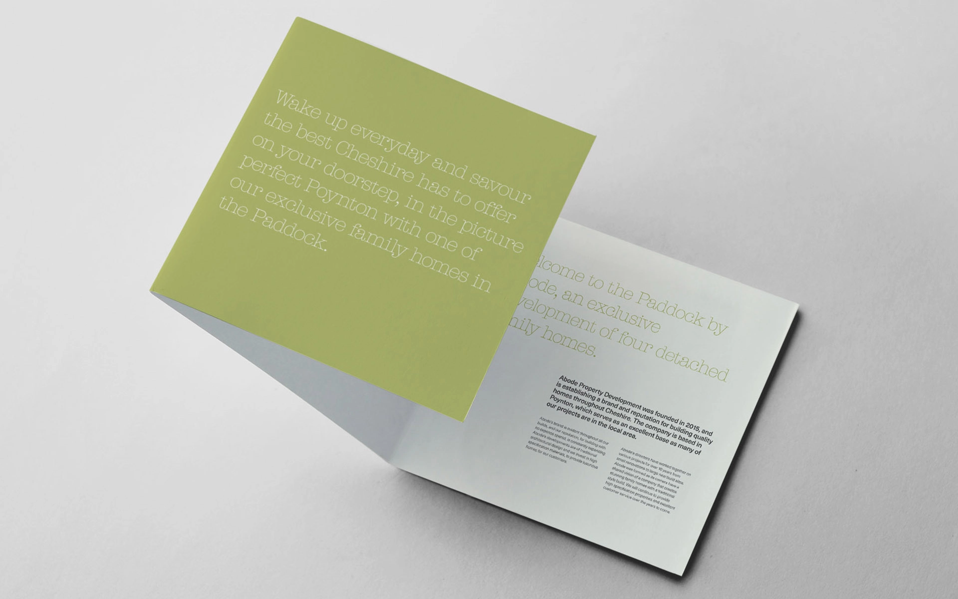
Once the logo was designed, the next stage was really about creating a tone in the design. So using subtle greens and warm accent colours, married with a leafy ‘graphic’ device and a mix of a serif and sans serif typographic pairing, we had the makings of a beautifully designed piece.
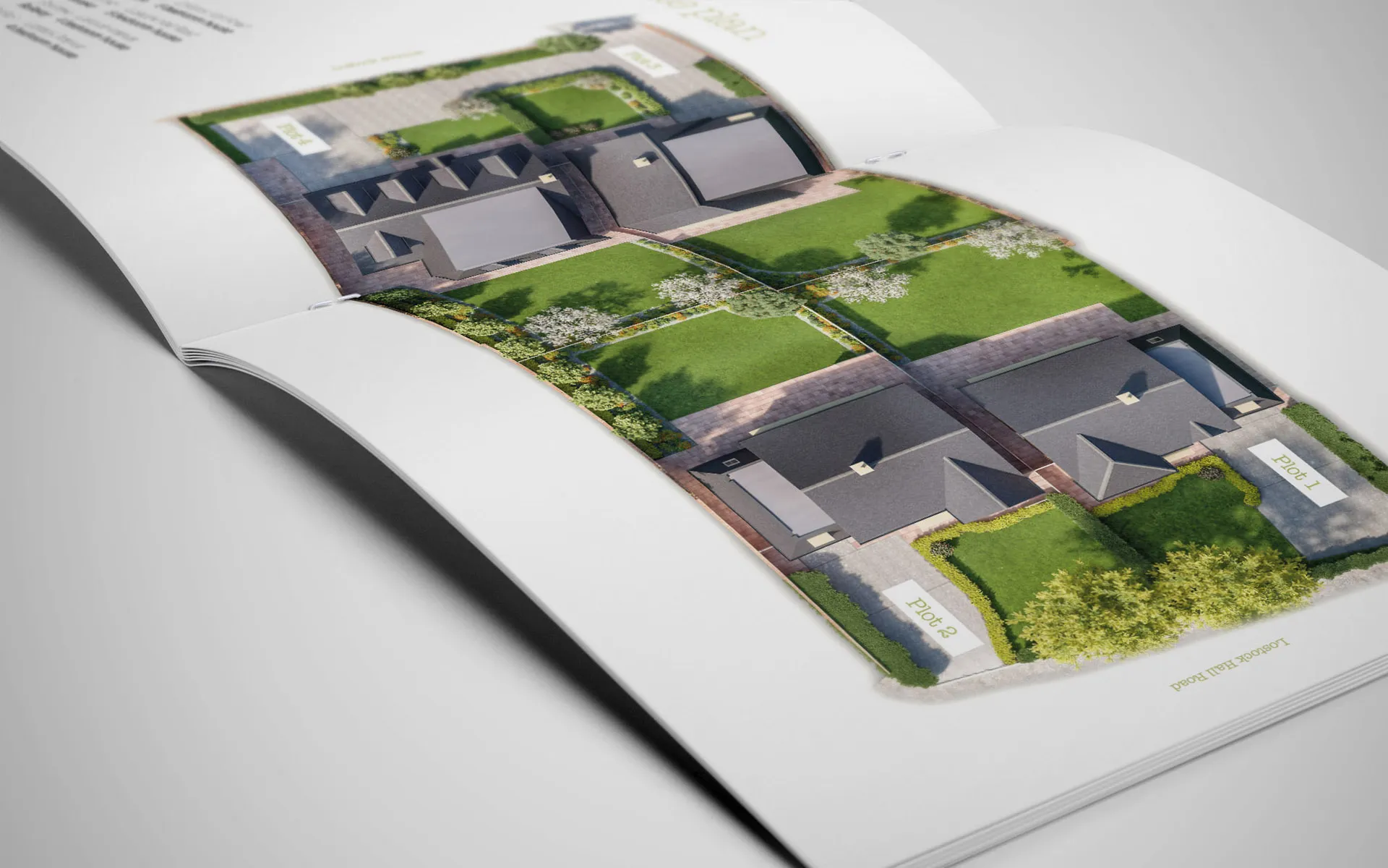
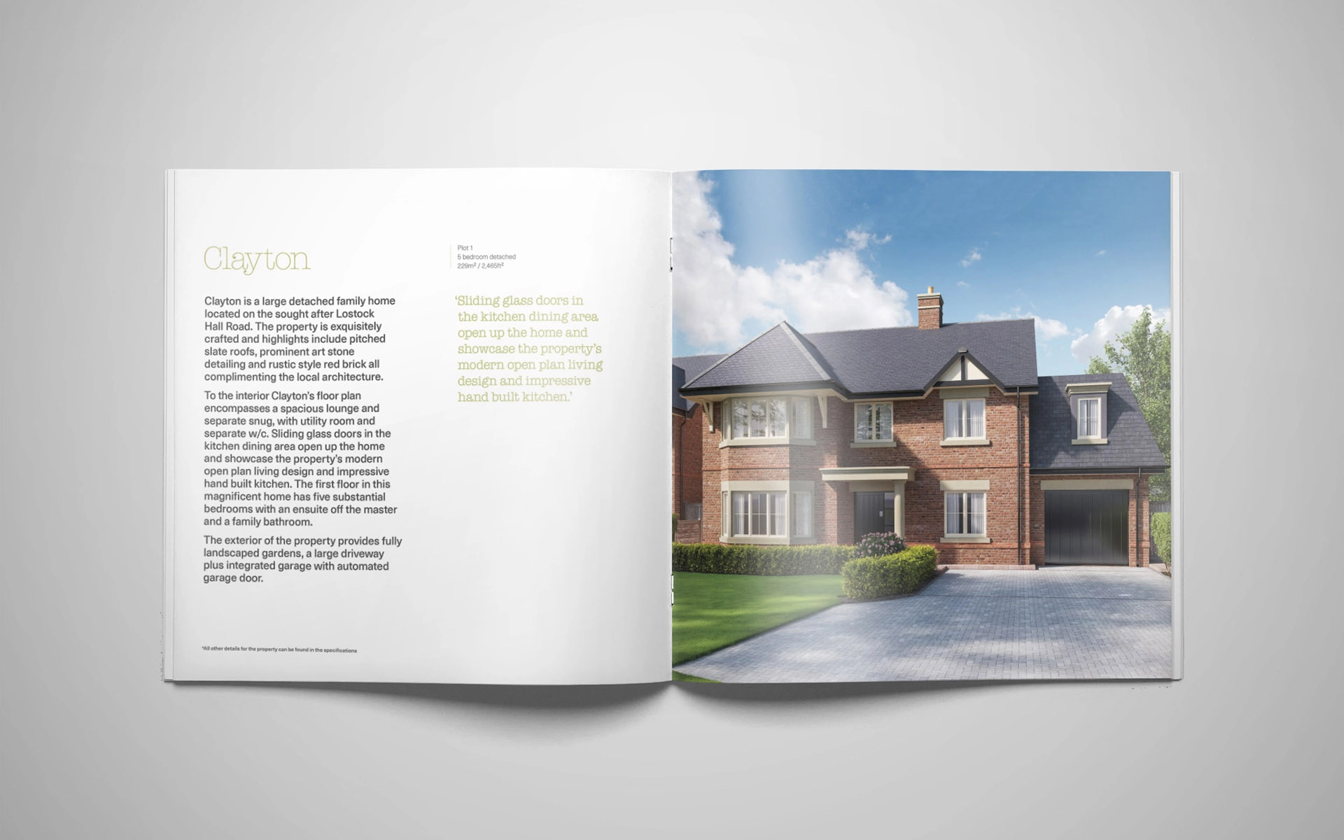
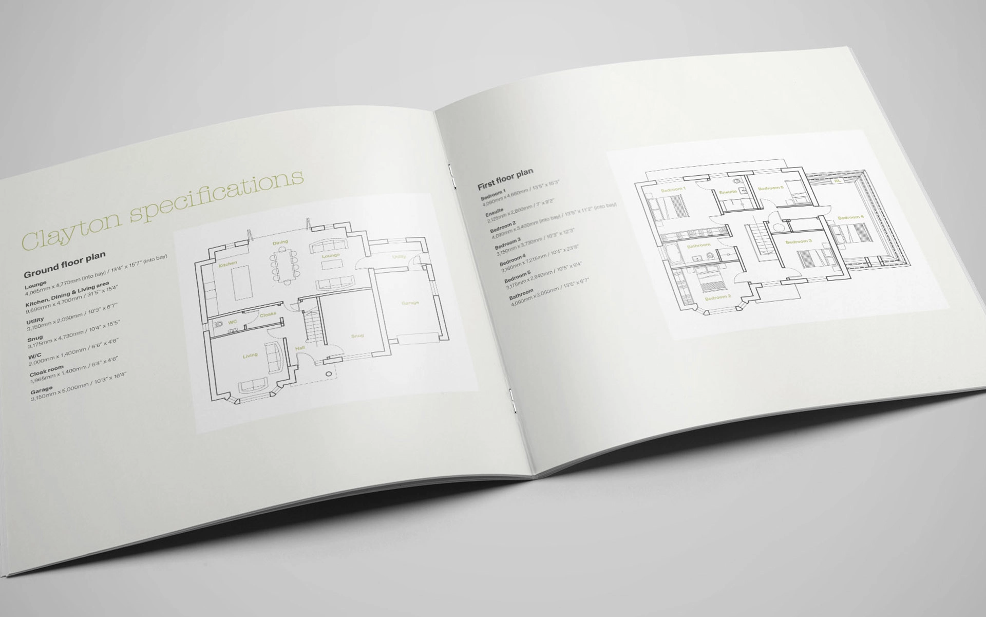
Going to a square format allowed us to have a 6-page cover and a reveal, to entice the reader into the brochure. Property specific sections followed local interest pages, ensuring ease of readability. CGI renders of soon-to-be-built homes were generously spaced, allowing them to stand out effectively.
Shortly after producing the brochure, three out of 4 properties at The Paddock found buyers. Moreover, our direct contact at Abode told us it was the “best sales brochure they’d ever seen.”
