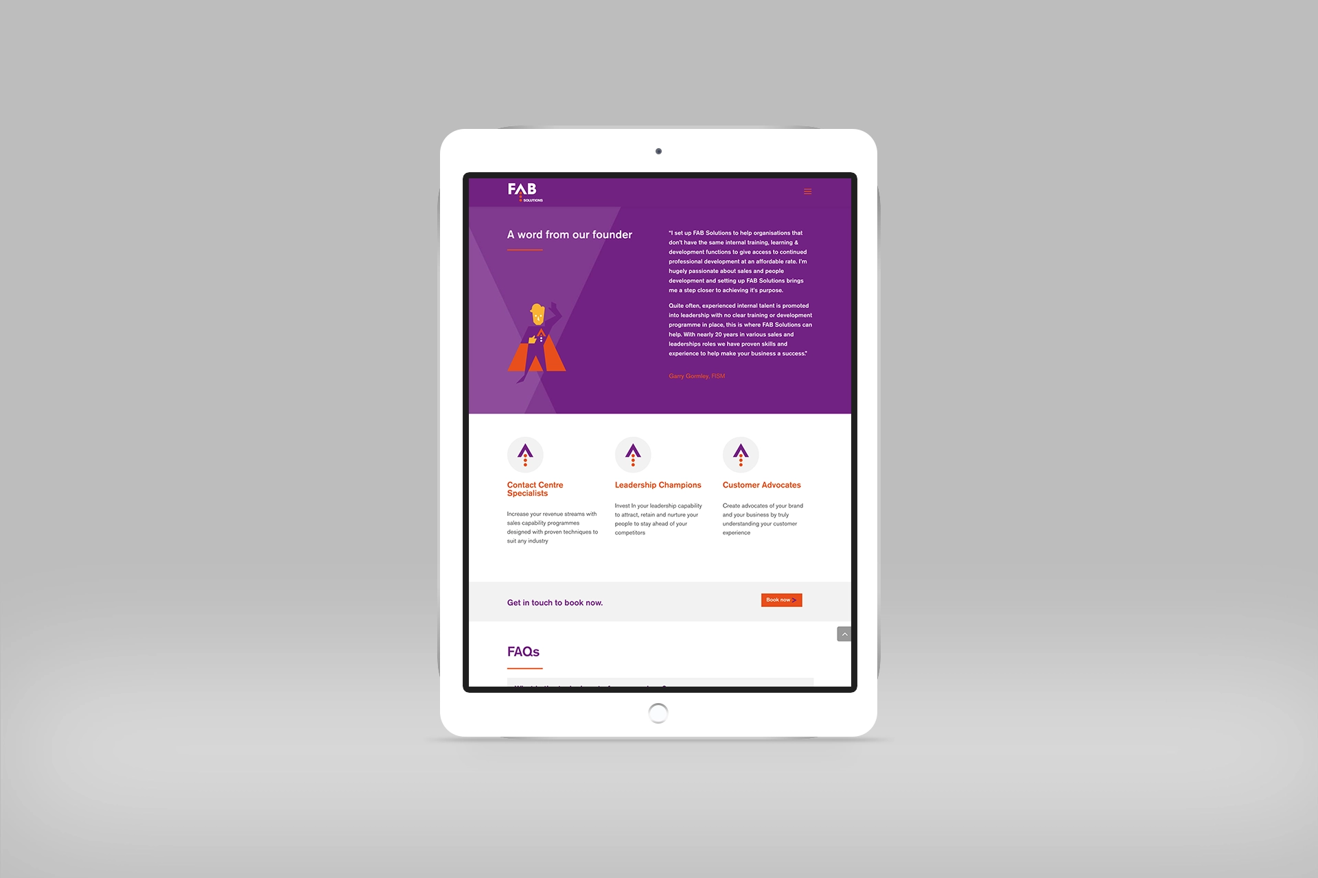
A fab (no pun intended) project for Manchester based startup business FAB Solutions. Having originally created his own logo and website in GoDaddy, Managing Director Garry realised it didn’t reflect the quality of his offering and recognised the need of both a new logo and a website. Garry got in touch with the team at Think Design to help out with how his new business represented itself.
Our Creative Director, Paul, originally met Garry through networking, and having listened to his elevator pitches and his 10 minute slot, he was really keen to help develop FAB Solution’s visual identity.
To begin, we started with the logo. This part of the project should ALWAYS come before a website design, as the logo should influence the design of the website and other collateral. We went back to Garry with multiple ideas, and he couldn’t decide between two of our designs; the first represents the idea of boosting sales, and the second focused on creating Garry into a superhero. This informed the brand development, as we took forward one logo but the idea of the other began to form the brand.
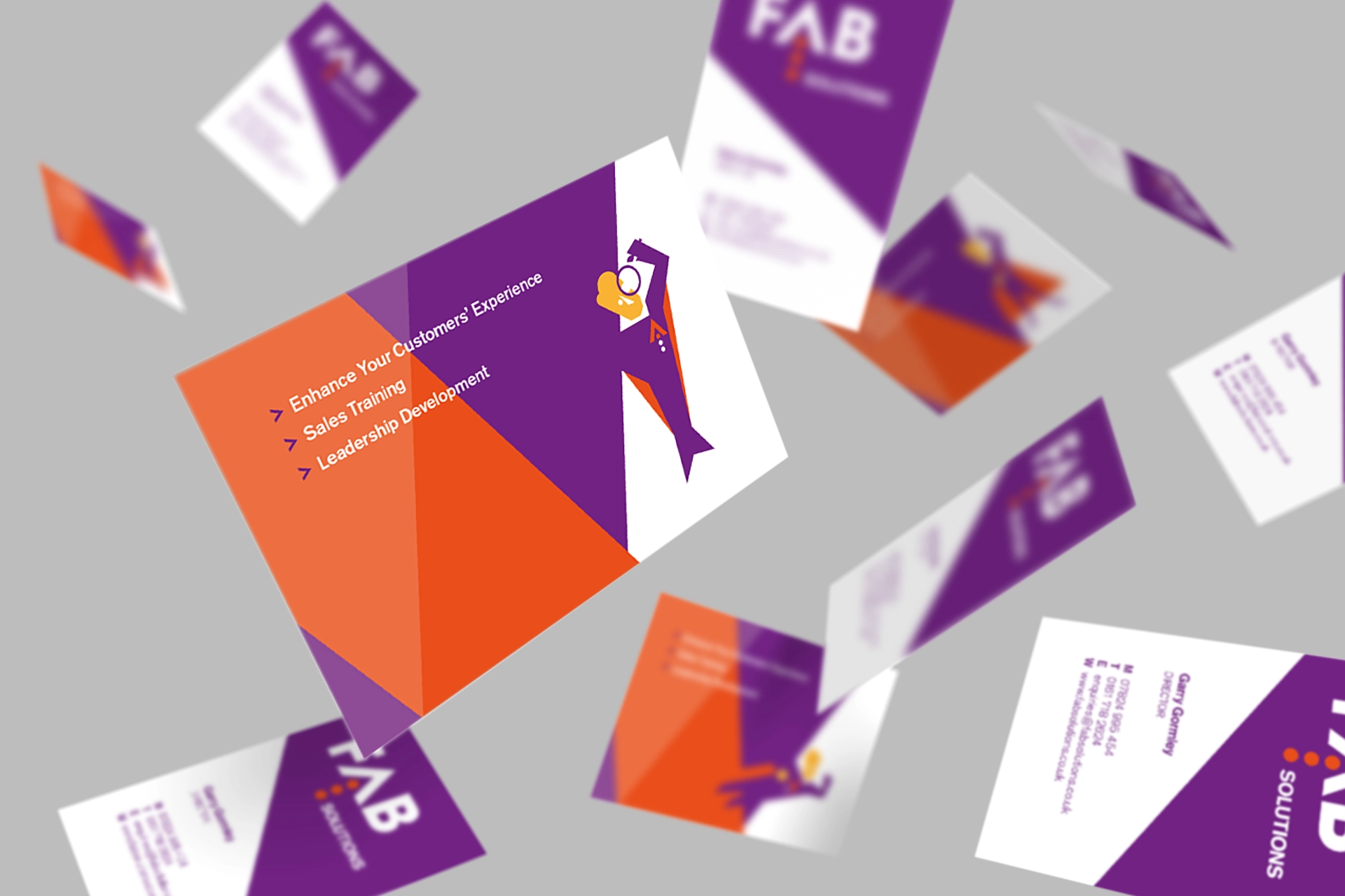
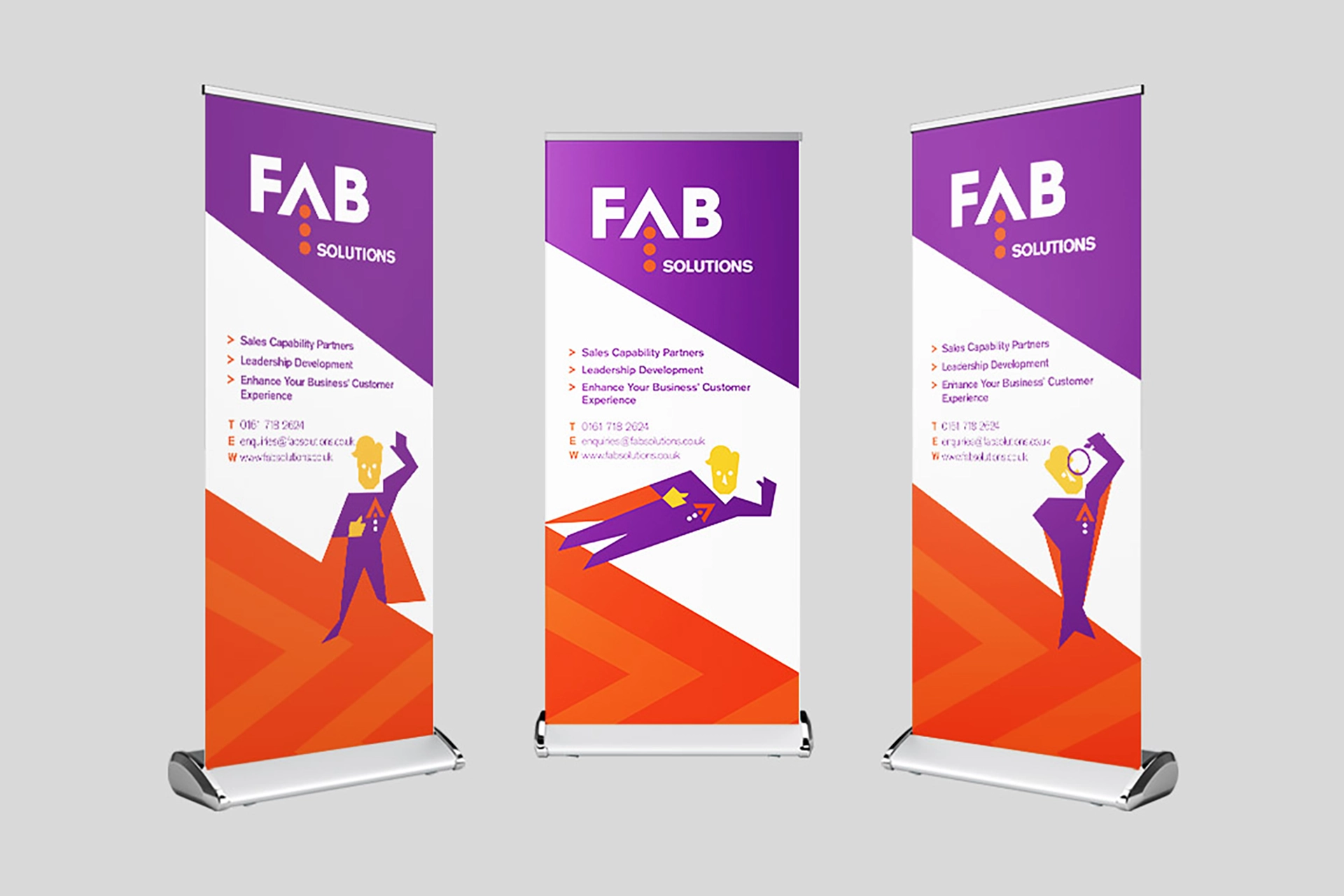
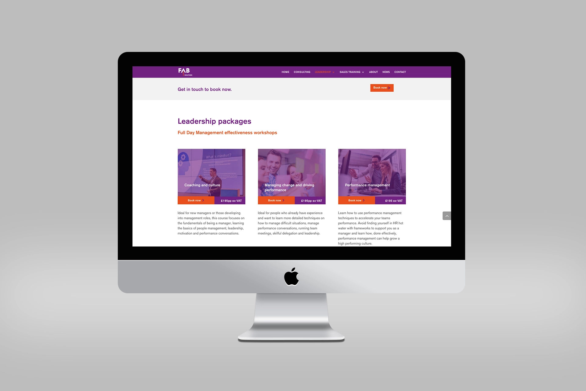
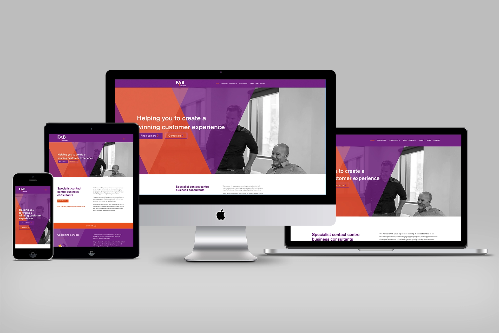
As the logo and character design evolved we created additional characters to reflect the sales and leadership training areas of the business. These were then rolled out onto pop up banners, business cards, invoice design, and of course the fabsolutions.co.uk website.
